Non-Designer Slides: How Zendeck Smart Layout Designs for You
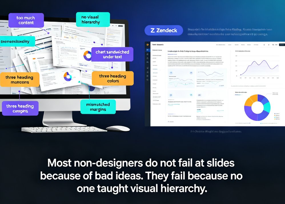
You've got 20 minutes before the meeting, and slide six still looks like it was assembled by someone who hates alignment. Font sizes drift, the chart got sandwiched under two paragraphs of context, and the same heading shows up in three different colors.
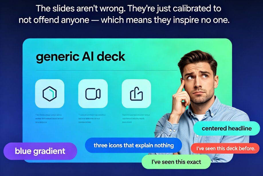
Here's the uncomfortable truth: most non-designers don't fail at slides because of bad ideas — they fail because no one ever taught them visual hierarchy. And you don't fix that by working harder. You fix it by letting the right tools make the design decisions for you.
In this guide, I'll walk you through why non-designer decks usually miss the mark, how Zendeck's smart layout engine and asset library solve the problem, and a 5-step workflow you can use today — even if you've never opened a design tool in your life.
01 Let's Be Honest: Most Non-Designers Make the Same Three Mistakes
When I review decks from teachers, HR leads, and first-time founders, the problems are almost always the same three things.
Mistake one: too much content per slide. When everything you want to say is on the slide, the audience reads instead of listens. The slide competes with you instead of supporting you. The classic 'Q1 Results' slide with five equally weighted bullets, a tiny chart in the corner, and two lines of context text is the perfect example. By the time someone finds the revenue number, they've already stopped caring.
Mistake two: no visual hierarchy. Every element is the same size, the same weight, the same color. The eye has nowhere to go. The revenue number that matters is visually identical to the footnote nobody reads. Your audience has to work to figure out what's important — and most of them won't bother.
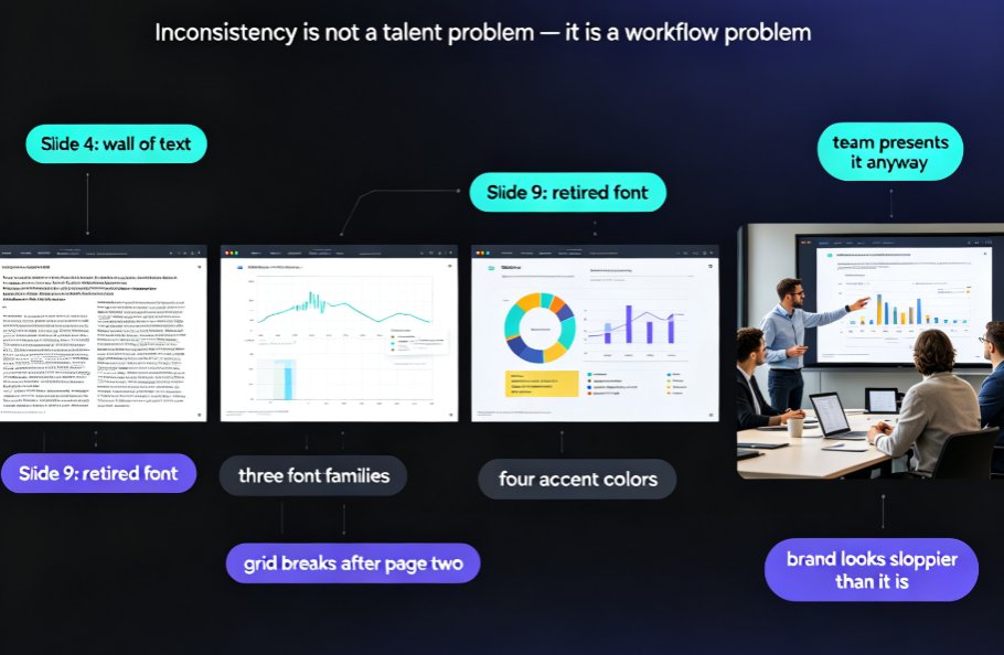
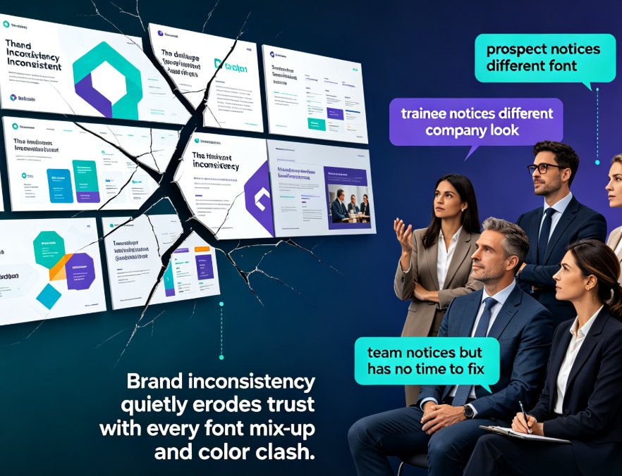
Mistake three: inconsistent design decisions. One slide uses one font, the next uses two. Colors change without logic. Margins drift between slides. The net effect is a deck that looks assembled piece by piece rather than designed as a whole. Nobody says 'great thinking, but the spacing threw me off' — they just feel vaguely uneasy about your credibility.
The fix isn't to binge a month of YouTube design tutorials. Smart layout tools let you hand the mechanical design decisions to software and keep your energy on the content — where you're actually strong.
02 Why 'More Effort' Actually Makes Things Worse
Let's be real: the manual approach has a ceiling — and it's a low one.
When a non-designer tries to fix a bad slide by hand, they do the only things they know how to do: make text bigger, shrink text, change the color, drag the chart slightly left, then slightly right, then slightly left again. That's not designing; that's rearranging anxious furniture.
On top of that, manual tweaking is slow in a way that's hard to see while you're doing it. Ten minutes here, twenty minutes there — suddenly you've spent two hours on a deck that should have taken forty-five minutes. And the result still doesn't look like anything from a professional design studio.
This is where AI-powered layout engines changed things. Tools like Zendeck analyze the content you give them — a Word outline, Markdown, or a text prompt — and make the layout decisions automatically. Font sizes scale according to hierarchy. Spacing gets normalized so nothing drifts. Colors follow a single consistent scheme. Alignment is handled by the engine, not by your tired eyes at 11pm.
The shift in outcomes is dramatic:
| Aspect | Manual Tweaking | Zendeck Smart Layout |
|---|---|---|
| Time on layout details | 30–60% of total deck time | ~5–10% |
| Visual consistency | Drifts across slides | Enforced by the engine |
| Result quality | Varies by the hour | Consistent from deck to deck |
| What you lose | Hours of your life | Nothing — content stays yours |
The best part? You don't need to 'learn design.' The engine learns it for you.
03 The Layout Engine: Your Invisible Part-Time Designer
Here's what 'smart layout' actually does, step by step.
Content parsing. When you paste your outline or upload a Word document, Zendeck identifies the title, sections, bullet points, and data. It understands structure — which text is a heading, which is a supporting point, which number deserves to become a headline.
Hierarchy assignment. Remember the 'Revenue Up 34%' example from design guides? The engine does that automatically. It picks one big idea per slide, makes it big and bold, and demotes the rest. Size and weight communicate importance — so the numbers that matter actually look like they matter.
Spacing and alignment. Margins get uniform. Text boxes no longer overlap. Images align to a grid. This is the invisible work that makes a deck feel 'professional' even when nobody can name exactly why.
Consistent theming. Whatever template you started with, every slide inherits the same fonts, colors, and layout rhythm. No more slide 4 looking like a different deck than slide 15.
If you want to nerd out on how AI templates are becoming context-aware — choosing the layout based on your content rather than a fixed grid — this piece on context-aware deck design gets into the details.
04 The Asset Library: Icons, Charts, and Illustrations Without Opening Adobe
The second big pain point for non-designers: visuals. You know you need an icon for 'growth,' but the last time you tried to find one, you ended up with a clip-art rocket that looked like it was from 1998.
Zendeck's curated asset library solves this in one move. It gives you instant access to professional icons, charts, and illustrations that match the design language of your deck. No more scavenger hunts through stock sites, no more mismatched free vectors that clash with your brand colors.
What makes a curated library different from a general stock site?
Consistency. Every asset lives in the same visual family. An icon on slide 3 looks like it belongs with an illustration on slide 15, because they were built to work together.
Relevance. You search for what you need and get options that fit your context — courseware icons for educators, revenue charts for finance teams, process flows for trainers.
Speed. The gap between 'I need a visual here' and 'it's on the slide' drops from hours (or years, if you're a perfectionist) to about ten seconds.
Whether you're building training slides, investor pitches, or internal updates, the library is where non-designers get their 'design confidence' back. For a deeper look at how these asset libraries are evolving, check out how AI-powered asset libraries are shaping smarter visuals.
05 A 5-Step Workflow That Works for Non-Designers
Let me give you the exact workflow I'd use, whether you're a trainer prepping a workshop or an HR lead building onboarding materials.
Step 1: Dump your content first, design later. Write your outline in Word, Google Docs, or Markdown. If you start with a blank white template and a blinking cursor, you'll design as you go — and that's when bad decisions multiply. Get the words right, then let the tool do the visuals.
Step 2: Let Zendeck generate the deck from your outline. Upload the file, and the AI turns your structure into a full slide deck with initial layout, hierarchy, and theming already applied. You're not starting from zero; you're starting from a finished draft.
Step 3: Pick a template with intent — or let context decide. Templates aren't just skins. Zendeck's template selection (and if you're curious how it picks, here's the inside scoop) considers what kind of content you're presenting so the visual tone matches the material. A sales proposal should look different from a training course.
Step 4: Swap visuals from the asset library. Replace low-quality stock images with library icons, charts, and illustrations. This is the 'polish layer' that instantly upgrades the perceived quality of your deck. For interactive data, you can even add interactive charts directly from the asset library.
Step 5: Apply a one-click reskin to lock consistency. Before you present, use the smart layout's reskin feature to unify fonts, colors, and spacing across every slide. What felt like a patchwork deck becomes a single, coherent visual statement.
Outcome? A deck that took you one hour — not one full weekend — looks like it came from a design department.
06 What the Numbers Actually Look Like
I've seen plenty of 'magic tool' claims, so let's put actual numbers on this. Based on typical non-designer workflows, here's how design time compares between manual PowerPoint tweaking and a smart-layout approach:
Read those bars again: a 50-slide deck that once ate a full ten-hour day drops to about two hours when generation, layout, and asset insertion are handled by the tool. That's a 4x reduction in time spent on design tasks — and the final deck looks more consistent, not less.
Naturally, exact numbers depend on your content, your template choice, and how much storytelling you want to add. But the pattern holds across every scenario I've seen: non-designers get dramatically better results in dramatically less time when they stop hand-designing and start letting the tool handle the layout.
If you're interested in the broader trend — where AI presentation tools are heading — this overview of agentic deck design and automation trends is worth a read.
07 One Last Word: Design Skill Is No Longer the Bottleneck
Let me leave you with this.
The most valuable thing a non-designer can do is stop believing that 'good slides' require 'design talent.' That belief keeps you stuck manually nudging text boxes at 11pm. What actually matters is your content, your story, and your ability to communicate clearly.
You don't need to become a designer to produce professional slides. You need a tool that designs with you — and Zendeck's smart layout plus asset library does exactly that.
Whether you're building courseware, training decks, or investor pitches, the workflow stays the same: dump your ideas, let AI generate the deck, swap in strong visuals from the library, and lock consistency with one click. The output is a deck that looks intentional — because the system was designed to make it so. For example, trainers building workshop materials can start from the AI presentation templates for trainers and adapt from there.
FAQ
Q1: I've never used design software. Is Zendeck beginner-friendly? A: Completely. If you can write an outline in Word, Google Docs, or Markdown, you can generate a professional deck. Zendeck handles layout, spacing, fonts, and color consistency automatically. The asset library and template picker are designed for people who think in content, not pixels.
Q2: Will the slides look too template-y? A: Not if you use templates as scaffolding, not as a finish line. The smart template engine selects designs contextually based on your content, and a one-click reskin makes every slide feel coherent. You can customize colors, swap visuals, and inject your branding before you present.
Q3: How long does it take to make a 50-slide training deck? A: With a complete outline, most users report finishing a 50-slide deck in about two hours — versus a full day or more using traditional tools. Content readiness is the main factor; the design work itself is near-instant.
Q4: Can I use my company's brand colors and fonts? A: Yes. Zendeck supports custom brand kits, so you can define your colors, fonts, and logo once, then apply them across every deck. For a deeper guide, see how to create a custom brand kit for consistent decks.
Q5: What types of content work best with Zendeck? A: Anything with structure — course outlines, training manuals, sales proposals, research summaries, you name it. The stronger your outline, the better the generated deck. Educational content benefits especially, since smart layouts surface key learning points cleanly. If you're building courseware, the AI courseware collection is a good starting point.