How to Add Interactive Charts to Your AI Slides with Zendeck's Asset Library
You've got the data. You've got the story. But when it comes to turning those numbers into a slide that actually lands, your design skills are... let's just say, a work in progress. Sound familiar? You're not alone. Most of us aren't data artists. We're educators, consultants, and team leads who need to present numbers clearly—without spending hours fiddling with chart colors and alignment.
Here's the good news: you don't need to become a designer. With Zendeck's asset library, you can drop in pre-built charts, icons, and illustrations, then let the platform auto-fit them to your brand. In minutes, you'll have data slides that look like they were crafted by a professional studio. Let's walk through exactly how to do it.
I. Why Data Slides Fail (and How to Fix Them)
Let's be real: a wall of numbers is the fastest way to lose your audience. Research consistently shows that people process visuals 60,000 times faster than text, and that's before we even talk about retention. But the problem isn't the data—it's the presentation. Most data slides fail because they're either:
- Overloaded: too many numbers, no hierarchy.
- Under-designed: default Excel charts that clash with your brand.
- Static: no visual interest, no story.
The solution isn't to become a chart wizard. It's to use tools that handle the heavy lifting. Zendeck's asset library gives you access to a curated set of chart templates, icons, and illustrations that are designed to be clear, modern, and on-brand. You just pick the right visual for your message, and the platform does the rest.
II. Getting Started with Zendeck's Asset Library
Before you start adding charts, make sure you've set up your workspace. If you haven't already, create a Brand Kit in Zendeck—this ensures every element you insert automatically matches your logo, colors, and fonts. (We've covered this in detail in our guide on creating a custom brand kit.)
Once your brand kit is ready, open any presentation and click on the Asset Library icon in the toolbar. You'll see categories like Charts, Icons, Illustrations, and more. For data-driven decks, the Charts section is your best friend.
III. Adding a Chart to Your Slide in Three Steps
Step 1: Choose Your Chart Type
Think about what you're trying to communicate. Comparison? Use a bar chart. Trends over time? A line chart. Part-to-whole? A pie or donut chart. Zendeck's library includes all the classics, plus some modern options like radial gauges and funnel charts.
Step 2: Insert and Populate
Click the chart you want, and it appears on your slide. Then, double-click to open the data editor. You can type in your numbers directly or paste from Excel. The chart updates instantly—no manual axis tweaking.
Step 3: Customize to Your Heart's Content
Select the chart and use the formatting panel to adjust colors, fonts, labels, and even add data callouts. Since your brand kit is applied, everything already looks cohesive. If you want to go further, you can resize, rotate, or layer the chart with icons from the same library.
Pro tip: Don't overload one slide. If you have multiple metrics, split them across slides or use a dashboard-style layout with several small charts. Your audience will thank you.
IV. Making Charts Interactive (Without Coding)
Interactive doesn't always mean JavaScript. In a presentation context, interactivity can be as simple as:
- Animations: Use Zendeck's animation presets to make charts appear element-by-element, so you control the narrative.
- Hyperlinks: Link chart elements to other slides or external resources for deeper dives.
- Video narration: Turn your data deck into a narrated video with Zendeck's PPT-to-Video feature. This is perfect for micro-courses or asynchronous training.
For example, if you're presenting a quarterly business review, you can add a line chart showing revenue growth, then animate it to reveal each quarter as you speak. That's a level of engagement a static PDF can't match.
V. Customizing Charts to Match Your Brand
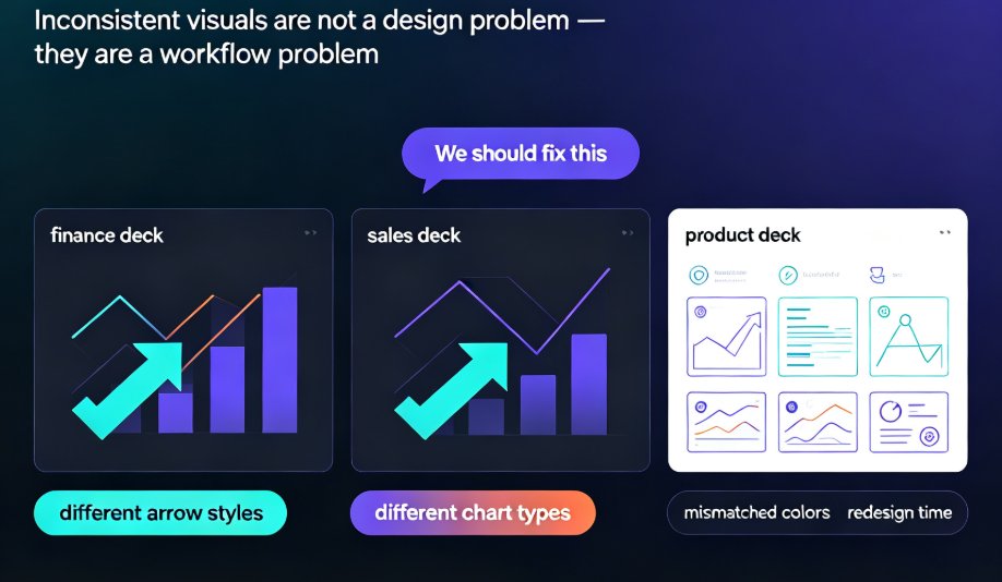
One of the biggest pain points with AI-generated slides is that they look generic. You've seen those decks—the ones that scream "template." Zendeck solves this with smart layout and brand kits. When you insert a chart from the asset library, it automatically inherits your brand's color palette and typography. No more clashing colors or mismatched fonts.
But you can also go deeper. Use the asset library to add custom icons that reinforce your message. For instance, if you're presenting sales data, drop in a small icon of a shopping cart next to your bar chart. These little touches make your deck feel bespoke.
If you're working with a team, you can share your brand kit across the organization, ensuring every department's presentations look consistent. We've written about this in our piece on maintaining brand consistency across hundreds of slides.
VI. Best Practices for Data Visualization (From the Trenches)
Based on years of helping teams build data-driven decks—and insights from tools like ChartGen—here are the non-negotiables:
- Clean your data first. Remove blank rows, align date formats, and label columns clearly. Garbage in, garbage out.
- Traceability matters. Every figure on your slide should trace back to your source dataset. If you're using AI to generate charts, prefer tools that pull from your uploaded data rather than guessing from general knowledge.
- Narrative flow. Your slides should tell a story: overview → detail → conclusion. Don't just dump charts; guide your audience through the numbers.
- Edit, don't accept. Even the best AI-generated charts need a human touch. Zendeck gives you full element-level editing, so you can fine-tune anything.
Here's a quick comparison of what to look for in a data visualization tool:
| Feature | Zendeck | Typical AI Tools | Manual Tools (Excel) |
|---|---|---|---|
| Pre-built chart templates | ✅ | ✅ | ❌ |
| Brand kit auto-apply | ✅ | ❌ | ❌ |
| Element-level editing | ✅ | Partial | ✅ |
| Data import from Excel/CSV | ✅ | ✅ | ✅ |
| Interactive animations | ✅ | ❌ | ❌ |
| PPT-to-video export | ✅ | ❌ | ❌ |
VII. Putting It All Together: A Real-World Workflow
Let's say you're a consultant preparing a case study deck. You have a spreadsheet with client metrics. Here's how you'd use Zendeck:
- Upload your data to a slide (or paste it into the chart editor).
- Choose a bar chart from the asset library to show year-over-year growth.
- Add a line chart for monthly trends.
- Drop in icons to represent key industries.
- Apply your brand kit—everything snaps to your client's colors.
- Add narration and export to video for a self-running summary.
Total time: under 10 minutes. That's the kind of efficiency that wins pitches. We've seen it happen—check out how a consultant created a data-rich case study deck in 10 minutes.
VIII. The Bottom Line
You don't need design skills to create data slides that impress. Zendeck's asset library puts professional-grade charts, icons, and illustrations at your fingertips. With smart layouts and brand kits, every element looks intentional and polished. Whether you're building a quarterly review, a training module, or a pitch deck, you can turn raw numbers into a compelling visual story in minutes.
So next time you're staring at a spreadsheet, don't panic. Open Zendeck, pick a chart, and let the platform do the heavy lifting. Your audience will see the difference—and so will you.
FAQ
Can I edit charts after inserting them from Zendeck's asset library?
Yes. Every chart you insert from Zendeck's asset library is fully editable. You can change the data, colors, fonts, and layout to match your brand. The chart remains a native object, so you can resize, reposition, or restyle it just like any other slide element.
Does Zendeck support interactive charts with tooltips or drill-downs?
Zendeck focuses on making charts visually compelling and easy to update. While it doesn't yet support full drill-down interactivity, you can add hyperlinks, animations, and even turn your deck into a video with narration to create an engaging experience. For true interactive dashboards, you might pair Zendeck with a BI tool.
How do I ensure my charts stay on-brand when using the asset library?
Set up a Brand Kit in Zendeck with your logo, colors, and fonts. When you insert any chart or icon from the asset library, Zendeck automatically applies your brand kit, so every element matches your corporate identity. You can also manually override any style if needed.
Can I import my own data into Zendeck to generate charts?
Currently, Zendeck's asset library provides pre-built chart templates that you can populate with your own numbers. For a more automated data-to-deck workflow, you can upload an outline or use the AI to generate slides from a document, then replace placeholder data with your actual figures.
Is Zendeck's asset library suitable for non-designers?
Absolutely. The entire platform is designed for people without design skills. The asset library offers curated charts, icons, and illustrations that are professionally designed and automatically fit your brand. You just pick, drop, and customize—no design training needed.