AI Data Visualization Trends 2026: Turn Raw Data into Compelling Decks
You've got the numbers. You've got the story. But your slides still look like a spreadsheet exploded. If that sounds familiar, you're not alone. Every week, I see consultants, marketers, and trainers drowning in raw data, trying to force it into a presentation that doesn't put people to sleep. The good news? AI data visualization trends in 2026 are changing that game entirely. Let's break down what's happening, why it matters, and how you can use tools like Zendeck to turn raw data into decks that actually persuade.
I. The Problem: Raw Data Is a Mess
Let's be real: raw data is ugly. It's rows and columns, decimals and outliers, and it has zero narrative. When you paste a table into a slide, you're not presenting insights—you're asking your audience to do the analysis themselves. That's a recipe for glazed eyes and lost deals.
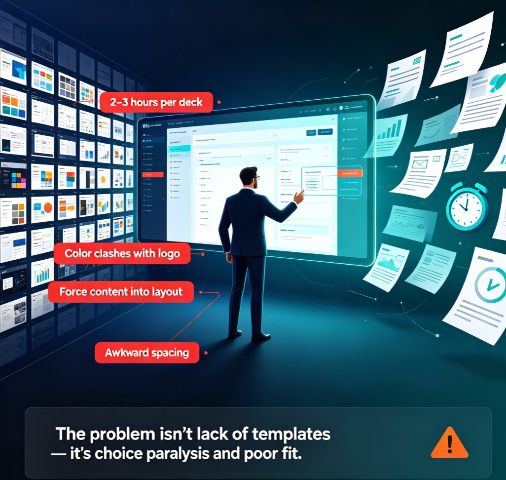
The pain point is universal: you have the data, but you don't have the time or design skills to make it sing. You spend hours in PowerPoint, adjusting chart colors, resizing legends, and praying the alignment works. Then you realize the chart type you chose doesn't even tell the right story.
Here's the outcome we all want: a clean, compelling deck where every chart has a purpose, every number supports a narrative, and the design looks like it came from a professional agency. That's the promise of AI data visualization.
II. What's Driving the Shift: AI Data Visualization Trends in 2026
2026 isn't just about prettier charts. It's about a fundamental shift in how we interact with data and presentations. Here are the trends that are reshaping the landscape:
1. AI-Driven Data Storytelling
Forget just plotting points. AI now structures your data into a narrative arc—introduction, conflict, resolution—automatically. Tools analyze your numbers, identify the most compelling insights, and suggest a flow that leads your audience to the conclusion you want. This is a game-changer for quarterly reviews and pitch decks.
2. Natural Language Queries
Instead of manually configuring chart axes, you type "show revenue growth by quarter with a trendline" and the AI builds it. This isn't sci-fi; it's already in tools like Zendeck. You speak like a human, and the AI translates that into a visual.
3. Real-Time Data Integration
Static decks are dying. In 2026, more tools will pull live data from your CRM, BI platform, or Google Sheets, so your presentation always reflects the latest numbers. No more "this data is from last quarter" apologies.
4. Automated Design Systems
Brand consistency is no longer a manual chore. AI applies your brand kit—colors, fonts, logo placement—to every chart and slide automatically. This is huge for teams that need to maintain a professional image across hundreds of decks.
5. Interactive and Adaptive Decks
Presentations are becoming more interactive, with AI adjusting the content based on audience reactions. While still emerging, this trend is gaining traction in training and sales environments.
III. How AI Turns Data into Decks: The Workflow
So how does this actually work in practice? Let's walk through a typical workflow using Zendeck, because that's the tool I've seen deliver the fastest results.
Step 1: Dump your data. You start with a Word outline, a markdown file, or even a brain dump. Zendeck's AI takes that raw material and structures it into a logical deck skeleton.
Step 2: Let AI suggest the visuals. Based on your content, Zendeck recommends the best chart types. If you're showing a trend, it'll suggest a line chart. If you're comparing categories, a bar chart. It even handles complex data like heatmaps or scatter plots.
Step 3: Apply your brand kit. One click, and every chart, every slide, every icon matches your brand guidelines. No more manual color picking.
Step 4: Add the narrative. Zendeck can auto-generate speaker notes that explain what each chart means and why it matters. You're not just presenting data; you're telling a story.
Step 5: Export and share. Whether you need PPTX, PDF, or a video version, Zendeck has you covered. You can even turn your deck into a narrated micro-course.
The outcome? You go from raw data to a polished, persuasive deck in minutes, not hours. And you don't need to be a designer or a data scientist.
IV. Traditional vs AI-Driven Data Visualization: A Comparison
To see the difference clearly, here's a side-by-side comparison of the old way and the new way:
| Aspect | Traditional Approach | AI-Driven Approach (Zendeck) |
|---|---|---|
| Chart selection | Manual, often trial-and-error | AI suggests best chart type based on data |
| Design consistency | Inconsistent, requires manual effort | Brand kit applied automatically |
| Time to create a 20-slide deck | 4-6 hours | 15-30 minutes |
| Data integration | Static, copy-paste | Real-time or imported from files |
| Narrative flow | You figure it out | AI structures the story |
| Speaker notes | Written from scratch | Auto-generated, editable |
| Error risk | High (misaligned charts, wrong data) | Low (AI validates and formats) |
That table isn't just about speed—it's about quality. AI doesn't just make you faster; it makes your presentations more effective. When the visuals are clean and the story is clear, your audience retains more and acts on your recommendations.
V. Practical Tips for Creating Data-Driven Decks with Zendeck
Now, let's get tactical. Here are five tips I've picked up from working with teams who've adopted Zendeck for their data-heavy presentations:
1. Start with the question, not the data
Before you open any tool, ask: "What decision do I want my audience to make?" That question drives everything. Zendeck's AI will help you structure the deck around that decision, not around every number you have.
2. Use the AI's chart suggestions, but know why
Don't just accept the first chart Zendeck suggests. Understand why a line chart works better than a bar chart for trends. The AI is smart, but you're the expert on your story. Use the suggestions as a starting point, then adjust.
3. Keep it to one key insight per slide
The biggest mistake in data presentations is cramming too much into one slide. Let each slide focus on a single takeaway. Zendeck's layout engine helps by automatically breaking down dense content into digestible chunks.
4. Annotate the 'so what'
A chart without context is just decoration. Add a callout or annotation that explains the insight. Zendeck lets you add text boxes and callouts easily, so you can highlight the key takeaway right on the chart.
5. Leverage the brand kit for trust
Consistency builds trust. When your charts look like they belong to your company, your audience takes you more seriously. Set up your brand kit once in Zendeck, and every future deck will automatically follow it.
VI. The Future: What's Next?
We're only scratching the surface. By late 2026, expect AI to handle even more of the heavy lifting: predictive analytics that suggest which data points will resonate, real-time collaboration where AI adjusts charts as you discuss, and even more seamless integration with your data stack.
The key takeaway: AI data visualization isn't about replacing human creativity—it's about removing the grunt work so you can focus on the story. Tools like Zendeck are making it possible for anyone, regardless of design skill, to create decks that look professional and persuade effectively.
If you're still manually wrestling with charts and colors, you're leaving time and impact on the table. Try Zendeck for your next data-heavy presentation and see the difference for yourself.
FAQ
Q: What are the biggest AI data visualization trends in 2026? A: The biggest trends include AI-driven data storytelling, natural language queries, real-time data integration, and automated design systems that enforce brand consistency. These are making it easier than ever to turn raw data into compelling narratives.
Q: How does Zendeck help with data visualization? A: Zendeck uses AI to turn your raw data or outline into a polished deck. It suggests the best chart types, applies your brand kit automatically, and even generates speaker notes that explain the data. You can import a Word outline or paste markdown, and Zendeck handles the layout and design.
Q: Can AI really replace manual chart creation? A: For most standard business charts—bar, line, pie, scatter—AI can generate them instantly and correctly. It won't replace the need for human judgment on which data matters, but it eliminates the tedious formatting and re-sizing work. You focus on the story, AI handles the visuals.
Q: What should I look for in an AI presentation tool for data? A: Look for tools that offer natural language data input, smart chart recommendations, brand kit enforcement, and easy export to PPTX or PDF. Also check if it can pull live data or integrate with your BI tools. Zendeck covers all these and more.
Q: How do I make my data-driven deck more persuasive? A: Start with a clear narrative arc—problem, insight, action. Use one key takeaway per slide, and let the chart support that takeaway. Use annotations to highlight the 'so what' behind the numbers. And always design with your audience in mind, not your data dump.
Want to dive deeper? Check out our guide on data-to-deck AI visualization trends or learn how to create a quarterly business review deck with Zendeck. For more on AI presentation agents, see AI Presentation Agents: How Autonomous Decks Reshape Workflows in 2026.