Data-to-Deck in Seconds: AI-Driven Data Visualization Trends in 2026
Introduction: The Data-to-Deck Revolution
Let’s be real: creating a data-heavy presentation from scratch is a pain. You spend hours copy-pasting numbers, wrestling with Excel, formatting charts, and second-guessing whether the shade of blue matches your brand. And after all that, the CEO still asks, “Can you make this chart bigger?”
But here’s the good news: AI-driven data visualization is changing that. In 2026, the trend is clear—tools that automatically convert raw data, reports, and outlines into polished, chart-filled slides are no longer nice-to-have; they’re essential. And Zendeck is leading the charge with its import-from-Word and rich asset library.
This article walks through the biggest trends, shows you how to stop manual charting, and gives you a practical workflow that saves hours while improving accuracy. Let’s dive in.
I. The Pain of Manual Data Visualization
If you’ve ever built a quarterly business review deck, you know the drill:
- Pull data from CRM or analytics.
- Open Excel, create pivot tables, build charts.
- Screenshot or copy charts into PowerPoint.
- Resize, recolor, and align everything.
- Pray the CEO doesn’t ask for a different chart type.
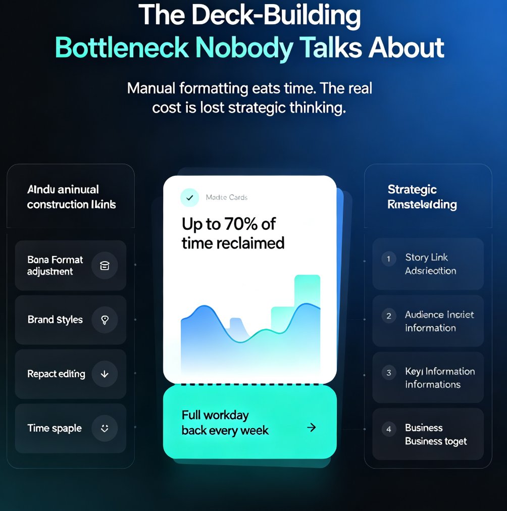
This workflow is broken. It’s error-prone (manual copy-paste mistakes), time-consuming (average 4–6 hours for a 20-slide data deck), and frustrating because you’re doing design work, not analysis.
And the outcome? Inconsistent charts, misaligned colors, and a deck that looks like it was assembled by five different people. Your data deserves better.
II. How AI Transforms Data-to-Deck Workflows
AI-driven tools like Zendeck flip the script. Instead of building slides from scratch, you feed the AI your source material—a Word outline, a PDF report, or even raw text—and it generates a structured deck with charts, tables, and icons in seconds.
Here’s what the new workflow looks like:
| Step | Manual Workflow | AI-Powered Workflow (Zendeck) |
|---|---|---|
| 1. Data preparation | Export data, manually clean | Import Word/PDF with data tables |
| 2. Chart creation | Build charts in Excel, copy | AI auto-detects numbers and generates charts |
| 3. Slide layout | Drag, resize, align manually | Smart layout applies brand kit in one click |
| 4. Customization | Adjust each element individually | Edit chart colors, labels, styles inline |
| 5. Output | Export to PPTX/PDF, check for errors | Export instantly with consistent formatting |
The result: a 4-hour task becomes 15 minutes. And because the AI handles the heavy lifting, accuracy improves—no more misaligned data points or mismatched fonts.
III. Real-World Example: Consultant Creates a Data-Rich Case Study Deck in 10 Minutes
Imagine a consultant, Sarah, who needs to present a case study to a potential client. She has a Word document with the client’s problem, solution, and results—including a table of key metrics (revenue increase, time saved, etc.).
Instead of spending an afternoon making slides, she:
- Imports the Word outline into Zendeck using the Word import feature.
- Zendeck’s AI parses the text, identifies the data table, and automatically creates slides with a bar chart showing revenue growth, a timeline for the project, and a summary slide.
- Sarah applies her brand kit (colors, fonts, logo) with one click.
- She opens the asset library to add a few icons and an illustration of the solution.
- 10 minutes later, she has a polished, data-rich deck ready to present.
Sarah’s outcome: She wins the client because the deck is clear, professional, and accurate. The AI saved her from charting errors and gave her time to focus on the story.
IV. Key Trends in AI Data Visualization for 2026
Here are four trends driving the shift from manual to AI-powered data visualization:
01. Natural Language to Chart
You can now type “Show monthly revenue growth for Q3 as a line chart” and the AI creates it. Zendeck’s smart parsing does this when you import a report with clear headings.
02. Real-Time Data Integration
Live data feeds are becoming standard. While Zendeck currently focuses on import-based workflows, it’s on the roadmap to connect to Google Sheets and databases for real-time chart updates.
03. Multi-Modal Outputs
Slides aren’t enough anymore. AI tools now generate video summaries, interactive dashboards, and narrated micro-courses from the same data. Zendeck’s PPT-to-video feature lets you turn a data deck into a narrated presentation.
04. Brand-Aligned Auto-Styling
Consistency is king. AI ensures every chart uses your brand colors, fonts, and spacing. Zendeck’s brand kits and smart layout make this effortless—no more manual tweaking.
Pro tip: Start with a clean Word outline. Structure your data in tables or bullet points, and the AI will interpret it better. Zendeck works best when you give it organized content.
V. Why Zendeck Stands Out for Data-to-Deck
Zendeck isn’t just another AI presentation tool. It’s built for professionals who need speed and accuracy without sacrificing quality. Here’s why it’s the best choice for data visualization:
- Import from Word/PDF: Upload your existing reports and outlines. The AI extracts key points and data to create a structured deck. Learn more.
- Rich asset library: Thousands of icons, charts, and illustrations to enhance your data slides. See the library.
- Smart layout: One click unifies all slides—no more manual alignment.
- Brand kits: Save your company’s colors, fonts, and logo for instant application.
- Collaboration: Share decks with your team for real-time edits and feedback. Real-time collaboration.
Bottom line: If you’re still manually creating charts, you’re wasting time. Zendeck’s AI does the grunt work so you can focus on the story behind the numbers.
VI. Getting Started: Your 5-Minute Data Visualization Workflow
Ready to try it? Here’s a quick workflow:
- Prepare your source: Write a Word outline with section headings and data tables. Keep it clean.
- Import into Zendeck: Use the Word import feature.
- Review and customize: Adjust chart types, colors, and add icons from the asset library.
- Apply brand kit: Ensure all slides match your brand identity.
- Export or share: Download as PPTX, PDF, or share online. Export options.
That’s it. In 5–10 minutes, you have a professional data deck ready to present.
FAQ
Q: What is AI-driven data visualization for presentations? A: It's the use of AI to automatically convert raw data, reports, or Word outlines into visually compelling charts and slides without manual charting. Tools like Zendeck parse numbers, detect trends, and generate charts that match your brand.
Q: How does Zendeck help with data visualization? A: Zendeck lets you import Word outlines, PDFs, or raw text, then automatically creates structured slides with charts, tables, and icons from its asset library. You can customize colors and layouts in one click.
Q: Can I customize the AI-generated charts in Zendeck? A: Yes. After generation, you can edit chart types, colors, labels, and data sources directly in the editor. The smart layout ensures consistency across all slides.
Q: Is AI data visualization accurate enough for executive presentations? A: Absolutely. AI tools like Zendeck use precise data parsing and avoid manual copy-paste errors. Always double-check source data, but the accuracy is typically higher than manual entry.
Q: What are the key trends in AI data visualization for 2026? A: Trends include real-time data integration, natural language query to chart, multi-modal outputs (slides, video, interactive), and brand-aligned automated styling. Zendeck is at the forefront of these.
Conclusion
The days of manual charting are numbered. AI-driven data visualization is the new standard for anyone who creates presentations from data. Whether you’re a consultant, analyst, marketer, or educator, Zendeck gives you the power to go from data to deck in seconds—with accuracy, consistency, and style.
Stop wrestling with Excel. Start telling stories that matter.
Try Zendeck today and see how fast your data can become a presentation.