How to Use Zendeck's Asset Library to Add Icons, Charts, and Illustrations to Your AI Slides
The One-Platform Reality: Why Your AI Slides Still Look Cheap (And How to Fix It)
Let’s be real for a second. You’ve just spent 10 minutes generating a deck with your favorite AI slide tool. The text is solid, the structure flows, and the data points are all there. But when you look at the slides, they feel… empty. Like a skeleton without skin.
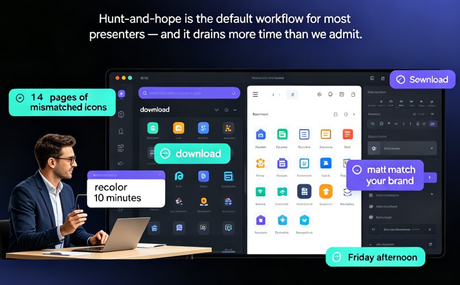
So what do you do? You open a new tab. Search for "free icons." Download a dozen PNGs. Then open another tab for stock photos. Then another for a chart maker. By the time you’ve pieced together visuals from three different sites, the icons don’t match, the colors clash, and you’ve wasted 45 minutes on something that still looks amateur.
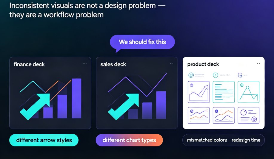
That’s the real cost of a fragmented asset workflow — not just money, but time, consistency, and polish.
Zendeck’s built-in asset library solves this by putting thousands of icons, charts, and illustrations directly inside the editor. No tabs, no downloads, no style mismatches. Just drag, drop, and done.
I. Why a Built-In Asset Library Beats the "Open Multiple Tabs" Workflow
Every time you leave your presentation tool to grab an asset, you introduce friction. And friction kills momentum. Here’s the breakdown of the traditional workflow vs. Zendeck’s approach:
| Step | Traditional Workflow | Zendeck Workflow |
|---|---|---|
| Find an icon | Search on Flaticon, The Noun Project, or similar | Search directly in Zendeck’s library |
| Download | Download PNG/SVG, sometimes need to sign up | Click to insert — no download needed |
| Style matching | Manually adjust colors to match brand | Icon inherits brand colors from your brand kit |
| Add a chart | Open Excel/Google Sheets, create chart, export image, import | Use built-in chart builder, data auto-fills, style applies instantly |
| Add an illustration | Search on unDraw, Humaaans, or illustrations.co, download, import | Browse and insert in one click |
| Total time per slide | 5–15 minutes | 30 seconds – 2 minutes |
The result? A deck that used to take 2 hours to visually polish can be done in under 20 minutes. And the final look is uniform, professional, and on-brand — because every asset comes from the same ecosystem.
II. Navigating Zendeck’s Asset Library: A Quick Tour
You don’t need a tutorial to use it. The asset library lives in the right-hand panel of Zendeck’s editor, labeled with a grid icon. Click it, and you’ll see three main tabs: Icons, Charts, and Illustrations.
Icons: Thousands, Fully Searchable
Icons are organized by category — business, technology, education, healthcare, finance, and more. You can search by keyword (e.g., "rocket," "chart," "handshake") and filter by style: line, filled, or colored. Each icon is a vector, so you can resize it to any scale without losing quality.
Pro tip: If you’re presenting to a technical audience, use line icons. They look cleaner and more modern. For educational slides, colored icons help with visual hierarchy and memory retention.
Charts: Data That Doesn’t Look Like a Spreadsheet
Charts are the biggest pain point in most AI-generated decks. The AI can’t guess your data, so you’re often left with placeholder tables or ugly screenshots. Zendeck’s chart builder lets you pick from bar, line, pie, area, and donut charts. You can either manually enter data or paste a small table from Excel.
Once you insert a chart, it’s fully editable. Change colors, add labels, adjust the legend — all without leaving the editor. And because the chart is tied to your brand kit, it will use your brand’s primary and secondary colors automatically.
Illustrations: From Flat to 3D
Need a visual to explain a concept? Illustrations are your best friend. Zendeck’s library includes flat, 3D, and isometric illustrations sorted by theme: team collaboration, data analysis, growth, remote work, and more. Each illustration is a layered SVG, so you can change colors of individual elements to match your brand.
Example scenario: You’re building a slide about "Why Our Team Needs a New CRM." Instead of a boring bullet list, you insert a 3D illustration of a team working around a dashboard, then add a callout arrow pointing to the data. That slide now tells a story.
III. How to Add Icons, Charts, and Illustrations in 3 Simple Steps
This is the part that matters: the actual workflow. I’ll walk you through a real scenario — building a Q4 pitch deck for a SaaS startup.
Step 1: Insert an Icon to Visualize a Key Point
You have a slide that says: "Our MRR grew 340% in 12 months." Instead of just text, let’s add a growth icon.
- Click the Asset Library icon in the right panel.
- Select the Icons tab.
- Search for "growth" or "arrow up."
- Choose a line icon and drag it onto the slide.
- Resize it, place it next to the number.
Result: The slide now has a visual anchor. The reader’s eye goes straight to the arrow, then to the number. Cognitive load drops, retention climbs.
Step 2: Insert a Chart for Your Metrics
Now you have a slide with four quarterly revenue figures. A bar chart is the obvious choice.
- Click Asset Library > Charts tab.
- Select Bar Chart.
- In the data editor that appears, paste your revenue numbers.
- Click Insert. The chart appears with your brand colors.
- Adjust the axis labels and title.
Pro tip: If you want to highlight a specific bar (e.g., the highest quarter), click on the bar in the chart and change its fill color to your accent color. This draws the audience’s attention without explanation.
Step 3: Add an Illustration for Emotional Impact
Your final slide is a call to action: "Join the 500+ teams already using our platform." Instead of a boring text button, use an illustration.
- Go to Asset Library > Illustrations.
- Search for "team" or "celebration."
- Choose a flat illustration of a team cheering.
- Insert it, then add a large button on top.
Outcome: The slide feels alive. It’s not just a pitch — it’s a vision of success.
IV. Best Practices for a Professional-Looking Deck with Zero Design Skills
You don’t need to be a designer to make a beautiful slide. But you do need a few rules. Here are the ones I use in every deck I create:
- Limit icon styles per deck. Stick to either line icons or filled icons, not both. Mixed styles look chaotic.
- Use charts for data, not tables. If you have more than 5 numbers, a chart is almost always better than a table. Our brains process visual patterns faster than text.
- Align illustrations to the center or right. Left-aligned illustrations can clash with text. Center them behind or to the right of your main copy.
- Keep color consistent. If your brand kit uses blue and green, don’t introduce a random red chart. Zendeck’s brand kit enforces this automatically, but it’s worth double-checking.
- Layer intelligently. Use charts as backgrounds when possible. For example, a faint line chart behind a quote can reinforce the data theme without distracting.
What about images? Zendeck’s asset library doesn’t include stock photos, but you can upload your own. For a fully integrated experience, check out our guide on how to reuse your company's brand assets with Zendeck's asset library.
V. The Real ROI: Why This Saves You Hours Every Week
Let’s put some numbers on it. If you create 3 presentations per week, and each one requires you to source assets from external sites, here’s the math:
- Traditional workflow: 3 decks × 45 minutes of asset sourcing = 2.25 hours per week.
- Zendeck workflow: 3 decks × 5 minutes of asset sourcing = 0.25 hours per week.
That’s 2 hours saved per week, every week. Over a month, nearly a full workday. And that’s just the time savings. The intangible benefit is consistency — your decks will look like they were designed by the same person, because they were designed using the same library.
For teams, this is even more critical. When everyone in an organization uses the same built-in asset library, brand consistency stops being a manual process. It becomes automatic. Read more about that in How AI Asset Libraries Are Revolutionizing Corporate Brand Consistency.
FAQ
What types of assets are available in Zendeck's library?
Zendeck's library includes thousands of icons (line, solid, colored), charts (bar, line, pie, area), illustrations (flat, 3D, isometric), and basic shapes. All are searchable by keyword and can be instantly inserted into slides.
Can I upload my own brand assets to Zendeck?
Yes. Zendeck allows you to upload custom icons, logos, and images into your personal asset library. These assets are then available alongside the built-in library, and they automatically apply your brand colors and fonts when used.
Do the assets in Zendeck's library work with brand kits?
Absolutely. When you apply a brand kit, assets like charts and icons inherit the brand's color palette and typography automatically. This ensures every slide stays on-brand without manual tweaking.
Is there a limit on how many assets I can use per slide or per presentation?
No. You can add as many icons, charts, and illustrations as you need. Zendeck's editor is built for performance, so even heavy asset use won't slow down your workflow.
Can I search for assets by style or color?
Yes. The asset library includes filters for style (e.g., line, filled, flat) and you can search by color. This makes it easy to find the perfect visual that matches your slide's design.
Ready to stop juggling tabs and start building decks that impress? Zendeck’s asset library is built into every plan. Give it a try with your next AI presentation and see how much faster you can create slides that look professionally designed.