How to Standardize Icons and Charts Across Your Team's Decks
How to Standardize Icons and Charts Across Your Team's Decks
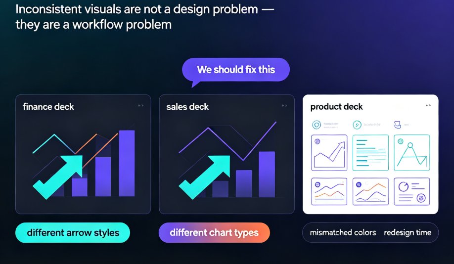
Let's be real: you've sat in a review meeting where the finance deck uses one style of arrows, the sales deck uses another, and the product deck has three different chart types. Somebody always says, "We should fix this," and nothing changes. Meanwhile, you're losing hours every week re-doing slides because the visuals don't match.
Inconsistent icons, charts, and illustrations are not a design problem. They're a workflow problem. And the fix isn't to make everyone a designer—it's to give your team a single, governed system they can pull from without thinking.
That's exactly what Zendeck's asset library does. In this guide, I'll walk you through why visual standardization matters, how to set it up in Zendeck, and how to make it stick across your whole team. No design degree required.
I. The Hidden Cost of Inconsistent Visuals
Every time your team builds a deck from scratch, they make micro-decisions: which icon set, which chart color, which placeholder style. Multiply that by ten people and a dozen presentations, and you've got a mess.
When every slide follows the same visual standards, the audience focuses on the content instead of being distracted by inconsistent design. That's not just a nice-to-have—it's the difference between a credible pitch and one that feels like a garage sale.
Think about the last time you saw a slide with three different font sizes, or a pie chart that used the brand color as the “other” segment. You stopped thinking about the message. You started wondering if the presenter even checked the file.
The real cost isn't the visual clutter. It's the redesign time. When an executive says “this doesn't look like us,” you're back in the file for another hour—or another day. According to a common industry observation, teams spend up to 30% of their presentation time fixing visuals instead of creating content. (We're not quoting a survey; we're just being honest about the pattern.)
II. Why an Asset Library Is the Unsung Hero
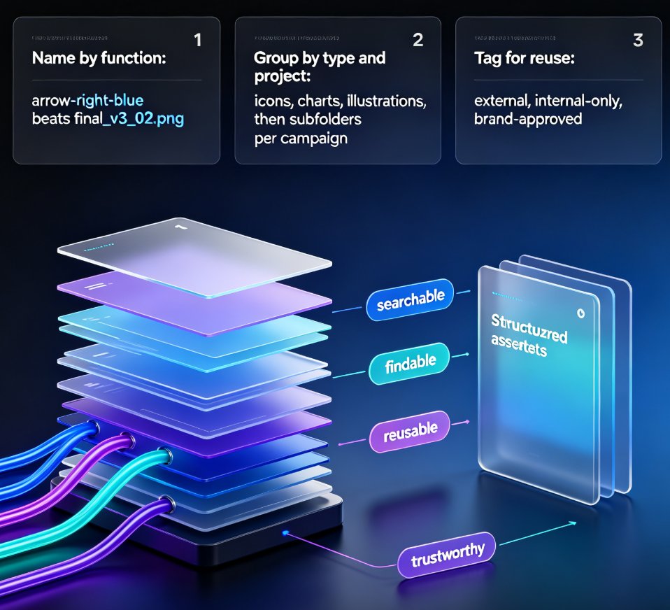
You can't standardize what isn't centralized. The first step is to stop letting your team source visuals from ten different places. Give them one library where every icon, chart style, and illustration is pre-approved and on-brand.
Zendeck's asset library isn't just a folder of files. It's a curated, governed collection that your team can access directly inside any deck. When they drag a bar chart in, it uses your brand colors and fonts automatically. When they need an icon for “growth,” they get the same one everyone else uses.
The result: your decks don't look like they were made by different people. They look like they were made by one designer—but nobody has to be that designer.
What's in the library:
- Icons: Thousands of line, filled, and duotone icons—all consistent in stroke weight and corner radius
- Charts: Bar, line, pie, donut, scatter—all pre-styled with your fonts and palette
- Illustrations: Flat, isometric, and 3D styles so you can pick one direction and stick with it
- Custom uploads: Your logo, your signature diagrams, your own icons—everything in one place
If you want to dive deeper into how AI is making these libraries smarter, check out our post on how AI asset libraries are revolutionizing corporate brand consistency.
III. Step-by-Step: Standardizing Icons and Charts with Zendeck
Let's get tactical. Here's the exact workflow I recommend to every team I work with.
Step 1: Set Up Your Brand Kit First
Your asset library is only as good as your brand kit. In Zendeck, create a brand kit that includes:
- Brand colors (with hex codes, not vague names like “blue”)
- Fonts (headings and body, plus fallback options)
- Logo placement rules
- Icon style (line, filled, or duotone—pick one)
This isn't just about cosmetics. When your brand kit is locked, every asset you drop in will automatically conform. No one has to remember the color code for “Zendeck Teal” because it's already there.
If you need help building that kit, we wrote a whole guide on 5 ways to create a custom brand kit in Zendeck for consistent decks.
Step 2: Choose Your Icon System (and Stick to It)
Here's the simplest rule: one icon set per presentation. Actually, one icon set per organization. Mixing line icons on one slide and filled icons on the next makes your deck feel like a collage.
In Zendeck, if you've defined your icon style in the brand kit, the library will only show you that style. You can even hide other styles to remove temptation.
A quick tip from a friend who's been burned: if your team uses a lot of technical icons (like network diagrams or circuit symbols), upload those custom sets into the library. Don't let people reinvent them every time.
Step 3: Standardize Chart Styles—All of Them
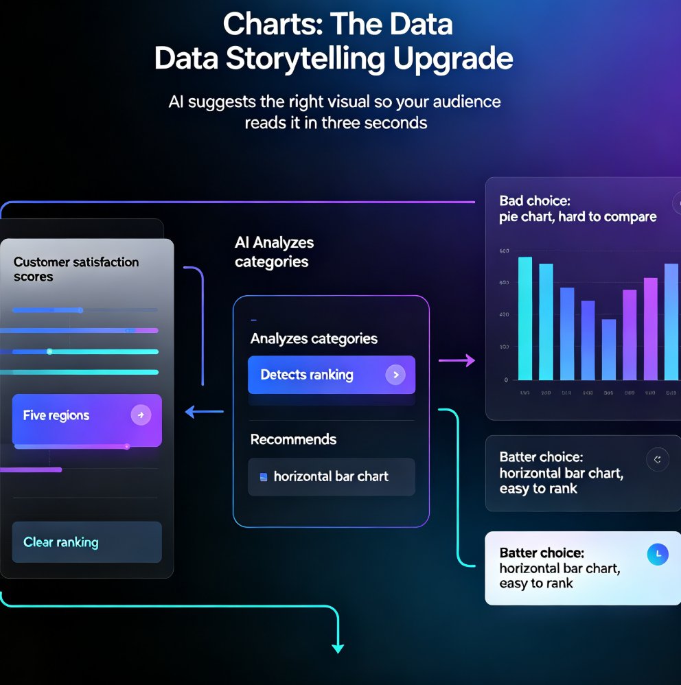
Charts are where most brands fall apart. Why? Because people use whatever default Excel or PowerPoint gives them. Your library should include pre-styled chart templates that match your brand.
Zendeck's asset library includes chart styles you can define once. Set the color order (most important series gets the brand primary color), the axis font, the data label format, and even the gridline opacity. Then, when a team member inserts a bar chart, it comes out perfect.
You know what's faster than adjusting twenty charts on Friday afternoon? Not having to adjust them at all.
If you want to make your charts interactive, we've got a guide on adding interactive charts to your AI slides with Zendeck's asset library.
Step 4: Make the Library Shareable—And the Default
The last step is the magic one. In Zendeck, you can share your asset library with your team. But don't just share it—make it the default. When someone starts a new presentation, they should see the shared library first, not their personal stash.
Set permissions so that only admins can add or remove assets. Everyone else just uses what's there. This prevents well-meaning teammates from uploading a random icon they found on the internet.
IV. Team Governance Without the Friction
You've set up the system. But will your team actually use it? Let's be honest—people hate being told what to do, especially when it comes to design. The trick is to make compliance easy enough that it becomes automatic.
Here's what works:
- Review earlier, not later. Build a brand check into your review process at three points: before building, mid-way through, and at the final review. We wrote a whole article about AI-driven design automation and smart layouts that covers this.
- Allow controlled flexibility. Not every slide needs the same layout. Core brand elements (logo, fonts, primary colors) should be locked. Supporting elements (images, chart styles, slide layouts) can flex. As one deck design guide put it, “Creative solutions that maintain brand integrity should be encouraged, not discouraged.”
- Teach troubleshooting. When someone can't find the right icon, show them where to look. When they need a color outside the palette, show them how to pick a complementary one that still fits. Give them the substitute font when the brand font isn't available. These little rules prevent workarounds.
The goal is not perfect brand compliance. The goal is consistent, professional-looking decks that clearly represent your company. Perfection is unrealistic. Consistency is achievable.
For a deeper look at how AI enforces these rules without human effort, see our piece on zero-design brand governance with AI templates.
V. What You Gain: A Side-by-Side Look
Still wondering whether this is worth it? Here's a quick comparison of the two worlds.
| Aspect | Manual Consistency | With Zendeck Asset Library |
|---|---|---|
| Icon selection | Each person picks from separate sites | One curated, on-brand set |
| Chart colors | Manually change every time | Auto-applied from brand kit |
| Font usage | Depends on memory | Locked in brand kit |
| Time per deck | 30-60 min extra on fixes | Close to zero |
| Review friction | Constant “fix this” comments | Minimal |
| Training needed | Design guidelines doc | None—library is self-explanatory |
| Consistency level | “Mostly” | “Always” |
A quick visual, just to show the difference in workload:
Note: numbers are illustrative, based on common team reporting. The point is the direction.
VI. Let's Wrap Up: Your Next Move
You've got two choices: keep letting your team free-wheel it and spend every Monday cleaning up slides, or set up a system that makes consistency automatic.
Standardizing icons and charts isn't about being rigid—it's about removing mental overhead so your team can focus on the story, not the style.
If you want to see this in action, open Zendeck, create your brand kit, and explore the asset library. It takes five minutes to set up, and you'll feel the difference the first time a teammate drops in a chart that just looks right.
For more on this topic, we have a full guide on AI-generated icons and charts and how asset libraries are evolving, plus a look at AI-powered asset libraries for smarter visuals.
And if you're ready to start, our courseware design category is full of practical tips to level up your decks.
FAQ
How does Zendeck's asset library help standardize icons?
Zendeck's asset library centralizes approved icons, charts, and illustrations in one place. Your team picks from the same curated set instead of hunting through downloads or free icon sites. One click and the asset is placed with the correct size, color, and style built in. That means every deck uses the exact same visual language without extra effort.
Can I enforce chart styles across teams with Zendeck?
Yes. Zendeck lets you define chart styles—colors, fonts, axis formats, even data label placement. When you create a chart in Zendeck, it automatically follows your brand kit. You can also lock the style so team members can't accidentally change it. This keeps every bar, line, and pie chart visually consistent across all presentations.
Do I need to upload custom assets to Zendeck?
No, but you can. Zendeck's built-in library includes thousands of professionally designed icons, charts, and illustrations. If your brand already has specific iconography, you can upload your own assets and set them as the default in your shared library. Either way, the library acts as the single source of truth for your team.
How do I get my team to actually follow the standard?
It's not just about saying 'use the library.' You need to make it the path of least resistance. With Zendeck, everyone sees the approved assets as they build—there's no reason to go elsewhere. Add a quick brand check into your review flow, as we cover in the article, and you'll catch slip-ups before decks go out. The more frictionless the system, the higher the compliance.
Does Zendeck support custom brand kits for different departments?
Absolutely. You can create multiple brand kits within Zendeck and assign them to different teams or sub-brands. For example, your marketing team might have a vibrant palette while your education team uses a formal one. Each department gets its own curated asset library but still stays within the overall corporate identity. This flexibility makes adoption much smoother.