AI-Generated Icons and Charts: How Asset Libraries Are Evolving
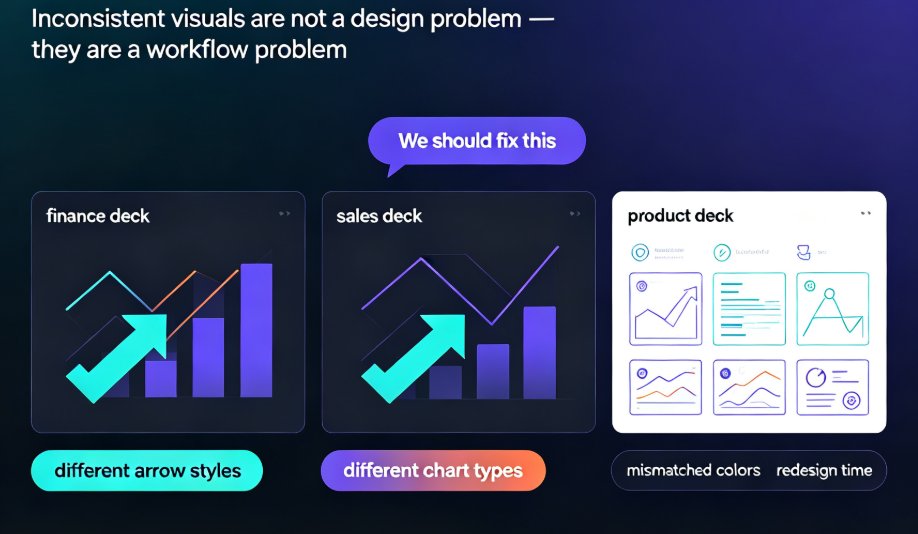
You know the feeling. You're 40 minutes into building a deck, and you're still scrolling through an icon library that has 10,000 options — none of which say "customer retention" without looking like a clip-art refugee. Then you hit the chart problem: pie chart or bar chart? Stacked or grouped? And somehow, none of it matches your brand colors.
The asset hunt is the silent killer of presentation productivity. And it's exactly what AI-generated icons and charts are here to fix.
This isn't a future trend. AI-powered asset libraries are already inside the tools you use, quietly turning the most tedious part of deck-building into a one-click workflow. Let's look at what's actually changing.
01 The Asset Hunt Is the Real Time Sink
Nobody tracks the minutes you lose scrolling through icon libraries. But if you're like most people, it's somewhere between 15 and 40 minutes per deck — before you even start adjusting colors, sizes, and alignment.
Picture this: you're a sales manager building a quarterly review deck. You need an icon for "renewal rate," a chart showing churn by segment, and a visual that communicates "upsell opportunity" without being cheesy. In a traditional workflow, that's three separate searches, two compromises, and one "good enough" decision you'll regret when the VP asks why the icons don't match.
Traditional asset libraries are static. You search, you scroll, you settle. The icon you find is "close enough" but not quite right. The chart template is fine, but it doesn't fit your data shape. So you improvise, and the slide ends up looking fine. Not great. Fine.
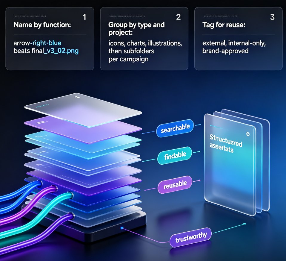
AI-powered asset libraries flip this dynamic. Instead of you searching for assets, the tool understands your content and suggests what you need. Zendeck's asset library, for example, analyzes the text on your slide and recommends icons, charts, and illustrations that match the meaning — not just the keywords.
The shift from "searching for assets" to "assets finding you" is the quiet revolution in presentation design.
02 What AI-Generated Assets Actually Change
Let's break down what's different in practice. Here's a side-by-side look:
| Capability | Traditional Asset Library | AI-Powered Asset Library |
|---|---|---|
| Search method | Keyword-based, manual | Context-aware, semantic |
| Icon generation | None — static set only | On-demand, prompt-based |
| Chart suggestions | Fixed templates | AI-recommended types |
| Brand compliance | Manual checking | Auto-applied via brand kit |
| Style consistency | Varies by asset source | Uniform across all assets |
| Time to find an asset | 15–40 minutes | Seconds |
Three changes matter most.
First, context-aware suggestions. When you type "revenue growth by region," an AI asset library doesn't just show you a generic bar chart icon. It understands you need a geographic breakdown and suggests a map-based visual or a grouped bar chart with regional labels. The asset matches your meaning, not just your keywords.
Second, on-demand generation. Can't find the perfect icon? Describe it. AI can generate icons, illustrations, and even custom chart styles from a simple prompt. The same image-generation capabilities that power tools like Midjourney and DALL-E are now built directly into presentation platforms — no separate design tool needed. You can generate dozens of logo concepts, color palettes, and typography options based on a simple prompt or mood board, then pick the one that fits your slide.
Third, style consistency. This is the big one. AI-generated assets can be produced in your brand's exact color palette, line weight, and visual style. A static library can never guarantee that. Your brand kit becomes the filter through which every asset is created — which means the icon you generate for slide 4 will match the chart you generate for slide 27.
03 Charts: The Data Storytelling Upgrade
Data visualization is where AI asset libraries shine brightest. Tools like Tableau AI and Flourish already use AI to analyze datasets and suggest the best charts, graphs, or infographics for your story. The same logic is landing in presentation tools.
Instead of staring at a blank slide and wondering whether to use a pie chart or a stacked bar, you paste your data and the AI recommends the right visual. It can even generate interactive dashboards, animated data stories, and real-time visualizations — the kind of thing that used to require a dedicated data team.
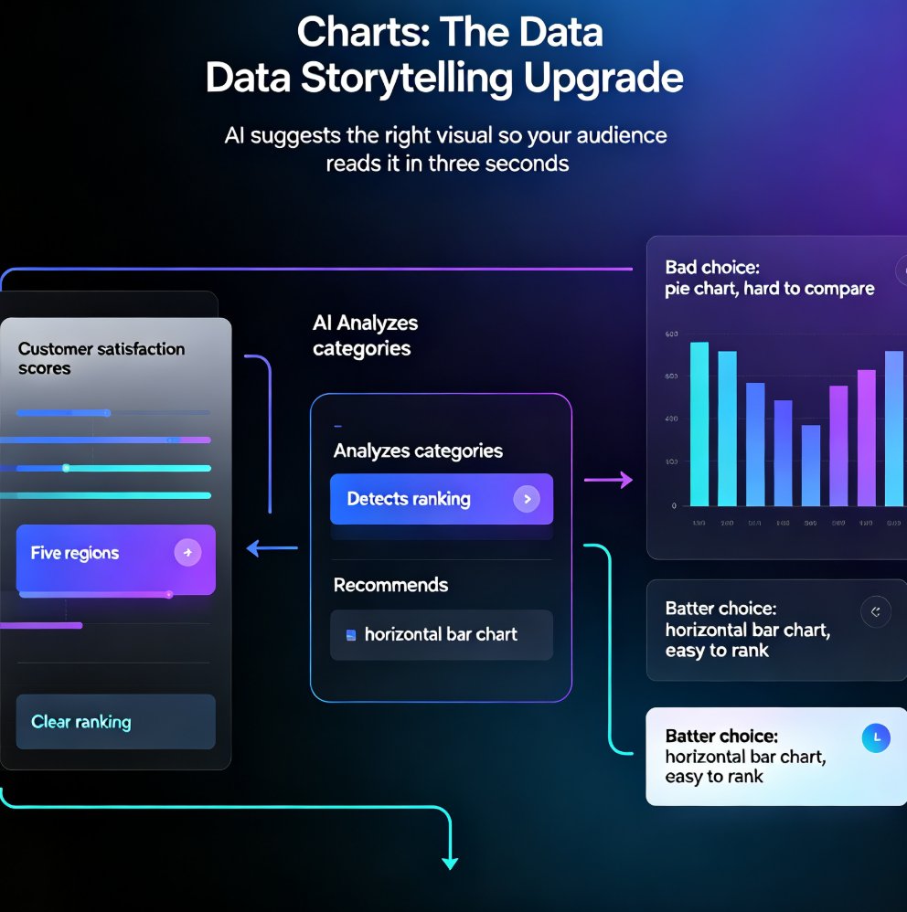
Say you're presenting customer satisfaction scores across five regions. Your instinct might be a pie chart. But the AI looks at your data — five discrete categories, one clear ranking — and suggests a horizontal bar chart instead. It's a small difference, but it's the difference between a slide your audience reads in three seconds and one they squint at for thirty.
The best chart is the one your audience can read in three seconds. AI asset libraries are getting scarily good at picking that one for you.
Here's a practical tip: when you're building a data-heavy deck, don't start with the chart. Start with the question you're answering. Then let the AI suggest the visual that answers it clearest. You'll be surprised how often the "obvious" chart choice is actually the wrong one.
If you want to go deeper on turning raw data into compelling decks, check out our guide on AI data visualization trends.
04 Brand Consistency Without the Design Degree
Here's the scenario that breaks most teams: three people, three decks, three different icon styles. One person uses flat icons, another uses 3D, and the third screenshots things from Google Images. The result is a brand that looks like a garage sale.
AI asset libraries solve this by enforcing a single visual language. When icons and charts are generated with your brand kit applied, every asset matches. Colors, stroke weights, corner radii — all consistent, all the time.
This matters more than you think. Brand consistency is what makes your deck feel professional, even when the content is routine. And it's exactly the problem AI asset libraries were built to solve. We've written about how AI asset libraries are revolutionizing corporate brand consistency — worth a read if you're tired of policing your team's icon choices.
05 A Real Workflow: From Outline to Finished Deck
Let's walk through a realistic workflow using Zendeck, because this is where the theory becomes practical.
Step 1: Paste your outline. Zendeck generates a structured deck with placeholder content and suggested layouts.
Step 2: Review the AI-suggested assets. For each slide, the asset library recommends icons and charts that match the content. You accept, reject, or refine.
Step 3: Generate what's missing. Can't find the right icon? Describe it and generate it on the spot. Need a specific chart type? The AI builds it from your data. If you're working with interactive elements, you can also add interactive charts directly from Zendeck's asset library.
Step 4: Apply your brand kit. One click, and every asset conforms to your brand — colors, fonts, and visual style.
Step 5: Export, share, or convert to video. Done.
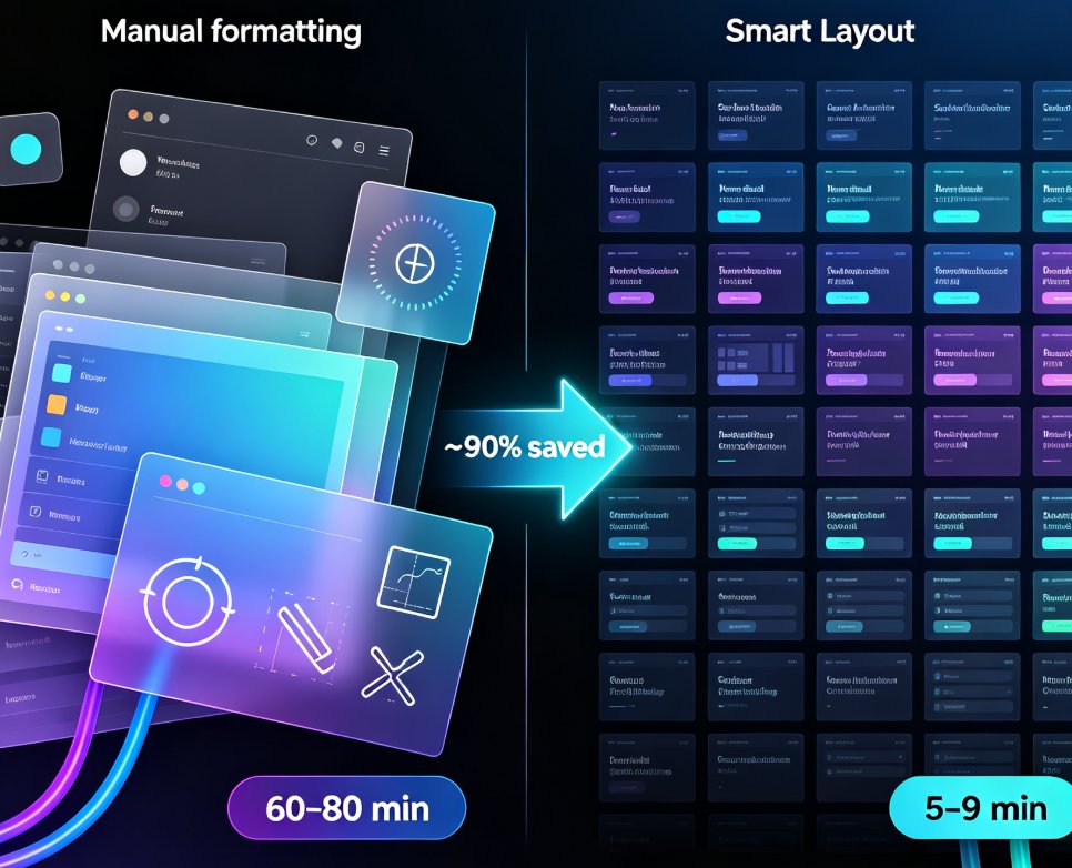
The whole flow takes minutes, not hours. And the result is a deck that looks like a designer touched it — because, in a sense, one did.
06 Why This Matters for Trainers and Educators
Courseware is where this really pays off. If you build training decks, you know the struggle of making dry compliance content look engaging. AI-generated visuals give you a way to illustrate abstract concepts without hiring a designer.
Think about it: a module on data privacy doesn't have to be a wall of text. With AI-generated icons, you can visualize a lock, a data flow, a warning — all in your brand style, all consistent across the course. And if you're building micro-courses, the same assets can be reused in video format when you convert your deck.
For educators and trainers, this isn't a luxury. It's a competitive advantage. Learners retain more when content is visually rich, and AI asset libraries make visual richness affordable for every team. If you're building course materials, our courseware design resources can help you take this further.
FAQ
Q: Can AI really generate icons that match my brand style?
A: Yes. Modern AI asset libraries apply your brand kit — colors, fonts, and visual style — to every generated asset. Icons and charts are created in your exact palette and line weight, so they blend seamlessly with your existing slides.
Q: How does Zendeck's asset library suggest the right chart?
A: Zendeck analyzes the content and data on your slide, then recommends the chart type that communicates it most clearly. You can accept the suggestion or browse alternatives, and the AI generates the chart from your data automatically.
Q: Do I need design skills to use AI-generated assets?
A: No. That's the whole point. The AI handles the design decisions — which icon, which chart, which style — so you can focus on the message. If you can describe what you need, you can generate it.
Q: Can I manually edit AI-generated icons and charts?
A: Yes. AI-generated assets are fully editable. You can recolor, resize, reposition, or replace them at any time. The AI gives you a strong starting point, but you keep full control.
Q: Are AI-generated assets safe for commercial use?
A: This depends on the tool you use. Zendeck's generated assets are intended for use within your own presentations and courseware. Always check the licensing terms of the specific tool for commercial usage rights.