Use Zendeck's Asset Library to Elevate Courseware Design
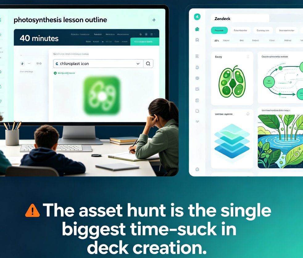
You've got 40 minutes before class starts. You just finished the outline for tomorrow's lesson on photosynthesis, and the slides are... fine. Functional. But "fine" doesn't hold a teenager's attention. The real problem? You're about to burn 20 of those 40 minutes hunting for the right icon of a chloroplast — and you'll probably settle for something that looks like a green blob.
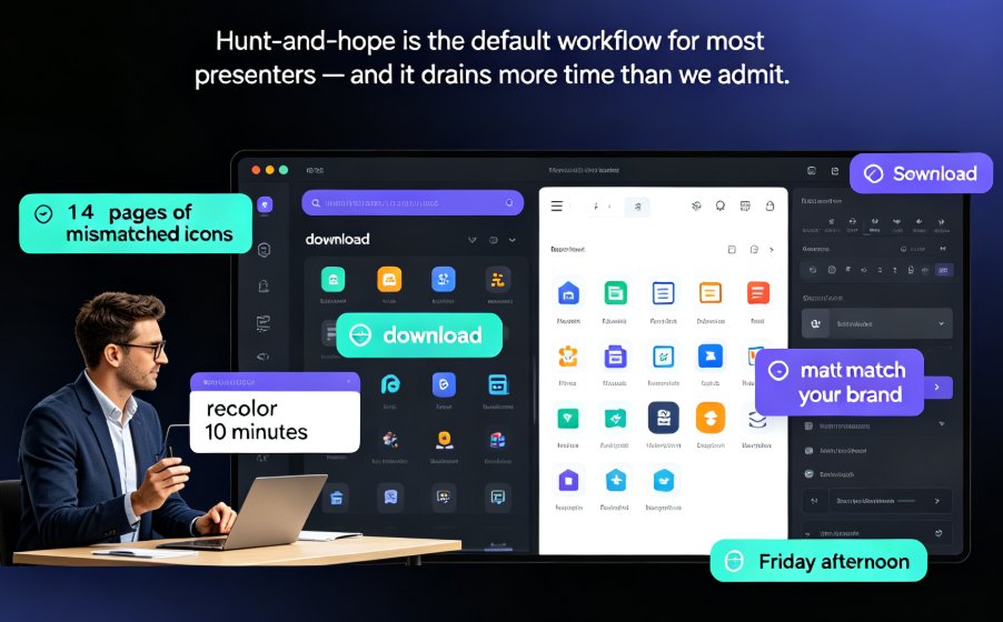
Let's be real: most courseware fails not because the content is weak, but because the visuals are. And for educators without design training, the asset hunt is the single biggest time-suck in deck creation.
This is where Zendeck's asset library changes the game. It's not just a folder of clip art — it's a curated, searchable collection of professional icons, charts, and illustrations that plugs directly into your AI workflow. Here's how to use it to make your courseware look like it was designed by a pro, even if you've never touched a design tool in your life.
01. Why Courseware Visuals Matter (and Where Most Decks Fail)
Here's a scenario you'll recognize. You've built a solid lesson on the water cycle. The text is accurate, the sequence is logical, and the learning objectives are clear. But the slides are wall-to-wall text with one generic image you found on a free stock site. Your students' eyes glaze over by slide three.
Think about the last time you sat through a presentation with dense text slides. You probably remember the feeling of your attention drifting — not because the content was bad, but because there was nothing to anchor your eyes. Your students experience the same thing, except they can't just scroll away. They're stuck in a classroom, and their brains are looking for an exit.
A well-designed slide can be the difference between a student who remembers the lesson and one who forgets it by lunch. Visuals aren't decoration — they're cognitive scaffolding. When you pair a concept with a clear icon or diagram, you give students a second pathway into the material.
The problem isn't that educators don't want better visuals. It's that the tools have been working against us:
- Stock photo sites are full of irrelevant, cheesy imagery that screams "generic corporate."
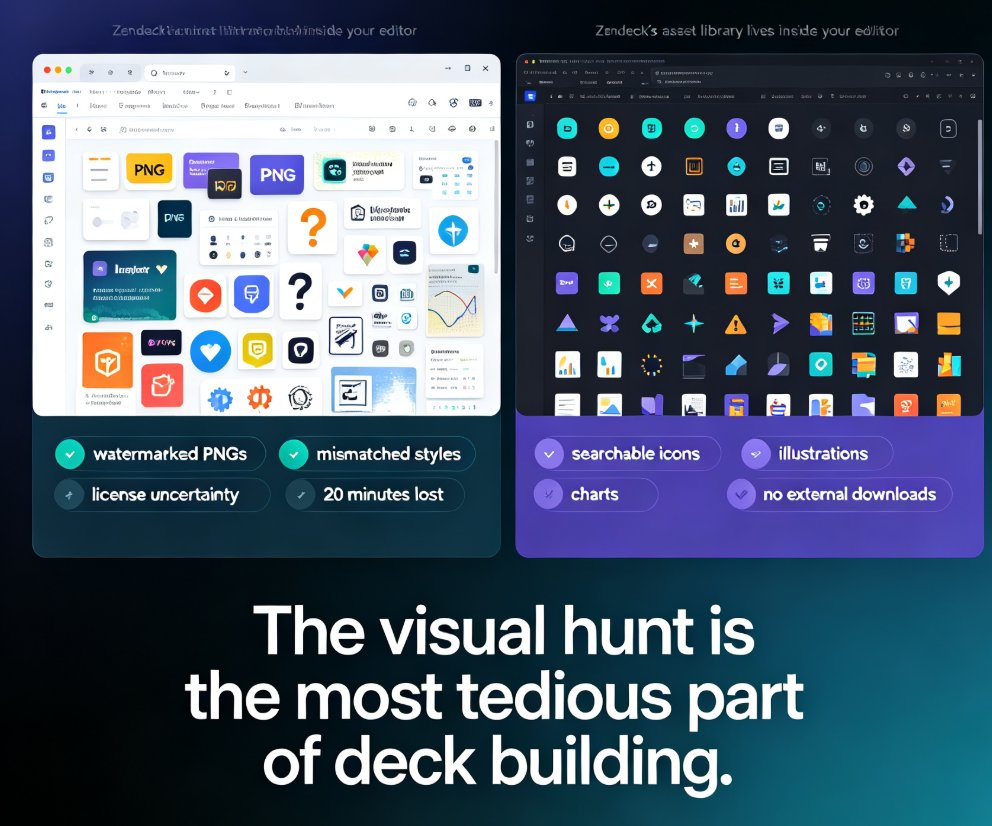
- Free icon sites offer thousands of options but zero style consistency — so your deck looks like a patchwork quilt.
- Manual design tools require a learning curve most teachers simply don't have time for.
The outcome? We default to text-heavy slides, or we spend hours fiddling with mismatched visuals. Neither serves your students.
02. What Makes Zendeck's Asset Library Different
Most asset libraries are just... piles of stuff. A search bar, a thousand results, and no guidance on what actually works together. Zendeck's library takes a different approach: it's curated for consistency and built for the AI workflow.
Here's the honest comparison:
| Feature | Generic Asset Libraries | Zendeck's Asset Library |
|---|---|---|
| Search within AI workflow | No — you leave your deck to search | Yes — search without leaving your project |
| Style consistency | Varies wildly between assets | Curated sets with matching visual language |
| Integration with slides | Manual copy-paste, then resize | One-click insert, auto-fits your layout |
| Asset types | Mostly static icons | Icons, charts, and illustrations in one place |
| Design skill required | High — you must style everything yourself | Low — assets match your deck's theme automatically |
The key difference is context. When you're building a deck in Zendeck, the asset library already knows your color scheme, your fonts, and your layout. Insert an icon, and it doesn't look like a sticker slapped onto a document — it looks like it was designed for that slide.
The biggest time-saver isn't the asset itself — it's that you never have to leave your workflow to find it. That's the difference between a library and a tool. And when you're juggling multiple classes, lesson prep, and grading, that difference adds up fast.
03. Search Tips: Finding the Right Icon in Seconds
Here's where most people waste time: they type one generic keyword and scroll through 400 results. Let's fix that with a few search habits that actually work.
Tip 1: Think like a librarian, not a shopper. Instead of searching "science," search "microscope" or "DNA helix." Specific terms return specific results. If you're teaching biology, "cell division" beats "biology" every time.
Tip 2: Use the same icon consistently across a lesson. If you use a lightbulb icon to represent "idea" in slide 3, use the same lightbulb in slides 7 and 12. Consistency builds recognition — your students will start associating that icon with the concept before you even say the word.
Tip 3: Don't be afraid to mix icons with real imagery. Icons work great for abstract concepts like "analysis" or "comparison." Real photos work better for concrete things like "volcano" or "rainforest." The combination keeps your deck visually varied without feeling chaotic.
Tip 4: Let the AI do the heavy lifting. In Zendeck, you can describe what you need in plain language and let the system suggest relevant assets. You're not just searching a database — you're collaborating with a tool that understands your context.
04. Using Charts and Illustrations for Data-Heavy Lessons
If you teach anything with numbers — economics, geography, statistics, even history — you know the struggle of making data digestible. A wall of numbers is the fastest way to lose a classroom.
The right chart doesn't just present data — it tells the story your lesson needs to tell. A bar chart shows comparison. A line chart shows change over time. A pie chart shows proportion. Choosing the right one is half the battle.
Here's a concrete example. You're teaching a lesson on population growth. You have data showing how a city's population changed over 50 years. A table of numbers might work for a statistics class, but for a general audience, a line chart tells the story instantly: the curve rises, the slope changes, the story unfolds. That's the power of choosing the right visual.
Zendeck's library includes chart templates and data visualization assets that you can drop into your slides and customize. Here's how to use them effectively:
- Start with the question, not the chart. Ask yourself: "What do I want students to notice?" If it's a trend, use a line chart. If it's a ranking, use a bar chart. If it's a share of a whole, use a pie chart.
- Label everything clearly. A chart without labels is a puzzle, not a teaching tool. Make sure axes, units, and data points are all visible and legible from the back of the room.
- Keep it to one key insight per chart. If you have three insights, use three charts. Cramming everything into one visualization just creates confusion.
And if you want to take it further, Zendeck's interactive chart options let students explore data themselves — which is a whole different level of engagement. Check out our guide on adding interactive charts to your AI slides for the full walkthrough.
05. Workflow: From Outline to Polished Deck in Minutes
Here's the workflow that actually works — the one I use when I'm building courseware under a deadline:
Step 1: Start with your outline. Write your lesson content in plain text or Word. Don't worry about visuals yet. Get the substance right first.
Step 2: Let Zendeck generate the base deck. Paste your outline into Zendeck and let the AI structure it into slides with a consistent theme. This is where the AI presentation templates for trainers come in handy — you get a solid foundation without touching a design tool.
Step 3: Open the asset library and search for your key concepts. For each slide, identify the one or two visuals that will reinforce the main point. Insert them directly — no copy-paste, no resizing, no styling.
Step 4: Add charts for any data-heavy slides. Use the library's chart assets to turn raw numbers into clear visualizations.
Step 5: Review and polish. Skim through the deck, check for consistency, and make sure every visual actually supports the learning objective. If an icon doesn't add meaning, cut it.
The whole process takes 15-20 minutes for a typical lesson. Compare that to the hour-plus you'd spend building slides from scratch in PowerPoint, and you'll see why AI-powered asset libraries are becoming the standard for smarter visuals.
06. Common Mistakes to Avoid (Even with a Great Library)
Even with a curated library, it's possible to go wrong. Here are the mistakes I see most often:
Mistake 1: Over-decorating. Just because you have access to 10,000 icons doesn't mean you should use 10,000 icons. One strong visual per slide beats five weak ones. If a slide has more icons than text, it's a poster, not a lesson.
Mistake 2: Ignoring visual hierarchy. The icon should support the text, not compete with it. Keep icons smaller than your headline, and don't place them where they'll distract from the main message.
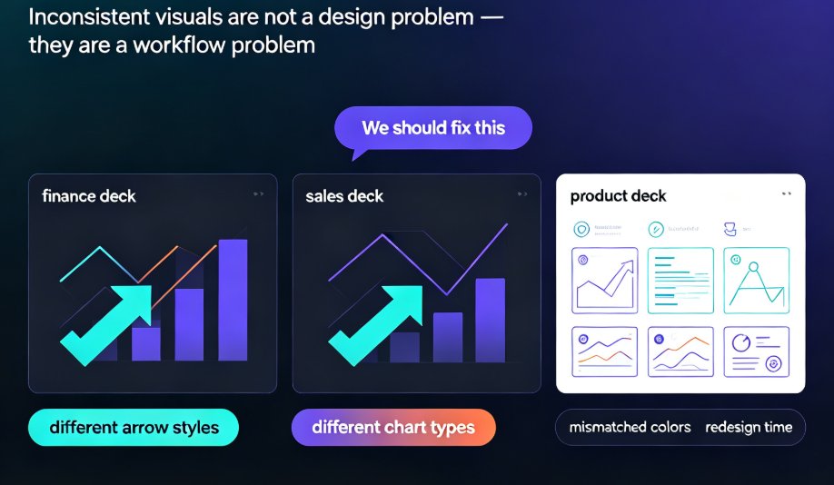
Mistake 3: Mixing incompatible styles. If you're using flat, minimalist icons, don't suddenly drop in a 3D illustration. The inconsistency signals "amateur" to anyone with design instincts — including your students, whether they can articulate it or not.
Mistake 4: Forgetting accessibility. Icons and charts need alt text for students using screen readers. Zendeck's approach to accessible courseware with auto-generated alt text handles this for you, but it's worth double-checking that your custom additions are covered too.
The goal isn't a beautiful deck — it's a deck that makes learning easier. Every visual choice should serve that goal, or it's just noise. When you keep that principle front and center, the asset library stops being a toy and becomes a genuine teaching tool.
FAQ
Q: Do I need design skills to use Zendeck's asset library? A: No. The library is designed for non-designers. Assets are curated for style consistency, and they automatically match your deck's theme when you insert them. You don't need to know anything about color theory or typography to make your courseware look professional.
Q: Can I search for specific icons, or do I have to browse? A: You can search. Use specific terms like "cell division" or "bar chart" rather than broad terms like "science" or "data." The search is integrated into your workflow, so you don't have to leave your project to find what you need.
Q: What types of assets are in the library? A: The library includes icons, charts, and illustrations. Icons work best for abstract concepts, charts for data-heavy content, and illustrations for more complex or conceptual visuals. All assets are curated to maintain visual consistency across your deck.
Q: Can I use the same icon consistently across a deck? A: Yes, and you should. Consistency is key for building visual recognition. Use the same icon for the same concept throughout your lesson, and your students will start associating the two automatically — which reinforces learning.
Q: Does the library work with the PPT-to-video feature? A: Yes. Assets you add to your slides carry through when you convert your deck to video, so your micro-courses maintain the same visual quality as your slides. That means your narrated lessons stay consistent from start to finish.