How to Create Custom Icons for Your Team in Zendeck's Asset Library
The Icon Problem Nobody Talks About
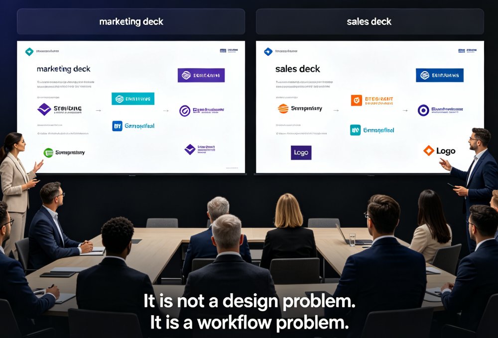
Every team has that one deck where the icons look like they were pulled from three different decades. A flat arrow here, a glossy 3D gear there, and suddenly your polished pitch feels like a garage sale. You've seen it. You've probably made it.
Here's the uncomfortable truth: icons are the quietest brand killers in any presentation. They don't shout, they whisper — and by the time anyone notices the mismatch, the damage is done. Your audience may not consciously register that the icons don't match, but they'll feel it. The deck will feel off-brand, unpolished, and just a little less trustworthy.
The root cause is almost never a lack of effort. It's a lack of system. Your team isn't lazy — they're just pulling icons from wherever they can find them. Marketing has its own stash, sales has theirs, and the intern who joined last week has a folder of screenshots they think are "close enough."
The fix isn't more design training. It's a single, shared home for your icons — one that your whole team can access, reuse, and stay consistent with. That's exactly what Zendeck's asset library gives you.
01 Why Custom Icons Matter More Than You Think
Let's talk about what icons actually do in a presentation. They're not decoration. They're wayfinding. A well-placed icon tells your audience where to look, what to group, and how to navigate your argument without reading a single word.
But here's the thing — icons only work when they're consistent. The moment one slide uses a thin-line icon and the next uses a filled one, your audience's brain has to do extra work to reconcile the difference. That extra work adds up. Over a 30-slide deck, it's the difference between an audience that's with you and one that's quietly checking their email.
Consistency matters on three levels:
| Level | What it means | What breaks it |
|---|---|---|
| Visual style | Same line weight, fill style, corner radius | Mixing flat, outline, and 3D icons |
| Semantic meaning | Same icon = same concept every time | Using different icons for the same action |
| Brand alignment | Icons match your logo, colors, and typography | Pulling icons from random free sites |
When you control your icon library, you control all three. And that control is what separates a deck that looks designed from one that looks assembled. If you've ever wondered why some teams ship decks that look effortlessly cohesive, this is the secret — they don't rely on talent, they rely on systems.
02 What You Can Upload to Zendeck's Asset Library
Before we get into the how, let's talk about the what. Zendeck's asset library isn't just a dumping ground for logos. It's a full asset management system that handles the icons your team actually uses day to day.
You can upload SVG, PNG, and JPG files — and for icons specifically, SVG is your best friend. Why? Because SVG scales cleanly at any size. That tiny arrow in a footer and that hero icon on a title slide will both render sharp, whether your audience is on a 13-inch laptop or a 40-foot conference screen.
PNG works fine for icons with complex gradients or drop shadows that SVG can't easily replicate. JPG is acceptable for photographic elements, but honestly, skip it for icons — the compression artifacts will make your edges look fuzzy.
Here's a quick comparison to help you decide:
| Format | Best for | Watch out for |
|---|---|---|
| SVG | Flat icons, line icons, logos | Complex gradients are harder to author |
| PNG | Icons with shadows or gradients | Large files can slow down your deck |
| JPG | Photographic elements | Compression artifacts on edges |
If you're starting from scratch and don't have a brand icon set yet, you can build one from PowerPoint shapes — a technique that's surprisingly effective. But once you have those icons, the real win is getting them into a shared library where your whole team can actually use them.
03 Step-by-Step: Uploading Custom Icons
Alright, let's get practical. Here's how you get your icons into Zendeck's asset library and start using them across presentations.
Step 1: Prepare your icon files.
Before uploading, make sure your icons are clean. Strip out any background colors you don't want, confirm the line weights are consistent across the set, and name your files descriptively — icon-arrow-right.svg beats final_v3_final.svg every time. Trust me on this one. Future you will be grateful.
Step 2: Open the asset library.
In Zendeck, navigate to the asset library from your workspace dashboard. You'll see the built-in collection of icons, illustrations, and charts — but what we care about is the upload button.
Step 3: Upload and tag your icons.
Drag your files in or browse to select them. Zendeck will process the uploads and add them to your library. Take a minute to add tags — things like navigation, data, actions, finance, healthcare. Tags are what make your library searchable later, and searchable is what makes it usable.
Step 4: Test one in a slide.
Open any presentation, insert an icon from the asset library, and confirm it renders the way you expect. Check it at small and large sizes. If it looks good, you're set.
That's it. Four steps. The whole process takes less than ten minutes for a typical icon set, and once it's done, it's done forever.
04 Organizing Icons So Your Team Actually Uses Them
Here's the thing about asset libraries: an unorganized library is just a slower way to lose files. If your team can't find the icon they need in under ten seconds, they'll go back to Google and pull whatever comes up first. That's how brand drift starts.
So let's talk about organization.
Create folders by use case, not by file type.
Grouping by navigation, data, actions, and departments is far more useful than grouping by SVG and PNG. Your team thinks in terms of what they're building, not what format the file happens to be.
Use consistent naming conventions.
Pick a pattern and stick to it. icon-{name}-{variant} works well — so icon-arrow-right-line and icon-arrow-right-filled tell you both what the icon is and how it's styled. This matters more than you'd think when you have forty variations of arrows.
Tag aggressively, but thoughtfully.
Every icon should have at least one functional tag and one style tag. Functional tags describe what the icon does (download, search, save). Style tags describe how it looks (line, filled, duotone). When someone searches for line download, they should find exactly one icon.
Review quarterly.
Set a reminder to clean up the library every few months. Delete duplicates, merge near-identical icons, and retire anything that no longer matches your brand. A tidy library is a trusted library.
05 Reusing Icons Across Presentations
Once your icons are uploaded and organized, the real payoff kicks in: reuse. This is where the asset library stops being a storage tool and starts being a brand enforcement system.
Every presentation your team builds in Zendeck can pull from the same icon set. That means the sales deck, the onboarding presentation, the quarterly review — they all use the same visual language. No more emailing icon files back and forth. No more "can you send me that arrow you used last week?"
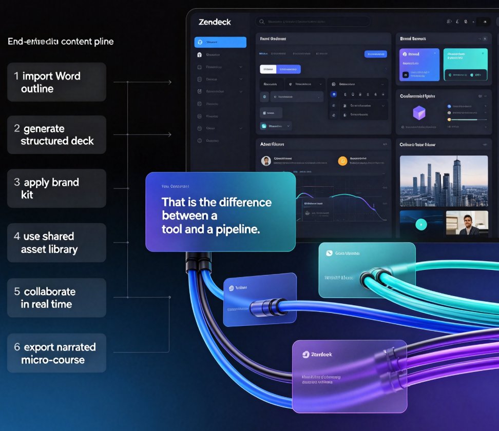
This is especially powerful when you're working with AI-generated decks. When you generate a presentation from an outline or a Word document, Zendeck's AI can pull from your custom asset library to populate slides with icons that match your brand — not generic stock icons that make every deck look the same. If you've ever felt like your AI-generated slides look off-brand, this is the fix. The asset library is what bridges the gap between AI convenience and brand integrity.
And the benefits compound. The more your team uses the library, the more familiar they become with what's available, and the faster they build. A team that used to spend twenty minutes hunting for icons now spends twenty seconds.
06 Best Practices for a Consistent Icon System
Let's wrap up with the practices that separate teams who nail icon consistency from teams who just talk about it.
Start with a core set of 20-30 icons.
You don't need 500 icons on day one. You need the ones you actually use: arrows, checkmarks, magnifying glasses, gears, people, charts. Build a small, high-quality set first. You can always add more later.
Define your style rules once.
Decide on line weight, corner radius, and fill style — then write it down somewhere your team can see it. A one-page style guide that says "2px line weight, rounded corners, single color" is worth more than a hundred design meetings.
Make the library the default, not the exception.
When someone asks "where did you get that icon?" the answer should always be "the asset library." If it's not, you have a gap in your library, not a gap in your team's discipline.
Audit your decks periodically.
Every few months, pick a recent presentation and check whether the icons are consistent with your library. If you spot strays, that's a signal to either add those icons to the library or remind the team about the rules.
Don't forget accessibility.
Icons should never be the only way you communicate meaning. Pair them with text labels, and make sure your color choices maintain sufficient contrast. An icon that only makes sense when it's green is an icon that fails half your audience.
FAQ
What file formats can I upload as custom icons in Zendeck's asset library?
Zendeck's asset library supports SVG, PNG, and JPG. SVG is the best choice for icons because it scales cleanly at any size. PNG works well for icons with gradients or shadows, while JPG is best avoided for icon shapes due to compression artifacts.
Can my whole team access the custom icons I upload?
Yes. Uploaded icons become part of your shared workspace, so any team member with access can search, preview, and insert them into their own presentations. That shared access is what keeps everyone on the same visual system.
How do custom icons help with brand consistency across presentations?
Custom icons lock in your visual identity. When every team member pulls from the same approved set, you eliminate the mismatched styles that come from sourcing icons across free sites and templates. Consistent line weights, fill styles, and semantic meanings make decks feel cohesive even when different people built them.
Can I organize custom icons into folders or categories?
Absolutely. Zendeck's asset library lets you create folders and subfolders to group icons by use case — think navigation, data, actions, or department-specific sets. A well-organized library means your team finds the right icon in seconds.
Do custom icons work with Zendeck's PPT-to-video feature?
Yes. Icons you upload carry through into any presentation you convert to video, so your narrated micro-courses and training videos stay visually consistent with your slide decks. The same brand language holds across every format you produce.
Building a custom icon library isn't glamorous work, but it's the kind of work that makes everything else look better. It's the difference between a team that ships decks that feel cohesive and one that ships decks that feel like a lucky accident. Start small, organize well, and let the library do the heavy lifting. Your future decks — and your future self — will thank you.