How to Choose AI Deck Templates for Business, Training & Education
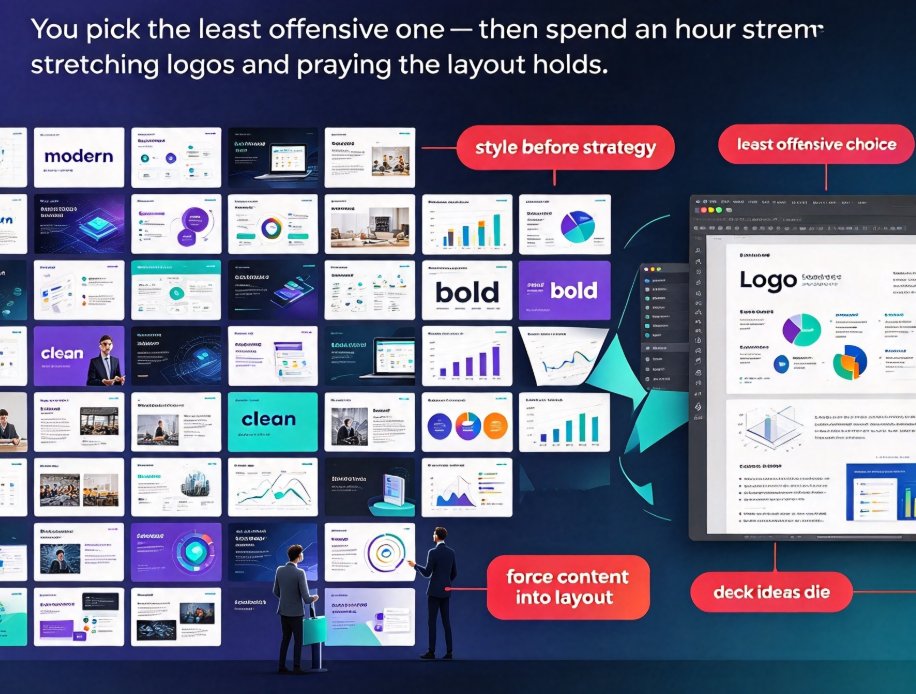
If you've ever opened a template gallery and felt your brain short-circuit, you're not alone. Fifty previews, each promising "modern" or "clean" or "bold," and somehow none feels right for your content. So you click the least offensive one — and spend the next hour stretching logos, shrinking bullet text, and praying the layout holds together when you drop in your third chart. If that sounds like your Tuesday, hear me out: this is how decent deck ideas die.
Here's the uncomfortable truth: the template wasn't the problem. The problem is that you picked a style before you picked a strategy. The right deck template is decided less by what "looks nice" and more by three questions: who's in the room, what you want them to do, and how much information you need to move. This guide walks through choosing a deck style for three worlds — business, training, and education — and how Zendeck's AI template library short-circuits the guesswork by reading your content first, then matching it to a layout that fits.
That shift — content first, style second — is the whole trick, and it's what separates a template that works for you from one you work for.
01 — Template Choice Is a Business Decision, Not a Taste Decision
Let's be real: a wrong template doesn't just look bad, it raises the cognitive cost of your entire message. When executives see misaligned charts, they start doubting the data. When trainees see dense walls of text, they stop following the process. When students see clashing colors, their attention splits before you've said a word. You've felt this from the audience side — the deck that made you work to understand the point.
The solution isn't "find a prettier template." It's to match the template's visual logic to the room's expectations. A template is not a background — it's a persuasion system, the visual hierarchy that tells the audience where to look first, where to look second, and what to ignore. A sales deck persuades through proof points; a training deck persuades through clarity; a lecture deck persuades through structure.
The payoff is measurable: decks that respect their audience's context get more questions, fewer clarifications, and less re-explaining after the meeting. Nobody claps for a beautiful template — they clap for understanding something quickly. That's the outcome we're actually after, and it's one you can feel in the room.
02 — Four Filters That Actually Decide Template Fit
Before you browse any library, run your content through four filters. They'll save you the forty-minute scroll.
-
Audience psychology — what does the room already expect? A board expects restraint and precision; a classroom expects warmth and patience; a training room expects predictable structure. If the template contradicts the room's expectations, your message pays the price.
-
Presentation goal — are you informing, persuading, or teaching? Persuasion needs visual proof points; teaching needs visible structure; informing needs a clean reading path. Mixed goals are fine, but pick a dominant one and let it lead.
-
Content density — how much text, data, and process do you need to move? A 15-slide pitch and a 60-slide courseware deck have opposite constraints. Dense content demands structured layouts; light content can afford editorial flair.
-
Delivery format — live on a stage, recorded as video, or self-paced on a screen? Self-paced material needs navigation cues and consistent headers; live decks need bigger, bolder anchors so a distant viewer can still track.
Here's a quick cheat sheet that sums up the three scenarios this guide focuses on:
| Scenario | Audience expectations | Template priorities | What Zendeck's AI adjusts |
|---|---|---|---|
| Business pitch | Investors/execs want conviction and speed | Restrained palette, strong data visuals, one idea per slide | Tightens spacing, converts text into charts, enforces one-message-per-slide |
| Corporate training | Learners want predictable structure | Clear hierarchy, numbered steps, callout boxes | Turns bullet lists into step sequences, adds progress cues, standardizes headers |
| Education courseware | Students need cognitive ease and accessibility | High contrast, generous white space, chunked content | Reflows dense paragraphs into scaffolded blocks, boosts font size, improves contrast |
This filter set is the difference between "this looks nice" and "this works." It's also the logic Zendeck's engine uses when it maps your content to a template — more on that in section 06.
03 — Business Decks: Boardrooms Punish Sloppy Visuals
Let's talk business first, because the stakes are brutal. A pitch deck that wastes a slide on a wall of text is a pitch deck that loses the room. Executives scan; they don't read. Your template needs to make the scan effortless — the chart tells the story, the headline states the conclusion, and the layout never makes them hunt for the point.
For business decks — investor pitches, quarterly reviews, sales kickoffs — the winning style is restrained and data-forward:
- One idea per slide, anchored by a chart, not a paragraph.
- A muted palette that makes your numbers the hero of the room.
- A consistent layout rhythm, so the audience never has to re-learn your slide structure as you move forward.
Pain point: most people start with a "corporate" template and then dump their full script into it, producing a gray wall of text that no executive will read. Solution: let the template's structure force you to trim — if a template makes your content overflow, that's your content telling you to cut. Outcome: a deck that reads in 45 seconds, survives the hard questions, and leaves investors talking about the numbers instead of the slides.
If you're building a pitch from scratch, this guide on creating a winning AI pitch deck walks through the problem-to-solution arc that investors actually expect. For internal business reviews, the same principles apply — just dial the formality down and let your quarterly numbers carry the visual weight. The presentation skills category has more on structuring decks for live delivery if you want to go deeper.
04 — Training Decks: Clarity Beats Flash
Training presentations live in a different universe. Here, the audience's job is to retain a process, not to be impressed. That changes the template math completely: a pretty deck that learners can't follow is worse than a plain one they can.
For corporate training, onboarding, and certification material, prioritize:
- Numbered steps and process diagrams over abstract visuals.
- Callout boxes that isolate key warnings or tips — the "don't skip this" moments.
- A consistent header system so learners always know where they are in the module.
Pain point: trainers often borrow flashy marketing templates, and learners walk away remembering the animation but not the procedure — retention tanks silently. Solution: choose an instructional template that gives structure to sequences, and resist the urge to decorate every slide with decorations that don't carry meaning. Outcome: your learners can describe the process back to you, which is the metric that actually matters.
One bonus: when training decks follow a clean, logical structure, they convert beautifully into narrated micro-courses — a workflow more teams are exploring as they turn static slides into self-paced video. That's a natural next step if you've ever had to re-run the same onboarding session four times.
05 — Education Decks: Cognitive Load Is the Real Enemy
For education — university lectures, courseware, and workshops — the enemy isn't boredom; it's cognitive overload. Students can only process so much at once, and the template is doing either the chunking for you or against you.
The education-friendly template style is about:
- High contrast between text and background — this isn't just taste, it's the legal baseline under modern accessibility expectations.
- Generous white space, so each concept has room to breathe and each slide feels lighter.
- Visual chunking — grouping related ideas so students can file them away as one mental unit rather than six loose facts.
Pain point: educators inherit corporate templates, and dense layouts overwhelm students mid-lecture — by slide twenty, nobody's tracking. Solution: swap to a courseware-style template that scaffolds content; let each slide carry one concept plus its supporting example, and let the template handle the grouping. Outcome: students follow the lecture line by line, the deck works fully self-paced too, and you spend less time re-explaining after the session.
If you're building for a classroom, the courseware design category has more on structuring content for learning rather than display. And if accessibility is on your radar, matching a high-contrast template to WCAG-friendly practices is the direction the whole industry is moving toward — worth planning for now rather than retrofitting later.
06 — How Zendeck's AI Makes Templates a Starting Point, Not a Cage
Here's where "AI-powered" stops being a buzzword. The difference between a generic template gallery and Zendeck's library is that Zendeck reads your content before it proposes a style.
You paste in an outline — a Word document or Markdown — and Zendeck analyzes structure, density, and tone. Then it maps your content to a template category that fits: a data-heavy quarterly review lands in a chart-forward layout; a procedural training outline lands in a step-sequence layout; a lecture outline lands in a scaffolded, high-contrast layout. It's contextual template selection rather than random browsing, and it's the pattern winning this year's tools.
This matters because the classic template workflow is backwards: you pick a pretty shell and then cram your content into it. Zendeck reverses that — content comes first, and the layout adapts to the content. Combined with smart layout tools that unify fonts, colors, and spacing in one click, you get a deck that looks intentional even if you have zero design training. For anyone whose last design decision was choosing a default font, this is the safety net.
The numbers tell the story — here's an illustrative comparison of time spent building a standard 20-slide deck:
These figures are illustrative, but they match what teams report when they stop hand-aligning and let layout automation finish the job. The real value isn't just speed; it's that the template is doing persuasive heavy lifting while you focus on the message. Speed is nice. Message clarity is the actual prize.
That's also where the template library landscape is headed. Generic collections are giving way to contextual templates that adapt to your content, and Zendeck is built on exactly that shift. If you want the mechanics, this breakdown of how Zendeck picks the right look for you digs into the selection logic, and this piece on context-aware design explains why static template galleries are becoming a thing of the past. For a wider view, this 2026 look at contextual templates traces where the library space is going.
07 — A 5-Minute Checklist Before You Hit "Generate"
Whatever tool you use, run this checklist before you commit to a style. It takes five minutes and saves you forty.
- Name the audience — executives, learners, students, or trainees? Write it down; every other choice follows it.
- State the goal — inform, persuade, or teach? If it's mixed, pick the dominant one and structure around it.
- Count your content — if your outline has 60 slides, choose a structured template, not a bold one. Volume dictates layout.
- Check the delivery — live, recorded, or self-paced? Adjust for navigation cues and anchor sizes.
- Enforce one idea per slide — if the template makes content overflow, cut the content, not the layout.
For most content, one idea per slide beats three ideas per slide, every single time. That single habit will do more for your decks than any template choice you make this year.
One small tip from someone who's built a lot of decks: don't treat the template as a final answer, treat it as a scaffold. If you're customizing brand colors, a brand kit keeps your logos, fonts, and palettes consistent even as you switch template styles — worth setting up once and reusing for every deck you ship.
When you choose with strategy instead of taste, the template stops being a constraint and starts being an accelerant. That's the whole game — and it's a game you can win in the next ten minutes, starting with the template you pick for your next deck.
FAQ
Q: How do I pick a template for a boardroom pitch versus a classroom lecture? Boardrooms reward restraint and data-forward visuals — one idea per slide, muted palette, charts as heroes. Classrooms reward cognitive ease — high contrast, generous white space, and chunked content. If you're unsure, name your audience and your dominant goal first; the template choice settles into place after that.
Q: Does Zendeck adapt my existing content to the template automatically? Yes. When you paste a Word outline or Markdown into Zendeck, the engine analyzes your content's structure and density, then selects a matching template category and lays out the slides accordingly — a data-heavy deck lands in a chart-forward layout, a procedural training outline lands in a step-sequence layout.
Q: Can I keep my brand colors across different template styles? Yes. Zendeck's brand kit lets you define logos, fonts, and palettes once, then apply them consistently even when you switch template styles. Smart layout then unifies the colors, typography, and spacing across the whole deck in one pass.
Q: What if none of the templates feels like an exact fit? That's normal — templates are scaffolds, not cages. Pick the closest match, then customize spacing, colors, and structure. If the template makes your content overflow, treat that as a signal to trim the content rather than fight the layout.
Q: Should education decks prioritize readability over visual flair? Yes, without hesitation. High contrast, generous white space, and clear chunking matter more than decoration because they reduce cognitive load. A readable education deck also supports accessibility requirements, which are becoming the industry baseline.