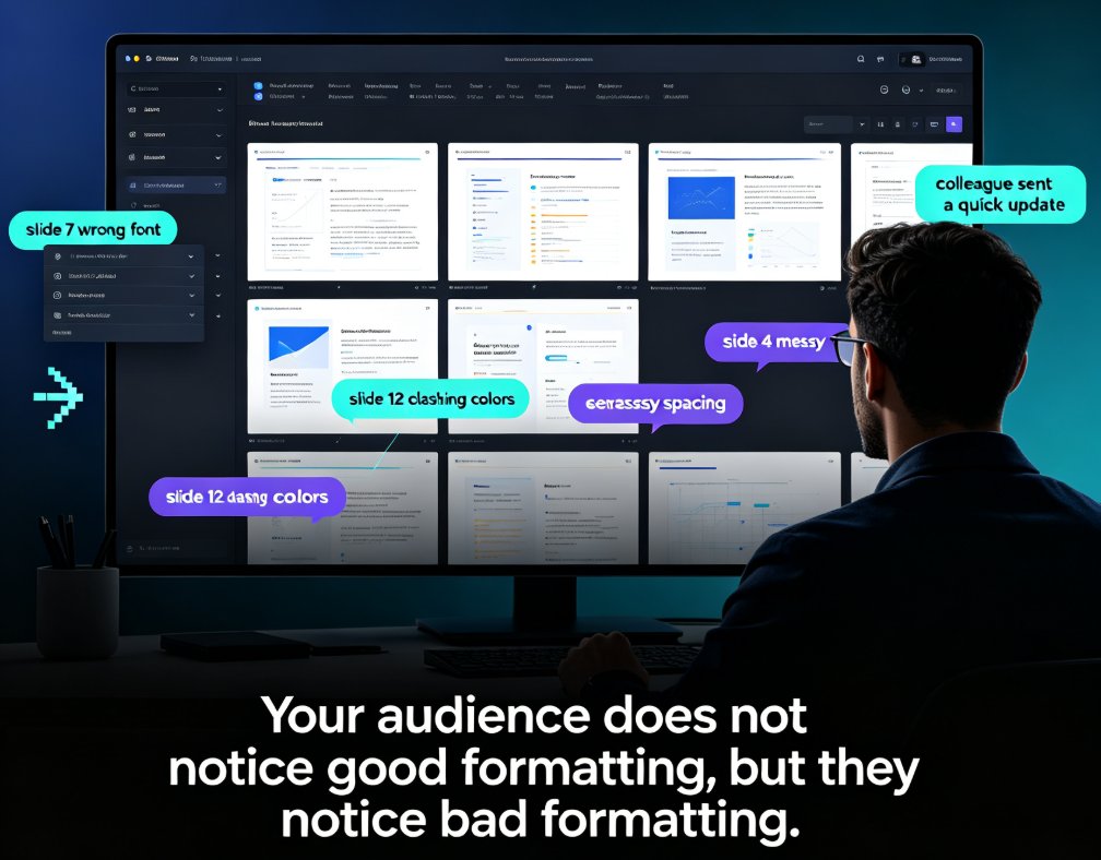
5 Smart Layout Tricks to Upgrade Your Presentation Design Instantly
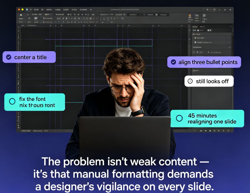
Let's be honest: the last time you spent 40 minutes nudging a text box in PowerPoint, you didn't feel productive. You felt defeated. You tried to center a title, align three bullet points, and fix the font, and somehow it still looked... off. You're not alone — this is the daily reality for millions of educators, trainers, HR leads, and content operators who build decks but never went to design school.
Here's the thing: the gap between an amateur-looking deck and a professional one is rarely talent. It's consistency. Uniform fonts, a restrained color palette, clean alignment, and clear hierarchy. And every one of those can be automated with the right smart layout tools. No design skills required.
In this guide, I'll walk through 5 smart layout tricks that instantly upgrade any presentation — and show you which ones Zendeck's smart layout and one-click reskin features handle for you. Along the way we'll look at a real comparison of manual formatting versus automated layout, plus the honest caveats worth knowing before you reskin a 60-slide course.
01. Why Formatting Slides Feels Like a Part-Time Job
The problem was never that your content is weak. It's that manual formatting demands a designer's vigilance for every single slide. You set a heading size on slide 3, then forget to match it on slide 14. You pick a font because it looks nice, pair it with another font, and suddenly the deck looks like two different presentations stapled together. Half your working time goes into fixing details that should have been settled before you typed the first word.
Now multiply that by a 40-slide training deck and a deadline at 5 p.m. The slide you're most proud of is usually the one you spent 45 minutes realigning — and it's still not quite right. Sound familiar?
You don't need a designer's eye to build a beautiful deck. You need a layout system that makes the design decisions for you — and that's exactly what smart layout does.
Zendeck's smart layout was built around this idea. When you paste a Word outline or Markdown into Zendeck, the tool reads your content, applies a consistent visual structure, and generates a complete deck where the typography, spacing, and alignment are already unified. You don't format slides; you edit content. The design happens underneath. If you want a deeper look at how this automation fits into the wider 2026 trend, our piece on AI-driven design automation and smart layouts covers the shift in detail.
02. Trick 1: Build a Typography System, Not a Font Collection
The fastest way to make any deck look unprofessional is to let every slide pick its own font family, size, and weight. Headings shrink and grow between slides. The bullet text on slide 6 is two points larger than on slide 7. Your title uses bold, your subtitle uses bold and italic, and your body text is suddenly underlined because someone wanted to "emphasize" something.
The fix is a typography system: one or two font families, three fixed roles (heading, subheading, body), and sizes that never change across the deck. Your audience shouldn't be able to tell when a slide changed — that's the goal.
Pain point: you have no idea which fonts pair well together, and you're tired of guessing.
Solution: smart layout tools predefine the font roles and sizes for you. Zendeck's smart layout picks a coherent type scale automatically when it generates your slides, so a title on slide 3 looks exactly like a title on slide 27.
Outcome: your deck reads as one clean, intentional piece of communication instead of a collection of random slides.
◉ Do I really need design skills to use these tricks?
No. That's the entire territory of smart layout. The tool handles the design judgment — which fonts pair, how large headings should be relative to body text, where bold belongs — so you can focus on what to say, not how it looks. If you ever want to override the defaults, Zendeck lets you tweak individual slides, but the baseline consistency is already done for you.
03. Trick 2: Let One Color Palette Carry the Whole Deck
Color is where amateur decks fall apart. Every slide gets a different accent color because someone thought variety meant visual interest. In reality, a deck with nine colors isn't interesting; it's exhausting. Professional design often limits a deck to one primary color, one or two complementary colors, and lots of neutral space. That's it.
Pain point: choosing colors that look good together feels like a mystery, and corporate brand colors are even more intimidating.
Solution: pick a small, consistent palette and apply it everywhere — headings, highlights, charts, and backgrounds. When the same accent color marks every important takeaway, your audience starts to associate that color with "remember this." That's a powerful communication pattern.
Outcome: the deck looks calm, branded, and intentional. Your eyes know where to go because the same color keeps guiding them.
If you're inside an organization with strict brand rules, this is where a custom brand kit in Zendeck becomes your best friend. Set your brand colors once, and every generated slide inherits them automatically. No more copy-pasting hex codes between slides.
04. Trick 3: Respect Alignment and Spacing on Every Slide
The difference between "okay" and "professional" in most decks is alignment. Elements that should share a left edge are scattered around like leaves in the wind. Text boxes overlap margins. A chart drifts two pixels off-center and suddenly the whole slide feels crooked — even if nobody can say exactly why.
Pain point: manually aligning five elements on each of twenty slides is tedious, error-prone work.
Solution: let the layout system enforce a grid. Smart layout applies consistent margins, ruled alignments, and even spacing between elements across every slide in the deck. Whitespace does real work here — it isolates key elements and raises perceived quality. Designers have argued for years that whitespace creates a feeling of luxury; it sharpens viewer focus by giving important content room to breathe.
Outcome: every slide follows the same invisible grid, so the deck holds together even when the content changes completely between sections.
The practical payoff is time. If you look at how smart layout cuts presentation design time, the recurring theme is that alignment and spacing are the single biggest source of wasted formatting hours. Automating them removes the most tedious part of deck building.
05. Trick 4: Use One-Click Reskin to Refresh Everything at Once
Here's a scenario every deck-builder knows. You've spent two days on a training deck. The content is solid. The structure is clear. But the visual style feels dated, or your manager just revealed that clients want the new brand colors — and the deadline is tomorrow morning.
This is the moment most people give up and ship an ugly deck. But it's also the moment where one-click reskin earns its keep.
Pain point: restyling 40 slides manually — new fonts, new colors, new every slide's accents — takes an afternoon and a lot of swearing.
Solution: a reskin command instantly reapplies a new visual style across the entire deck. Fonts, colors, spacing, and layout rules all update at once while your actual content stays untouched.
Outcome: you get a cohesive, on-brand deck in seconds instead of hours.
Reskinning a 40-slide deck used to take an afternoon. With one-click reskin, it takes seconds — and the whole deck stays on-brand.
Zendeck's reskin works hand-in-hand with its smart layout. You can flip through template styles, pick the one that matches the audience or the occasion, and the tool carries your fonts, colors, and logo across every slide. For teams that produce frequent updates — think onboarding decks, monthly training, or courseware refreshes — this alone is a workflow changer.
06. Trick 5: Design a Content Hierarchy So Nobody Gets Lost
Pretty slides are useless if the audience can't tell what matters. Content hierarchy is the silent structure that guides a listener from the big idea to the supporting evidence — and it's the trick that separates a lecture from a story.
Pain point: every slide competes for attention equally, so the audience remembers nothing.
Solution: give each slide one clear visual hierarchy. The main takeaway gets the largest, strongest treatment; supporting points get progressively lighter visual weight. Charts, icons, and pull-quotes should reinforce the hierarchy, not fight it.
Outcome: the audience immediately knows what to focus on, and your key messages actually land.
Zendeck's smart layout builds this hierarchy for you by structuring headings, body text, and emphasis consistently. If you're creating courseware and need quizzes or interaction to strengthen retention on top of the hierarchy, Zendeck's interactive charts in the asset library and polls and quizzes extend the same principle into engagement.
07. Smart Layout vs. Manual Formatting: The Honest Comparison
Let's put the two approaches side by side. The numbers below are ballpark estimates based on typical formatting work in office and education settings — your mileage will vary depending on deck length and how fast you click.
| Task | Manual PowerPoint | Generic Template Editor | Zendeck Smart Layout |
|---|---|---|---|
| Initial deck structure from outline | 30–45 min | 15–25 min | ~2 min |
| Consistent typography (headings & body) | 20–40 min | 10–15 min | Automatic |
| Color palette and brand application | 15–30 min | 10 min | Automatic |
| Alignment and spacing fixes | 20–35 min | 10–20 min | Automatic |
| Full deck reskin | 1–2 hours | 20–40 min | ~1 click |
| Total for a 20-slide deck | ~2 hours | ~1 hour | ~15 min |
The takeaway isn't just speed. It's which tasks manual work forces you to do. With the table above, you can see that the most time-consuming parts — especially full reskins — collapse almost entirely with a smart layout tool.
Here's the same comparison visually. This chart shows the typical time a person spends purely on formatting a 20-slide deck across three approaches:
Notice the pattern: the longer the deck, the bigger the gap. On a 60-slide course, manual formatting can easily swallow an entire afternoon. Smart layout scales, which is exactly why teams that ship courseware weekly are shifting toward AI deck generation as the default workflow — not as a fringe experiment but as the normal way to produce.
08. The One Caveat Nobody Mentions
Before you go all-in on automation, one honest caveat: smart layout fixes how a deck looks, not what it says. A perfectly aligned slide with a muddled message is still a muddled slide. The tools save you hours of mechanical work, but they can't decide your core argument or translate your thinking for the audience.
That's your job — and it should be. The whole point of removing formatting drudgery is to free your energy for substance. The best workflow I've seen in teams is: draft content first, let the layout system handle the visuals, then do one pass reviewing the message rather than the margins.
If you're building courseware specifically, the same principle applies inside the courseware design workflow — content first, polish second, and let automation carry the repetitive part. Once your deck structure is in place, Zendeck can even turn those slides into narrated videos so your formatted work reaches people who'd rather watch than read.
FAQ
What is a smart layout in presentation tools?
A smart layout is an automated design system that applies consistent typography, color, spacing, and alignment rules across every slide. Instead of manually adjusting each text box, the tool reads your content and places it into a structured, visually balanced layout. Zendeck's smart layout does this automatically when you generate slides from a Word outline or Markdown, so deck-wide consistency comes without design work.
Will one-click reskin change my actual content?
No. Reskin changes only the visual layer — fonts, color palette, spacing, and template style. Your text, data, and slide order stay untouched. That's why you can restyle a 40-slide deck until it matches your brand or audience without rewriting a single sentence.
Do I still need design skills if I use smart layout?
You need zero design background. The tool makes the visual decisions for you: font pairing, hierarchy, alignment. What you do need is judgment about content — the key message and what your audience cares about. The design thinking is handled for you, so your brain stays free for the substance.
Can smart layout handle courseware used in education and training?
Yes. Courseware is usually long — 20, 40, or 60 slides — which is exactly where manual formatting falls apart. Zendeck keeps fonts, colors, and alignment consistent across the entire course, and you can reskin it for different cohorts or brand guidelines. It's a practical way to produce more courses in less time without a designer.
How long does it take to reskin a complete deck in Zendeck?
In practice, a one-click reskin applies a new visual style to a full deck in seconds — a task that would take an hour or more in traditional presentation software. For finer control, Zendeck also offers a scene-based editor where you can drag and refine individual slides. But the core automation means most reskins are literally one click followed by a quick review.