
Data-Heavy Slides Made Simple: Research Decks with Zendeck Charts
Data-Heavy Slides Made Simple: Research Decks with Zendeck Charts
You know that feeling when you've spent three hours making a bar chart "look right" — only to realize the axis labels are still misaligned and the colors clash with your university's branding? Yeah. We've all been there.
If you're an educator, researcher, or graduate student, you're not a designer. You're an expert in your field. But somewhere along the way, presenting your data became a design exercise — and it's eating hours you don't have.
Here's the good news: turning raw numbers into clean, compelling slides doesn't require design skills anymore. With Zendeck's chart and data visualization assets, you can build a professional research deck in minutes, not days.
I. The Real Reason Data-Heavy Slides Fail
Let's be honest: most data slides fail not because the data is wrong, but because the presentation makes it impossible to understand.
Pain point: You've got a spreadsheet with 40 rows of survey responses, a deadline in 48 hours, and a conference audience that will judge your credibility in the first 30 seconds. You open PowerPoint, paste a chart from Excel, and immediately notice the fonts don't match, the colors are jarring, and the legend overlaps the data.
The result? Your audience squints, checks their phones, and misses the insight you worked months to uncover.
The core problem is that researchers are trained to analyze data, not to visualize it. We know what the numbers mean — but translating that into a visual story requires a completely different skill set. And the tools we've been using (Excel charts, PowerPoint's native graphs) were never designed for non-designers.
Solution: A workflow that separates the thinking from the formatting. You focus on the data and the story; the tool handles the visual execution. That's exactly where Zendeck steps in.
II. What Zendeck's Chart Assets Actually Do
Zendeck's asset library isn't just a collection of pretty icons. It's a built-in chart and data visualization system designed for people who don't think in pixels.
Here's what that means in practice:
- Pre-built chart templates for bar, line, pie, scatter, and histogram charts — all styled to match your deck's theme automatically.
- One-click color harmonization — charts pick up the palette from your selected template, so you never have to manually match hex codes again.
- Smart layout integration — charts snap into your slide layout without breaking alignment or spacing.
- Icon and illustration support — add context with icons that reinforce your data story, not distract from it.
◉ What makes Zendeck's charts different from Excel charts?
Zendeck treats charts as native slide elements, not imported afterthoughts. When you add a chart, it inherits the deck's typography, colors, and spacing automatically. No more copying and pasting from Excel and hoping it doesn't break. If you've ever dealt with a chart that resizes awkwardly or loses its formatting when you paste it into PowerPoint, you know exactly why this matters.
For a deeper look at how asset libraries are evolving, check out our breakdown of AI-powered asset libraries and smarter visuals.
III. Building a Research Deck: Step by Step
Let's walk through a real scenario. You're a PhD candidate preparing a 15-slide presentation for an academic conference. You have the data in a spreadsheet, an outline in Word, and exactly one evening to make it presentable.
Step 1: Import Your Outline
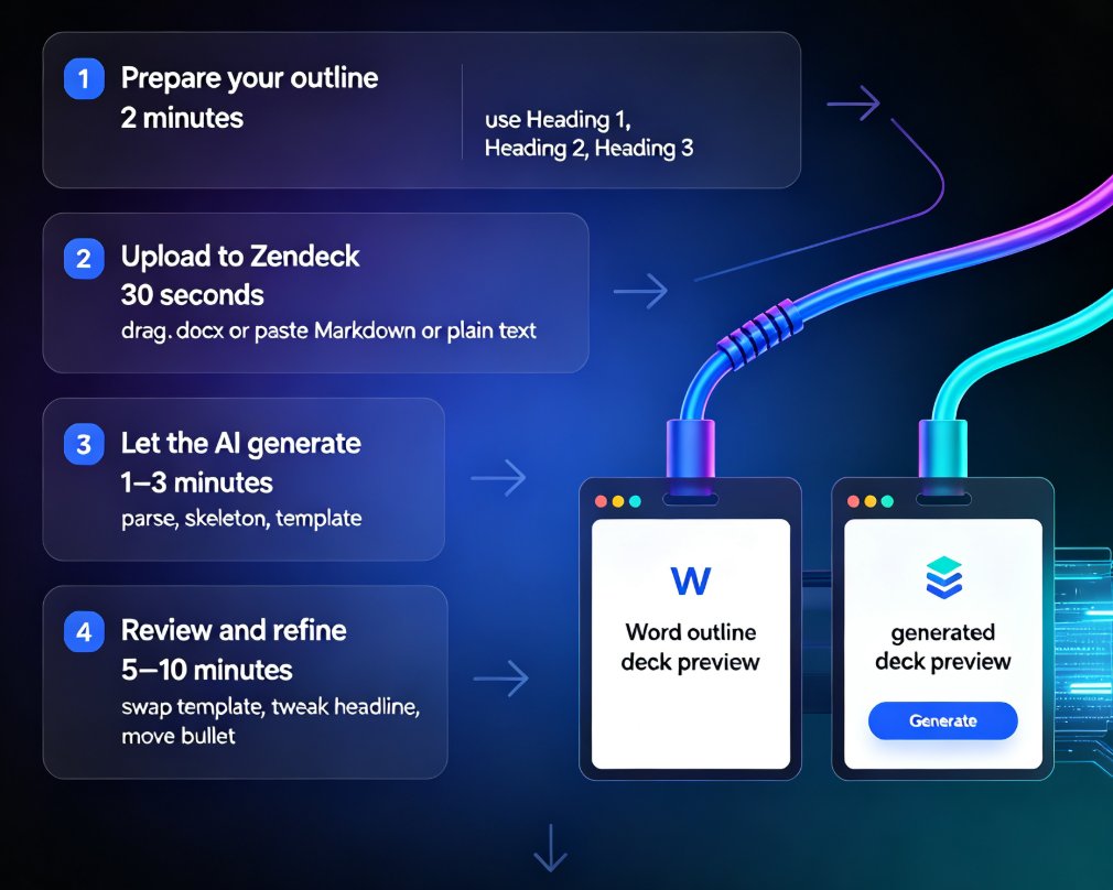
Start by importing your Word outline or pasting your Markdown into Zendeck. The platform generates a structured deck with consistent typography and layout — no manual slide-by-slide formatting. If you're new to this workflow, our guide on AI prompt to deck generation walks through the basics.
Step 2: Choose Your Chart Types
For each data-heavy slide, select the chart type that matches your data. Zendeck's library covers the essentials:
- Bar charts for categorical comparisons
- Line charts for trends over time
- Pie or donut charts for proportions
- Scatter plots for correlations
- Histograms for distributions
Step 3: Let Smart Layout Do the Heavy Lifting
Once your charts are in place, Zendeck's smart layout engine adjusts spacing, alignment, and sizing automatically. You don't need to nudge elements pixel by pixel — the platform handles it. This is where the time savings really add up.
Step 4: Add Context with Icons and Illustrations
Use the asset library to add icons that reinforce your key points. A small icon next to a statistic can make it memorable without cluttering the slide. For example, a graduation cap icon next to enrollment numbers, or a microscope icon next to lab results.
Step 5: Review and Refine
Preview your deck, check the flow, and make adjustments. The entire process — from outline to polished deck — typically takes under an hour. Compare that to the traditional workflow of manually building each slide in PowerPoint, and you'll see why AI deck generation is replacing traditional PPT in 2026.
IV. Choosing the Right Chart for Your Data
Not all charts are created equal. Choosing the wrong visualization can obscure your insight, even if the data is perfect. Here's a quick reference:
| Data Type | Recommended Chart | Best For | Common Mistakes |
|---|---|---|---|
| Categories vs. values | Bar chart | Comparing groups | Too many bars (keep under 8) |
| Trends over time | Line chart | Showing change | Ignoring axis scale |
| Parts of a whole | Pie/donut | Proportions | More than 5 slices |
| Relationships | Scatter plot | Correlations | Overplotting |
| Distribution | Histogram | Data spread | Wrong bin size |
◉ How do I pick the right chart type?
The golden rule: if you need to explain the chart, it's the wrong chart. Your audience should grasp the insight within five seconds of seeing the slide. If you're comparing categories, use a bar chart. If you're showing change over time, use a line chart. If you're showing parts of a whole, use a pie or donut — but only if you have fewer than six slices.
Notice how the chart uses a consistent color palette, clear labels, and no unnecessary gridlines or decorations. That's the standard Zendeck applies automatically.
For more on how to make your charts interactive and engaging, check out our guide on adding interactive charts with Zendeck's asset library.
V. Design Principles That Make Data Stick
Beyond choosing the right chart type, a few design principles separate memorable data slides from forgettable ones.
1. Less is More
Cut every element that doesn't serve the message. If a gridline, label, or legend isn't essential, remove it. Your audience should focus on the data, not the chart furniture. A common mistake is keeping Excel's default gridlines and borders — they add noise, not clarity.
2. Color with Purpose
Use color to highlight the key data point, not to decorate. One accent color for the insight, neutral tones for everything else. Zendeck's templates enforce this automatically, so you don't have to think about it. If you're presenting to a specific institution, you can also set up a custom brand kit to keep everything on-brand.
3. Annotate the Insight
Don't just show the data — tell your audience what to see. Add a callout or annotation that states the takeaway directly. "Enrollment grew 23% after the new curriculum" is more memorable than a bare line chart. Your audience shouldn't have to do mental math to understand your point.
4. Keep It Accessible
Your slides should be readable by everyone, including people with color vision deficiencies. Zendeck's chart defaults use colorblind-safe palettes, and you can add alt text for screen readers. For more on this, check out our guide on accessible AI presentations and WCAG compliance.
VI. Real-World Scenarios: Where This Workflow Shines
Academic Conferences
You have 15 minutes to present months of research. Every slide needs to communicate instantly. With Zendeck, you can build a conference-ready deck the night before — and spend your energy rehearsing, not formatting. The AI courseware tools are built exactly for this kind of high-stakes, time-constrained work.
Classroom Teaching
Educators face a different challenge: making data digestible for students who may not have statistical training. Clean, well-designed charts with clear annotations help students grasp concepts faster. Zendeck's courseware design capabilities make this straightforward, whether you're teaching statistics, economics, or biology.
Stakeholder Reports
Whether you're reporting to a department head, a funding body, or a corporate sponsor, your data needs to tell a story. Zendeck's chart assets help you present findings with confidence — no design team required. And if your slides still feel messy after generation, our guide on fixing messy AI-generated slides has practical fixes.
VII. Why This Matters for Your Workflow
Let's be real: the tools we use shape how we work. If you're still manually formatting charts in Excel and pasting them into PowerPoint, you're spending hours on tasks that add zero value to your research.
Zendeck's chart and data visualization assets are designed for one purpose: helping you communicate data clearly, without becoming a designer.
The workflow is simple: import your outline, add your data, let the smart layout handle the rest. You focus on the research. Zendeck handles the presentation. That's the difference between spending your evening formatting and spending it refining your argument.
If you want to see where this is heading, our overview of AI data visualization trends for 2026 covers what's coming next in the space.
FAQ
What types of charts does Zendeck's asset library include?
Zendeck's library includes bar charts, line charts, pie and donut charts, scatter plots, and histograms — all styled to match your deck's theme automatically. You can also add icons and illustrations to provide context around your data.
Can I import data from Excel or CSV files into Zendeck?
Yes. You can import your data directly and Zendeck will help you visualize it. The platform handles the chart creation and styling, so you don't need to manually format graphs in Excel first.
How do I keep chart colors consistent with my institution's branding?
Zendeck's templates enforce color consistency automatically. When you select a template or create a custom brand kit, charts inherit the same palette, typography, and styling — no manual hex code matching required.
Can I edit charts after inserting them into my slides?
Absolutely. Charts are native slide elements in Zendeck, so you can update data, change chart types, or restyle them at any time without breaking the layout.
Does Zendeck support accessible charts for WCAG compliance?
Yes. Zendeck's chart defaults use colorblind-safe palettes, and you can add alt text for screen readers. For more details, see our guide on accessible AI presentations.


