Designing Conference Keynote Decks with AI Templates That Engage
You've got 20 minutes on stage, 300 people in the room, and a slide deck that looks like a Word document with extra steps. Sound familiar?
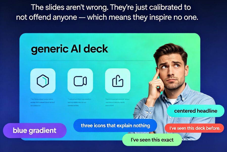
Here's the uncomfortable truth about conference keynotes: your audience doesn't remember your data points, they remember how your deck made them feel. If your slides are walls of text with default templates, you're not delivering a keynote — you're reading a report out loud.
The good news? You don't need to be a designer to fix this. With AI templates, smart layout tools, and a curated visual asset library, you can build a stage-ready keynote that holds attention from the opening slide to the closing call-to-action. Let's walk through exactly how.
01 — Why Keynotes Need a Different Design Language Than Regular Decks
A quarterly business review and a conference keynote are both presentations, but they're different animals. A BIR is read, scanned, and filed. A keynote is watched, felt, and remembered.
The single biggest mistake speakers make is treating a keynote like a document with slides attached. They pack every slide with bullet points, embed dense tables, and expect the audience to keep up. The result? The audience stops reading by slide three and starts checking email by slide ten.
Think about the last great keynote you saw. Chances are you remember a bold visual, a striking statistic, or a moment of emotional resonance — not the speaker's bullet points. That's because keynotes work on a different level than documents. They're performances, and the deck is the set design.
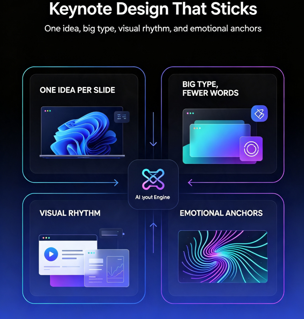
Keynotes demand a different design language:
- One idea per slide. If a slide has more than one takeaway, it has none.
- Big type, fewer words. Your slide should support your voice, not compete with it.
- Visual rhythm. Alternating layouts keep the eye moving and prevent monotony.
- Emotional anchors. A striking image, a bold stat, a human story — these are what people remember.
This is where AI presentation tools shine. They don't just apply a template; they help you enforce these principles automatically. Smart layout systems handle spacing, alignment, and hierarchy so you can focus on the message. If you want to understand how these design suggestions work under the hood, this breakdown of AI-powered design suggestions is worth a read.
02 — Start With the Narrative, Not the Template
Here's a trap most speakers fall into: they open a template gallery, pick something that looks nice, and then try to cram their content into it. That's backwards.
The most engaging keynotes are built narrative-first. You figure out the story you're telling — the problem, the tension, the resolution — and then you let the design serve that story.
With Zendeck, you can start from a simple Word outline or pasted Markdown and let the AI generate a structured deck around your narrative. This is a game-changer for speakers who think in words, not pixels. You write your story, the tool handles the visual scaffolding.
This narrative-first approach does two things. First, it forces you to clarify your argument before you get distracted by fonts and colors. Second, it means the deck's structure mirrors your story's arc — setup, conflict, resolution — which is exactly what keeps an audience engaged.
If you're new to this workflow, check out how to import Word outlines into Zendeck for instant decks. It's the fastest way to go from rough notes to a structured presentation.
03 — Smart Layout Creates Visual Rhythm
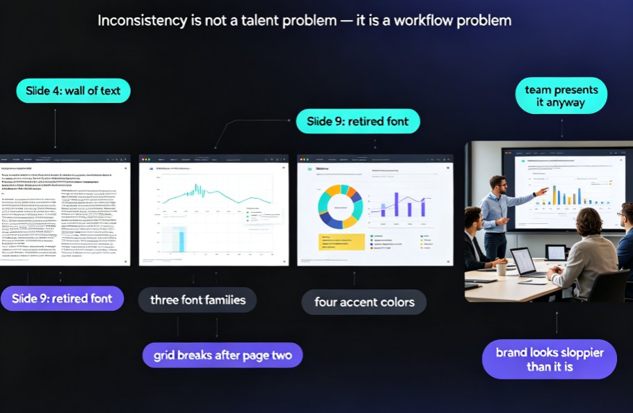
Once your narrative is in place, the next challenge is visual consistency. Nothing kills a keynote faster than slides that look like they were designed by five different people.
Smart layout tools apply consistent spacing, alignment, and typography across every slide automatically. You set the rules once, and the system enforces them everywhere. This is what separates a polished keynote from a collection of slides.
Here's what smart layout handles for you:
- Consistent margins and grid alignment — every element sits on the same visual grid
- Automatic font and color unification — no more mismatched headings
- Balanced text-to-visual ratio — the system prevents text-heavy slides
- One-click reskinning — change the entire look of the deck without rebuilding slides
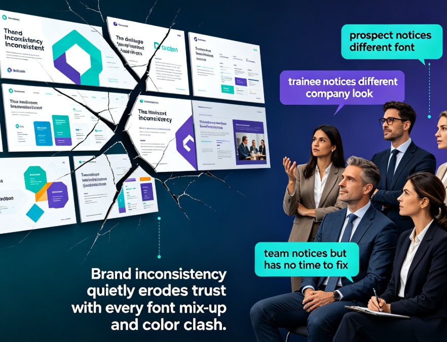
The result is a visual rhythm that feels intentional. Your audience perceives the deck as cohesive, which builds trust in your message. When slides look chaotic, audiences subconsciously assume the thinking is chaotic too.
There's also a practical benefit: consistency makes your deck easier to update. When you change one element, the system propagates the change across the entire presentation. No more hunting through 40 slides to fix a font mismatch.
If you want to go deeper on keeping decks consistent, Zendeck's brand kits let you lock in your organization's colors, fonts, and logo treatment across hundreds of slides.
04 — Curated Assets Beat Generic Stock
Here's the other thing that makes keynotes feel generic: the same stock photos and clip-art icons everyone else uses. You've seen them — the handshake, the lightbulb, the rocket ship.
The fastest way to make a keynote feel custom is to use a curated visual asset library instead of generic stock. Icons, charts, and illustrations that match your brand and your message make the deck feel designed, not assembled.
Zendeck's asset library gives you access to icons, charts, and illustrations that you can drop into slides without breaking the visual system. This matters more than you think. A well-chosen icon can replace a paragraph of text. A clean chart can make a data point memorable. An illustration can carry emotional weight that a photo can't.
The practical payoff: you spend less time hunting for visuals and more time refining your message. And because the assets are designed to work with the templates, they integrate seamlessly — no awkward sizing, no clashing styles.
For speakers presenting data-heavy content, the ability to turn raw numbers into clean, on-brand charts quickly is a huge advantage. You can focus on the story behind the data instead of wrestling with spreadsheet formatting.
05 — Manual Design vs. AI-Assisted Keynote Creation
Let's be real about the trade-offs. Here's how the two approaches stack up:
| Dimension | Manual Design | AI-Assisted |
|---|---|---|
| Time to first draft | 4–8 hours | 10–20 minutes |
| Visual consistency | Depends on skill level | Built into the system |
| Customization effort | Every slide by hand | One-click reskin |
| Asset curation | Endless stock searching | Curated, on-brand library |
| Design skill required | Yes, or a designer on call | None |
| Revision speed | Slow, manual | Instant, automated |
For most speakers, the AI-assisted approach isn't just faster — it produces more consistent, stage-ready results. The time you save on layout and asset hunting goes straight into rehearsing your delivery, which is where the real impact lives.
That's not to say manual design has no place. If you're a designer crafting a bespoke deck for a single high-stakes event, go for it. But for the 90% of speakers who need a polished, professional keynote without a design team, AI templates are the smarter play.
06 — A Practical Workflow for a Stage-Ready Keynote
Here's a five-step process you can use for your next conference talk:
Step 1: Write your narrative outline. Three acts — setup, conflict, resolution. One idea per slide. No design thinking yet, just story.
Step 2: Generate the deck from your outline. Paste your text into Zendeck and let the AI structure it into slides with appropriate layouts.
Step 3: Apply a template that matches your tone. Choose from the template library — something bold for a big keynote, something clean for a technical talk.
Step 4: Curate your visuals. Swap in icons, charts, and illustrations from the asset library. Replace any generic placeholders with assets that reinforce your message.
Step 5: Reskin and polish. Use one-click reskinning to unify fonts and colors, then review the flow. Cut any slide that doesn't serve the narrative.
That's it. From outline to stage-ready in under an hour, without opening a design tool. The next time you're asked to speak, you'll spend your energy on the delivery — not on fighting your slides.
FAQ
Can AI templates really make a keynote look custom, not generic?
Yes, if you use them correctly. The key is starting with your narrative, then using smart layout and curated assets to customize the template. A template is a starting point, not a final product. Zendeck's asset library and reskinning tools let you make the deck feel uniquely yours.
How do I keep my keynote from looking like everyone else's template deck?
Three things: customize the color palette and fonts to match your brand, replace generic stock with curated icons and illustrations, and vary the slide layouts so the deck has visual rhythm. A template becomes generic when you leave it untouched.
What's the fastest way to turn my outline into a stage-ready deck?
Write your narrative outline first, then import it into Zendeck as a Word document or Markdown. The AI generates a structured deck in minutes. From there, apply a template, add curated visuals, and reskin for consistency.
Do I need design skills to use AI layout tools?
No. That's the whole point. Smart layout handles spacing, alignment, and typography automatically. You focus on the message; the tool handles the design. If you can write an outline, you can create a professional keynote.
How do I add charts and data without breaking the visual flow?
Use the asset library's chart tools, which are designed to match the template system. Keep charts simple — one clear takeaway per chart — and let the visual style stay consistent with the rest of the deck.