Zendeck Asset Library Tips: Finding Visuals Fast as a Non-Designer
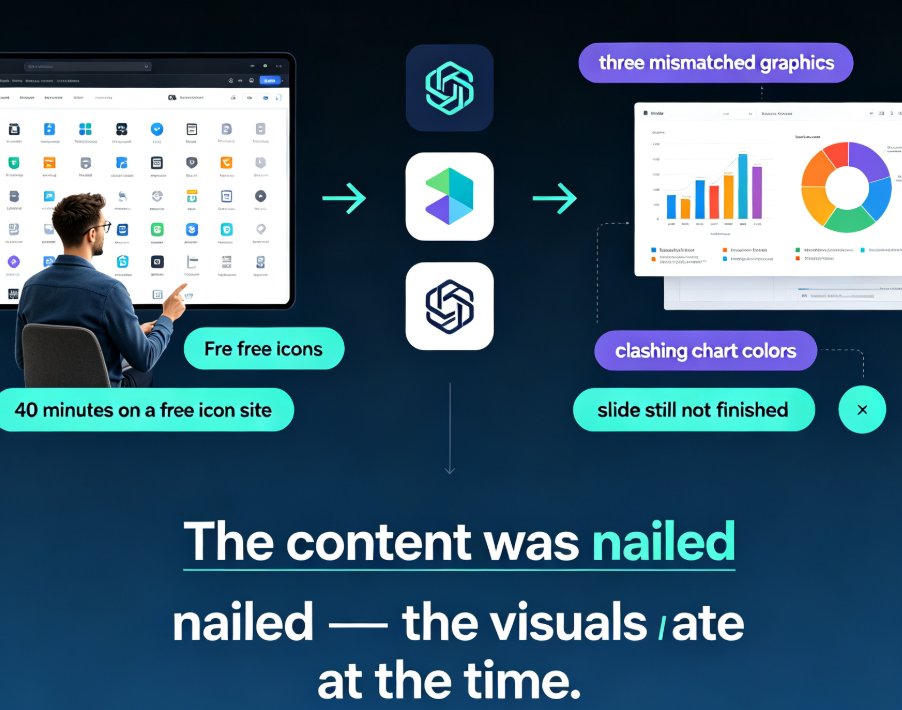
Raise your hand if you've ever spent forty minutes on a free icon site, ended up with a pile of mismatched graphics, and still felt your slide looked off. That was me three jobs ago, before I learned a simple truth: the people who make beautiful decks aren't inherently better designers — they just stopped building from zero.
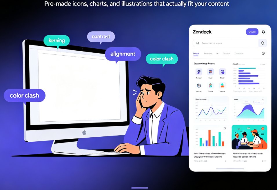
Here's the thing: if you're an educator, an HR lead, or a content operator, your job isn't to master typography. It's to get a clear message onto slides people actually want to look at. And that's exactly where Zendeck's asset library comes in — a built-in collection of icons, charts, and illustrations that turns "I can't design" into "I can finish this deck before lunch."
Below are the practical asset library tips I wish someone had handed me years ago. They're simple, repeatable, and require exactly zero artistic talent.
01 Why Non-Designers Lose Hours to Visuals
You've got the content nailed — the outline, the talking points, the data. Then you hit the wall: making it look presentable.
The old workflow looks something like this. You open a free icon site, browse generic categories, and download three icons that don't match each other in style. Then you search for a chart, find a decent-looking one, but the colors clash with your company's palette. Before you know it, forty-five minutes have vanished and the slide still isn't finished. Sound familiar?
The deeper problem isn't a lack of taste. It's that free and generic tools force you to make dozens of micro-design decisions — which icon style, which thickness, which color, which spacing — and every decision eats up time and introduces inconsistency.
Here's the pivot: when the assets are pre-designed, curated, and already on-brand, the design decisions disappear. You stop choosing and start placing. In my experience, that single shift cuts slide-production time by more than half.
You don't need design talent to make professional slides — you need the right assets in the right place.
02 What's Actually Inside Zendeck's Asset Library
Before we talk strategy, let's get clear on what you're working with. The Zendeck asset library isn't a random pile of clip art. It's organized into three main buckets, each covering a common presentation need:
| Asset type | What it includes | Best used for |
|---|---|---|
| Icons | Flat, line, and filled icons in consistent styles | List items, skill markers, feature callouts |
| Charts | Bar, line, pie, and donut charts that are data-ready | Turning numbers into something scannable |
| Illustrations | Scene-based illustrations for storytelling | Explainers, concept slides, section dividers |
Because everything in the library is designed to share a similar visual language, you can mix icons and illustrations on one slide without it looking like a patchwork. That consistency — more than any single asset — is what reads as "professional."
If you want a deeper look at how these libraries are evolving, check out our breakdown of AI-powered asset libraries and smarter visuals. The short version: asset libraries are shifting from static collections to context-aware recommendations, which is exactly why they're becoming the non-designer's best friend.
03 Search Like a Pro: Finding Visuals in Seconds
The biggest mistake I see non-designers make is browsing instead of filtering. They open the library, scroll through pages of icons, and hope something jumps out. That's slow and exhausting. Here's how to search with intent.
◉ Use concrete keywords, not vague ones
"Business" returns a thousand irrelevant results. "Handshake," "growth chart," or "lightbulb" returns exactly what you need. Think about the object behind your idea, then type that object's name. Want to show collaboration? Search "people together" or "puzzle pieces" rather than the abstract "teamwork."
◉ Narrow by style before you commit
Once your results appear, filter by style and color. If your deck uses thin strokes, select the matching icon style so you're not mixing a chunky filled icon with a delicate line icon two slides later. This one habit instantly makes your deck feel cohesive.
◉ Build a favorites collection for repeat work
Trainers and course creators reuse the same ideas weekly — checklists, objectives, key takeaways. Save the assets you use often to a favorites collection so you're not re-searching every time. Think of it as your personal design starter pack.
Offhand advice: if you're mid-flow and the perfect icon isn't showing up, try one synonym before you give up. "Gear," "cog," and "settings" all live in different corners of a library. Ten seconds of synonym-switching often beats scrolling forty pages.
04 Use Icons Like a Designer (Even If You Aren't One)
Icons are the highest-leverage visual you'll ever use — but only if you place them with a little restraint. Here are the patterns that consistently work in real decks.
First, pair icons with list items. Instead of a plain bullet list of skills or steps, drop a small icon next to each item. Your audience's eye gets a quick anchor, and the slide becomes scannable at a glance. This is the cheapest upgrade in presentation design.
Second, commit to a single icon style per deck. Don't mix a hand-drawn illustration with a crisp line icon on the same slide. Pick one style from the library and stay consistent; the variety you'd get from generic sources is exactly what makes decks look amateur.
Third, add short captions or labels beside icons. An icon without context is just decoration. One or two words of text — "Enroll," "Complete," "Review" — turns decoration into a visual story.
This is also where Zendeck's AI design logic helps. Rather than hunting for every asset manually, you can let the system suggest relevant visuals based on your slide content, which is part of the broader move toward AI-generated icons and charts. The result: you get a designer's curation without doing the curation yourself.
05 Turn Numbers into Charts Without Touching Excel
Nothing kills a slide faster than a screenshot of a cluttered Excel chart with gray gridlines and a mismatched font. But here's what most non-designers don't realize: you don't need to become a data-viz expert to fix it.
With Zendeck's asset library, you insert a chart and paste in your data. The chart inherits your deck's fonts and brand palette automatically — no manual recoloring, no resizing battles. If your data changes later, the chart stays editable, so you're not re-screenshotting and re-pasting.
For more advanced needs, our guide on adding interactive charts to your AI slides shows how to make charts respond to clicks and hovers — a small touch that makes data feel alive in courseware and client decks alike.
The key lesson: let the library do the formatting, and spend your energy on what the data actually means.
06 Keep It On-Brand Without Thinking About It
Here's the scenario that used to keep me up at night: I'd find the perfect illustration, drop it into a slide, and realize the accent color was completely wrong for our brand. Then came the manual fix — recoloring individual elements, hoping nothing broke. It was wasteful, and frankly, it rarely looked right.
The root cause is that generic assets don't carry your brand's DNA. When you pull visuals from an open-source site, you're on your own for matching colors, fonts, and spacing. When you pull from an asset library tied to your brand kit, all of that is automatic.
The fastest way to look like a designer is to stop designing from scratch and start curating on-brand assets. In Zendeck, library assets align with your brand kit, so an icon or chart you insert is already in your palette. If you haven't set up a brand kit yet, our guide to maintaining brand consistency in decks walks through the steps — it takes a few minutes and saves you hours on every future deck.
The 60-Second Comparison
If you're still skeptical, here's the same task side by side — done the old manual way versus with Zendeck's asset library:
| Visual task | Old manual way | Zendeck asset library way |
|---|---|---|
| Find an icon for "leadership" | 10–15 min browsing free icon sites | 5 seconds with keyword search |
| Add a data chart | Build in Excel, export, screenshot | Insert chart, paste data, done |
| Keep colors consistent | Pick from memory, hope it matches | Auto-applies brand palette |
| Reuse a favorite illustration | Save to random folder, forget it | Favorites collection, one click |
| Match fonts across slides | Manual tweak on every slide | One-click smart layout syncs fonts |
That's not a marginal improvement. That's the difference between spending your evening wrestling with shapes and actually enjoying dinner while your deck finalizes itself.
The Takeaway
Let's be honest: nobody grades you on how many hours you spent in a design tool. They grade you on whether the deck communicated clearly. The asset library exists to remove the friction between "I have an idea" and "I have a slide that shows it."
Start small. Search for one icon, drop it next to a list item, and see how much more confident the slide looks. Add one chart to your next data-heavy section. Save three illustrations to your favorites. Within a week, you'll have a personal library of go-to visuals — and you'll wonder why you ever built decks sight-unseen.
If you're creating courseware or training materials specifically, our courseware design guides cover more ways to structure visual content for learners. Pair them with these asset library tips, and you've got a workflow that makes professional-looking slides the default, not the exception.
FAQ
How do I search for icons fast in Zendeck's asset library?
Use specific, concrete keywords instead of vague ones. For example, type "leadership" rather than "business," then narrow results with filters like style and color. Zendeck's library responds to plain-language queries, so you can go from search to insert in a few seconds.
What types of assets are included in Zendeck's library?
The library includes a broad set of pre-made visuals: flat and line icons, data-ready charts (bar, line, pie, and donut), and illustration scenes for storytelling. Everything is designed to share a consistent visual style so your deck looks cohesive even if you mix asset types.
Can I keep my own brand colors when using library assets?
Yes. When your deck is connected to a brand kit, assets from the library automatically adopt your brand palette and fonts. That means you can pull in an icon or chart without worrying about color mismatches — Zendeck handles the heavy lifting.
How do I add a chart to a slide without design skills?
Insert a chart from the asset library, then paste in your data. Zendeck formats the chart to match your deck's style automatically. You don't need Excel or manual tweaking; the chart renders cleanly and stays editable if your numbers change.
Do I need to be a designer to use Zendeck's asset library?
No. The entire library is built for non-designers, with keyword search, style filters, and favorites collections that handle curation for you. Your job is just to pick a relevant asset and drop it in — the design system does the rest.