Turn Complex Concepts into Visuals: Zendeck's Auto-Infographic Feature
Turn Complex Concepts into Visuals: Zendeck's Auto-Infographic Feature
You've got 40 minutes before the training session starts. Your content is solid — the logic checks out, the data is real, the examples are sharp. But when you look at your slide, it's just... a wall of bullet points. You know the audience will glaze over by slide three. And somewhere in the back of your mind, you know the fix: this needs to be a diagram, not a paragraph.
That gap — between knowing something should be visual and actually making it visual — is where most presentations die. Let's talk about how Zendeck's auto-infographic feature closes that gap for good.
01 Why Text-Heavy Slides Fail Your Audience
Here's the uncomfortable truth about how people actually process slides: the average viewer decides whether to pay attention within the first 8-10 seconds of each slide. If they see dense paragraphs, their brain categorizes it as "reading material" and checks out. If they see a clear visual — a chart, a flow diagram, an icon-driven layout — their brain engages with it as a story.
The problem isn't that your content is bad. It's that text forces the audience to do all the heavy lifting: they have to read, parse, connect, and infer the relationships between ideas. A good visual does that work for them.
This is especially painful for educators and trainers. When you're explaining something abstract — say, the difference between formative and summative assessment, or how a neural network learns — words alone create a cognitive bottleneck. Your audience is so busy decoding your sentences that they miss the actual concept.
The solution isn't "add more pictures." It's having a system that automatically identifies which parts of your content need visual treatment and generates the right visual for each one. That's exactly what auto-visualization does.
02 What Auto-Visualization Actually Does
Let's be clear about what we're talking about. Auto-visualization isn't a filter that slaps a stock image on your slide. It's an AI layer that reads your content, identifies the underlying structure, and proposes the most effective visual representation for each idea.
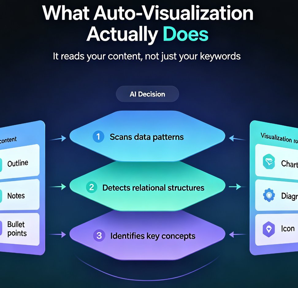
When you feed Zendeck an outline or a set of notes, the AI does three things:
- Scans for data patterns — numbers, percentages, trends, comparisons — and flags them as chart candidates.
- Detects relational structures — cause-and-effect, hierarchies, processes, timelines — and flags them as diagram candidates.
- Identifies key concepts that would benefit from icon-based reinforcement.
Then it generates suggestions. You don't have to accept everything it proposes — you review, tweak, and keep what works. But the starting point is no longer a blank canvas. It's a deck that already knows where visuals belong.
This matters more than you might think. Most people don't skip visuals because they're lazy — they skip them because they don't know where to start. Auto-visualization removes that decision paralysis by giving you a smart first draft. If you've ever ended up with messy AI-generated slides because you didn't know what to ask for, this is the fix.
03 The Visualization Decision Engine: Chart, Diagram, or Icon?
◉ How does Zendeck decide between a chart, diagram, or icon?
This is the part that separates a genuinely useful AI tool from a gimmick. The decision isn't random — it's based on the semantic structure of your content.
Here's a rough breakdown of how the logic works:
| Content pattern | What it signals | Suggested visual |
|---|---|---|
| Percentages, growth rates, comparisons | Quantitative data | Bar chart, line chart, pie chart |
| Steps, phases, sequential processes | Temporal flow | Flow diagram, timeline, numbered steps |
| Cause → effect relationships | Causal logic | Arrow diagram, fishbone, branching tree |
| Hierarchies, org structures | Levels & nesting | Tree diagram, pyramid, nested boxes |
| Abstract nouns (trust, growth, innovation) | Conceptual ideas | Icon + short label pairing |
| Pros/cons, before/after | Contrast | Split layout, comparison table |
The key insight here: the AI isn't just matching keywords to chart types. It's reading the relationship between ideas and choosing a visual that makes that relationship visible.
For example, if your outline says "Revenue grew 23% in Q3 after the pricing change," Zendeck doesn't just suggest "a chart." It suggests a bar chart with a highlighted Q3 bar — because the content implies a before/after comparison. That's the difference between auto-visualization and a random chart generator. And when it comes to icons, the suggestions pull from a unified set so your deck stays visually coherent — the same principle behind AI-generated icons and charts in asset libraries.
04 From Messy Outline to Visual Deck: A Real Workflow
Let's walk through what this actually looks like in practice. Say you're a corporate trainer building a session on "The 5 Stages of Team Conflict Resolution."
Step 1: Dump your content. You paste your rough notes into Zendeck — messy, bullet-pointed, half-formed thoughts included. The AI doesn't need polished prose; it needs your raw material.
Step 2: Let the AI propose the structure. Zendeck identifies that "5 stages" is a sequential process and suggests a flow diagram as the anchor visual for the overview slide. It also spots that you mentioned "escalation rate" and "resolution time" — both quantitative — and flags those as chart candidates.
Step 3: Review the suggestions. You don't have to accept everything. Maybe you want the flow diagram but prefer a horizontal timeline instead. You can adjust the visual type, tweak the colors, or swap the icon set. The point is, you're editing — not creating from scratch.
Step 4: Refine and brand. Once the visuals are in place, you apply your brand kit to make everything consistent. Fonts, colors, logo placement — all unified in one click.
Step 5: Ship it. The result is a deck where every complex concept has a visual counterpart, and the whole thing took you a fraction of the time it would have taken to design from scratch.
This workflow matters because the biggest time sink in presentation design isn't formatting — it's deciding what to visualize and how. Auto-visualization compresses that decision phase from hours to minutes.
05 Manual vs AI-Assisted Visualization: The Time Math
Let's be honest about the numbers. If you've ever built a custom diagram in PowerPoint, you know the pain: drawing shapes, aligning arrows, adjusting text boxes, re-aligning everything when you realize the layout is off. It's not hard — it's just brutally slow.
Here's a realistic comparison of time spent creating visual elements manually versus with AI assistance:
| Visualization type | Manual (typical) | With Zendeck AI | Time saved |
|---|---|---|---|
| Data chart (bar/line) | 40-50 min | 3-5 min | ~90% |
| Process flow diagram | 50-70 min | 6-10 min | ~88% |
| Icon set for a concept slide | 25-35 min | 2-4 min | ~90% |
| Comparison matrix | 30-40 min | 4-6 min | ~87% |
And here's what that looks like visually:
The takeaway: auto-visualization doesn't just save you time — it changes what you're willing to attempt. When a diagram costs 60 minutes, you skip it and use text. When it costs 8 minutes, you include it. And that's the real win: your audience gets the visual explanation they needed, not just the one you had time to build. This is part of a broader shift toward AI-driven data visualization that's reshaping how decks are built.
06 When Auto-Visualization Shines (and When It Doesn't)
Auto-visualization is a powerful tool, but it's not magic. Let's be real about where it helps and where it doesn't.
Where it shines:
- Data-heavy content — quarterly reports, survey results, market trends. If your content has numbers, the AI will find them and chart them.
- Abstract concepts — anything that's hard to explain in words benefits from a visual anchor. Think organizational culture, learning theories, change management models.
- Process explanations — workflows, methodologies, step-by-step frameworks. These are natural diagram candidates.
- Training and education — when you're teaching something new, visuals reduce cognitive load and improve retention.
Where it doesn't:
- Deeply nuanced arguments — if your point relies on subtlety and caveats, a visual might oversimplify it. Use text for the nuance, visuals for the structure.
- Emotional or narrative content — storytelling slides often work better with imagery and minimal text than with data visualizations.
- When you're not sure what the visual means — if you can't explain why a chart is on the slide, neither can your audience.
The skill isn't in generating visuals — it's in knowing which ideas deserve visual treatment and which don't. Auto-visualization handles the "how." You still own the "whether." And as AI slide generation shifts from design to strategy, that judgment becomes the real differentiator.
07 Making It Stick: Best Practices for Visual Storytelling
Once you have auto-generated visuals in your deck, a few habits will make them dramatically more effective:
1. One idea per visual. If a chart is trying to show three different trends, split it into three charts. Your audience's working memory is limited; don't overload it.
2. Label what matters. The AI will generate clean, readable labels — but make sure the headline of each visual states the takeaway, not just the topic. "Revenue grew 23% after pricing change" beats "Q3 Revenue" every time.
3. Keep icons consistent. If you're using icons to reinforce concepts, stick to one style across the deck. Zendeck's asset library makes this easy — you can pull from a unified icon set instead of mixing styles. And if you want to take it further, you can even add interactive charts to let your audience explore the data themselves.
4. Let the visual breathe. White space isn't wasted space. A diagram with room around it reads as confident; a crammed slide reads as anxious.
5. Test your deck on someone who hasn't seen it. If they can explain your core concept back to you after a 30-second glance at the visuals, you've nailed it. If they're confused, the visual isn't doing its job.
FAQ
Q: How does Zendeck's auto-infographic feature decide which visualization to use? A: Zendeck analyzes the semantic structure of your content — detecting data patterns, relational structures, and key concepts — then matches each to the most effective visual format. Percentages and trends become charts; processes become flow diagrams; abstract concepts get icon reinforcement.
Q: Can I customize the charts and diagrams Zendeck generates? A: Yes. Auto-visualization produces a smart first draft, but you retain full control. You can change the visual type, adjust colors and fonts, swap icons, or replace a suggested visual entirely. The feature is designed to accelerate your workflow, not override your judgment.
Q: Does auto-visualization work with existing content or only new outlines? A: Both. You can paste a rough outline, import a Word document, or bring in existing slide content. Zendeck will scan whatever you provide and suggest visual treatments for the parts that need them.
Q: What types of content benefit most from auto-infographics? A: Data-heavy reports, abstract concepts, process explanations, and educational content benefit the most. If your material involves numbers, relationships, or step-by-step logic, auto-visualization will find the visual structure your audience needs.