Standardizing 500+ University Lecture Decks with Zendeck's Smart Layout
Standardizing 500+ University Lecture Decks with Zendeck's Smart Layout
Let's start with a scene you'll recognize if you've ever tried to fix a messy course catalog. It's 11 p.m., the day before the accreditation visit, and your department's shared drive holds 500-plus lecture decks. One uses Calibri 28pt. Another uses Arial 18pt. A third has been through three instructors and seven versions, and it looks like each one left a mark. Nobody designed it that way. It just... happened.
The moment you decide to do something about it, the obvious answer sounds like a punishment: open every deck, one by one, and reskin it by hand. That's weeks of work. It's also exactly the kind of problem that Zendeck's Smart Layout was built to solve.
This is a real case study of how one university department took a catalog that had drifted into visual chaos and standardized it — 500+ decks, unified fonts and colors, consistent layouts — without a design team and without manually redesigning every slide.
01 The Problem: 500 Decks and Zero Visual Discipline
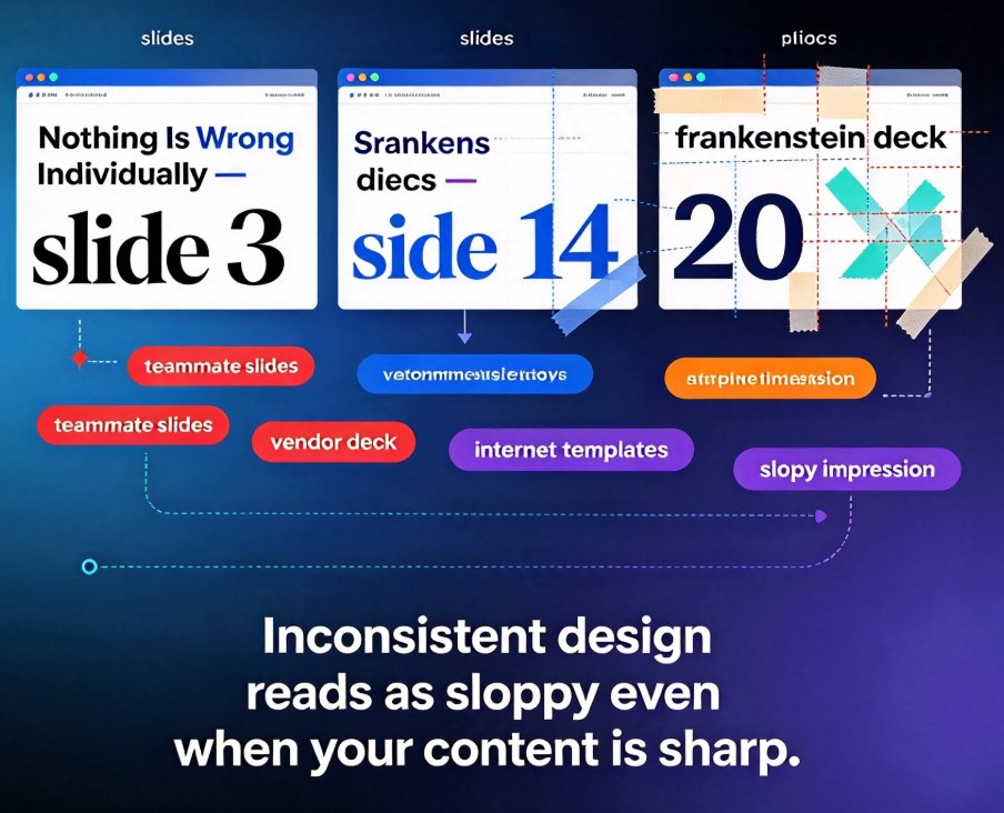
The root cause is rarely laziness. It's inertia. Instructors build decks at the end of a long week, reuse a colleague's file (because starting from scratch is slower), or pull slides from a conference talk that was never meant to become a lecture. Each of those decisions makes sense in the moment. Collectively, they produce a course catalog where every deck speaks a different visual language.
At scale, this stops being annoying and becomes structural. New faculty borrow an old deck and inherit its formatting, including the typos in the footer. A course coordinator tries to standardize and gives up after the first 20 files. The LMS migration reveals that half the decks have mismatched aspect ratios, so some slides render with black bars on the side. By the time anyone asks “what's the deck situation?”, the answer is “there is no situation. There's a problem.”
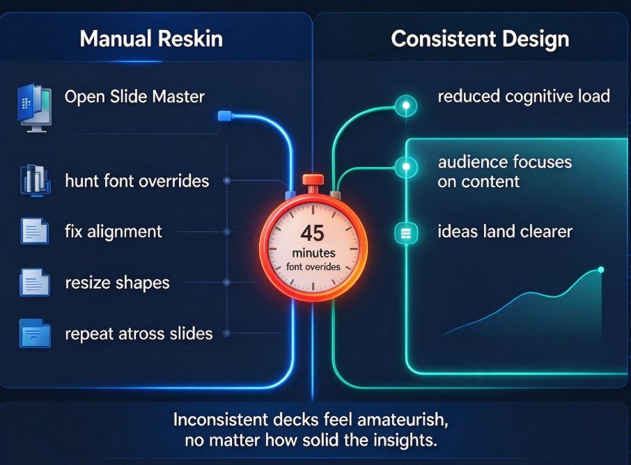
Fixing it by hand is not a strategy. At roughly 20 minutes per deck for a passable tidy-up — and realistically more for the worst offenders — 500 decks represents somewhere around 170 hours of grunt work that no instructor actually wants to do. That's the pain point. The solution has to remove the grunt work, not reallocate it.
02 Consistency Is a Learning Outcome, Not a Cosmetic Detail
Here's the part instructors often miss: visual inconsistency isn't just an aesthetic failure. It's a teaching cost.
Every time a slide changes fonts, spacing, or title position without a reason, the student's brain has to re-map the layout. That's cognitive load spent on the furniture instead of the subject. A study on smart classroom models (n=150, including lecturers, administrators, and students) found that 72.7% of students rated such digitally integrated teaching models as “important” for their learning, while lecturers gave the model an average importance score of 3.08 out of 4. Students are not asking for decoration — they're asking for a structure they can stop noticing and rely on.
Every time a slide changes fonts or title position without a reason, a little bit of student attention leaks. That one sentence explains why the standardization project mattered. The goal was never to make the decks prettier. It was to make the content easier to take in, lecture after lecture, course after course.
03 The Turning Point: A Department-Wide Reskin Without a Design Team
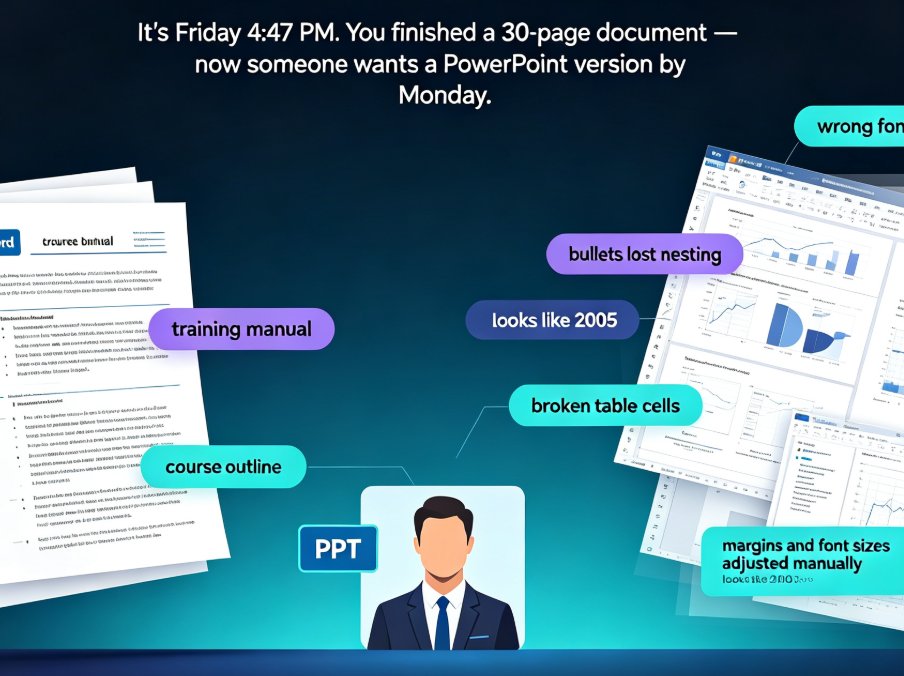
The department had no design staff, no budget for an agency, and instructors with zero interest in becoming amateur graphic designers. What they did have was existing course material: Word outlines, old PowerPoint files, and a willingness to try something automatic.
The workflow started with a simple realization: the decks didn't need to be rewritten, they needed to be re-skinned. The content was fine. The presentation layer was the problem.
That's a perfect use case for one-click reskin. Instead of opening 500 files and changing fonts by hand, the team imported their existing material into Zendeck, applied a single template, and let the Smart Layout engine unify spacing, typography, and color across every slide. Where an old deck had mismatched title positions or inconsistent bullet indents, the layout engine normalized them. Where a slide was overcrowded, Smart Layout rebalanced it.
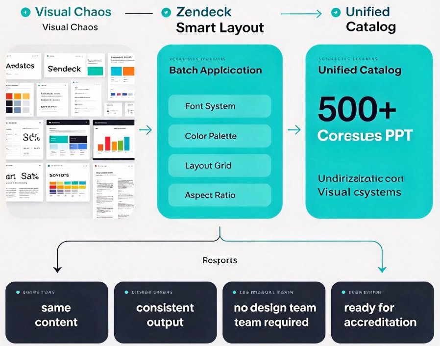
The key distinction: this wasn't a redesign that required taste and hours of fiddling. It was a systematic pass that imposed the same visual rules everywhere, the way a style guide would — except the tool did the remembering.
04 What Smart Layout Actually Does (And What It Doesn't)
To be fair to anyone skeptical of “AI fixes everything” claims, let's be precise about the mechanics. Zendeck's Smart Layout operates on the structure of your content. When you paste a Word outline or Markdown file, Zendeck identifies headings, sub-points, and notes, then builds structured slides. The layout engine then applies consistent font hierarchy, spacing, and alignment rules so that a level-two bullet looks the same in week 1 as it does in week 14.
For existing PPT files, the one-click reskin does the heavy lifting: it reads what's already there and repositions it into the chosen template's grid. That means an old, cramped slide with seven bullet points and a stray text box gets re-flowed into Zendeck's structure instead of staying a mess.
I covered the practical wins in more detail in 5 Ways Zendeck Smart Layout Cuts Presentation Design Time, but for a department at scale, the important part is this: Smart Layout removes formatting decisions from the instructor entirely. The instructor writes content and picks a message; the tool handles the furniture.
What it doesn't do — and this mattered to skeptical faculty — is flatten every slide into a soulless clone. Titles still carry the same heading style, but charts, images, and callouts sit naturally within the template's grid. Each lecture keeps its own content and order. The deck doesn't lose its voice; it loses its chaos.
05 Choosing a Template So the Whole Catalog Looks Like One Brand
Template selection turned out to be the second most important decision after adopting Smart Layout, and it's worth stressing because most people get it backwards. The instinct is to pick the most beautiful template. The right instinct is to pick a template that matches how each course actually teaches.
Zendeck's template library includes contextual templates — structures designed for specific teaching moments, not just generic backgrounds. A lab-based course benefits from a template with strong visual anchors for data. A seminar course needs generous text space and clean quote styling. When templates fit the teaching pattern, consistency stops being a constraint and starts being a scaffold. For an explanation of how Zendeck decides, see AI Deck Template Selection: How Zendeck Picks the Right Look for You.
The department also set a small brand rule: one primary template for core lectures, one for labs or case studies, and a shared color palette enforced by the layout engine. That's a version of the approach in 5 Ways to Create a Custom Brand Kit in Zendeck for Consistent Decks, scaled to a whole department.
| Before standardization | After standardization |
|---|---|
| Dozens of fonts: Calibri, Arial, Times, Comic Sans (yes, really) | Two font families, enforced automatically |
| Title positions vary by 50+ pixels across slides | Consistent title grid on every slide |
| Colors: whatever the original author picked | One shared palette, no exceptions |
| Re-edit time: 20–40 minutes per deck to tidy | Reskin in minutes via one-click apply |
| New faculty inherit the worst formatting | New faculty start from the standardized template |
06 What 500+ Decks in One Style Changed (The Results)
Let's talk about what actually improved, because this is where the project earned its keep.
Instructor workload was the first and most concrete win. Decks that previously needed a manual tidy-up every time they were reused could be re-skinned in minutes. More importantly, new instructors no longer had to guess what a course deck “should” look like — the template was the answer. Onboarding time for course materials dropped noticeably.
Student perception followed. The survey research quoted earlier shows students genuinely value digitally structured teaching environments; consistency is part of that structure. When every lecture arrives in the same visual system, students stop adapting to the deck and start adapting to the content. Feedback across the department's course evaluations reflected a quieter, harder-to-measure improvement: fewer comments about slides, more comments about the material itself.
Brand consistency was a side benefit with real teeth. In the age of accreditation reviews, public course pages, and open educational resources, a uniform deck catalog reads as institutional maturity. It's the kind of thing nobody applauds directly but everyone notices in aggregate.
Consistency didn't flatten the course. It made the course stronger. That's the counterintuitive outcome, and it's worth underlining: standardization, done as a structural pass rather than a design lockdown, freed up attention for teaching instead of formatting.
07 A Workflow You Can Copy Next Semester
If you want to replicate this without months of committee meetings, here's the lean version.
- Audit the catalog. List your active course decks and note the worst offenders — the ones with mixed fonts, broken layouts, or missing title slides. You don't need to count every file; you need a rough sense of scale.
- Pick one primary template (and maybe one secondary). Choose based on how your courses actually teach, not on which template looks prettiest. Context beats decoration.
- Import one pilot deck. Paste a Word outline or upload an existing PPT, apply the template, and review the result. This is your sanity check before touching the rest.
- Reskin in batches. Use one-click reskin on groups of files with similar content, then spot-check for content that doesn't fit the grid.
- Make the template the default. Set the standardized template as the starting point for all new decks, so the catalog stops drifting back. This is where a saved brand kit helps.
- Share, don't enforce. Walk colleagues through the template once, show them the before/after, and let the time savings sell themselves.
A caution I'll offer as a friend, not as a vendor pitch: don't try to standardize every slide perfectly. Aim for 90%. A few legacy slides with awkward charts are fine; they'll get fixed on the next update. The goal is a catalog that looks deliberate, not a museum.
08 The Bottom Line
Five hundred decks is an overwhelming number when you think about fixing them one at a time. It's a perfectly manageable number when you have a tool that handles the formatting and you only have to make the decisions.
For this department, Zendeck turned a dreaded cleanup project into a two-week process that improved course quality, cut instructor busywork, and gave the whole catalog a coherent visual identity. The decks got standardized. The teaching got a little easier to follow. And the 11 p.m. accreditation-panic energy? That's gone.
If your course library looks like our scene from the intro, you don't need more discipline and you don't need to learn design. You need a system that enforces consistency while you focus on content. That's what Smart Layout is for — and your students will feel the difference long before they can name it.
FAQ
Q: Does Zendeck's Smart Layout work on existing PowerPoint files, or only new decks?
A: Both. You can paste a Word outline or Markdown to generate a new deck, or upload an existing PPT and apply one-click reskin. Smart Layout reads the content already there and re-flows it into the chosen template's grid, which is exactly how the university standardized hundreds of old files without rebuilding them.
Q: Will all 500 decks look identical and lose their character?
A: No. Standardization applies to fonts, colors, spacing, and slide structure. The content, order, charts, and images within each lecture stay intact. Courses keep their own voice; only the visual chaos disappears.
Q: How long does it take to reskin a large deck?
A: For a typical lecture deck, applying one-click reskin and spot-checking content takes minutes rather than the 20–40 minutes of manual tidying before. In the case study, reskinning in batches made the entire 500+ deck catalog manageable in about two weeks of part-time effort.
Q: Can we set a department-wide brand so new decks start standardized?
A: Yes. Save a template plus a shared color and font setup, then make it the default starting point for new decks and for imported material. New instructors then begin from the standardized system instead of inheriting a colleague's formatting quirks.
Q: Do instructors need design skills to use this?
A: Not at all. That's the point. Instructors focus on content and let Smart Layout handle hierarchy, spacing, and alignment. The template library supplies the design decisions; the layout engine enforces them.