Why Does Zendeck's Smart Layout Produce Consistent Slides? FAQ
Why Does Zendeck's Smart Layout Produce Consistent Slides? FAQ
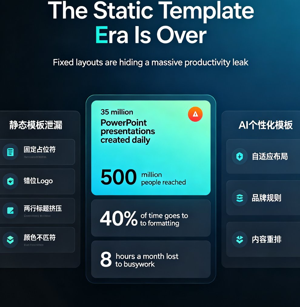
Let's be honest — you've probably stared at a finished deck and thought, "Why does slide 7 look like it belongs in a different presentation?" It's not your content. It's your formatting.
Mismatched fonts, drifting colors, uneven spacing — these small inconsistencies pile up until your audience spends more energy decoding your layout than absorbing your message. Research shows that consistent design helps audiences stay focused on content rather than decoding formatting (Deckary, 2024).
That's where Zendeck's Smart Layout comes in. This FAQ breaks down exactly how the auto-formatting engine works, when it shines, and when you should still design manually.
01 — Why do decks fall apart visually?
The usual suspects:
- Font chaos: Someone pastes text from a Word doc, and suddenly you have Calibri next to Arial next to whatever default your template shipped with.
- Color drift: Slide 3 uses the brand blue; slide 12 uses a slightly darker version because someone eyedropped the wrong shade.
- Spacing roulette: Text boxes that are 20 pixels from the edge on one slide, 35 on the next.
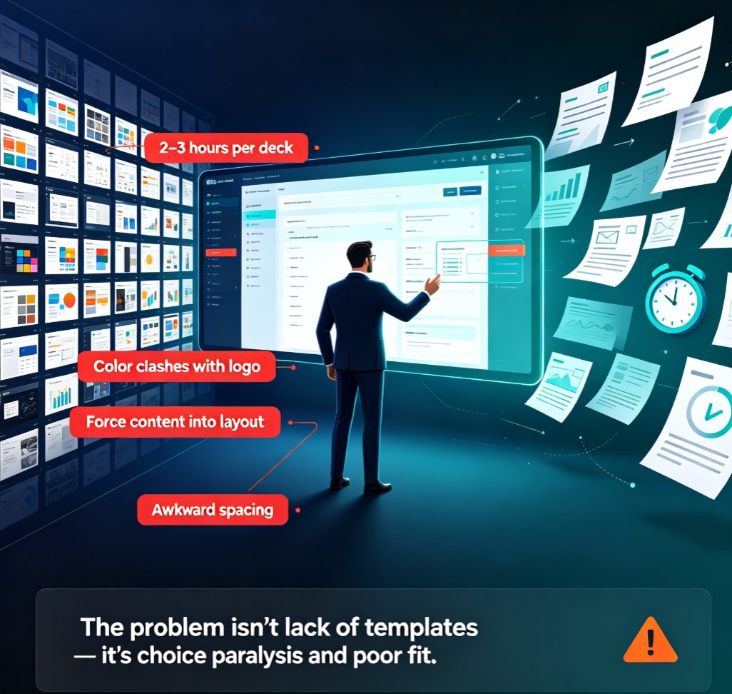
When multiple people build different sections of the same deck — or when you import slides from an old template — these inconsistencies multiply. The deck stops feeling like one cohesive story and starts feeling like a patchwork.
This is exactly why your AI-generated slides still look messy even when the content is solid. The content isn't the problem; the formatting is. And the cost of that mess is real: audiences spend mental energy decoding your formatting instead of absorbing your message. In a 30-minute presentation, that's minutes of attention lost to layout confusion.
The fix isn't more manual effort. It's automating the rules.
When every slide follows the same visual rules, your audience can focus on the content without being distracted by mismatched design elements. Every slide feels intentional, polished, and professional (Ink Narrates, 2024).
02 — What exactly does Smart Layout do?
Smart Layout is Zendeck's auto-formatting engine. When you enable it, it scans every slide in your deck and applies a unified visual system — fonts, colors, spacing, and alignment — across all of them in one pass.
Think of it as a design manager who walks through your deck with a ruler and a brand guide, fixing everything that doesn't match.
The core promise: one click, one consistent deck. No design skills required.
Here's what it touches:
| Element | What Smart Layout enforces |
|---|---|
| Typography | One font family for headings, one for body text, consistent sizes |
| Color palette | Brand colors applied to backgrounds, text, and accents |
| Spacing | Uniform margins, padding, and line heights across all slides |
| Alignment | Grid-based positioning so elements line up across slides |
| Charts & tables | Consistent axis labels, colors, and formatting |
The beauty is that it removes the dependency on designers while keeping every slide on-brand. Your team can focus on content while the templates handle the visual and structural consistency (Ink Narrates, 2024).
Over time, this approach ensures that every deck — even if created by different people — feels cohesive and professional. That's a huge win for teams that produce decks regularly, whether it's sales enablement, training, or quarterly business reviews. You stop worrying about whether slide 14 matches slide 3 and start worrying about whether the message lands.
03 — The three rules that make it work
Rule 1: One typeface system
Fonts are the fastest way to make a deck look unprofessional. Smart Layout locks your deck to a single heading font and a single body font, then applies consistent sizes based on slide hierarchy. No more mixing serif and sans-serif like it's a ransom note.
Rule 2: Brand palette enforcement
Colors are where most decks drift. Smart Layout pulls from your brand kit and applies the same palette to every slide — no more "close enough" shades. If you've set up your brand colors in Zendeck, they get applied automatically across backgrounds, text, and accents. This is the same principle behind setting up brand kits for consistent presentations — the setup pays off every time you generate a new deck.
Rule 3: Grid-based spacing
Small inconsistencies in margins and alignment are subtle but noticeable. Smart Layout uses grid guides to align every element, keeping consistent padding around images, text boxes, and charts. We often see teams eyeball spacing and alignment, which leads to subtle inconsistency — precise placement makes your presentation look polished and professional (Ink Narrates, 2024).
These three rules work together. Fix fonts alone, and the color drift still distracts. Fix colors, and the spacing still feels off. Smart Layout handles all three in one pass, which is why the result feels cohesive rather than patched.
04 — Smart Layout vs. manual design: when to use which
Not every deck needs the same treatment. Here's a practical breakdown:
| Scenario | Smart Layout | Manual design |
|---|---|---|
| 50-slide corporate deck, tight deadline | ✅ Best choice | ❌ Too slow |
| Pitch deck needing a unique visual identity | ✅ Good starting point | ✅ Add custom touches |
| One-off creative presentation | ⚠️ Use as a base | ✅ Full control |
| Team collaboration across departments | ✅ Ensures consistency | ❌ Inconsistencies creep in |
| Training or courseware with many modules | ✅ Uniform look across modules | ⚠️ Only if you have design skills |
The rule of thumb: if consistency matters more than uniqueness, let Smart Layout handle it.
For teams that need to maintain brand consistency across hundreds of slides, Smart Layout combined with a well-configured brand kit is the fastest path to a professional result. It's the difference between hoping everyone follows the style guide and knowing they will. This is the same logic behind zero-design brand governance — AI templates enforce consistency so humans don't have to remember it.
05 — How to get the most out of Smart Layout
A few practical tips from teams that use it daily:
-
Set up your brand kit first. Smart Layout pulls from your brand kit, so the better your kit is configured, the better your output. Colors, fonts, logo placement — get these right once, and every deck benefits.
-
Run Smart Layout as a final pass. Even if you build slides manually, run Smart Layout before you export. It catches the small drifts that accumulate during editing. This is especially useful when you're dealing with AI-generated slides that look off-brand — one pass fixes them all.
-
Use it selectively for creative decks. If you're building a one-off creative presentation, apply Smart Layout to the base structure, then customize individual slides. You get consistency where it matters and freedom where it doesn't.
-
Combine with PPT-to-video. Once your deck is visually consistent, it's ready to become a narrated micro-course or training video. Consistent slides make for cleaner video exports — check out our courseware design resources for more on this workflow.
FAQ
How often should I run Smart Layout on a deck?
Every time you finalize a presentation — especially if multiple people worked on it. Do a quick audit for alignment, spacing, colors, fonts, and chart styles. If multiple people are working on a deck, a second review is essential to catch inconsistencies (Ink Narrates, 2024).
Can Smart Layout work with my existing brand colors?
Yes. Smart Layout pulls from your brand kit, so if you've set up your brand colors in Zendeck, it applies them automatically across backgrounds, text, and accents. No need to re-enter hex codes on every slide.
Will Smart Layout override my intentional design choices?
Only if you let it. You can apply it selectively to specific slides or run it across the whole deck. It's a tool, not a dictator — you stay in control of the final look.
Does Smart Layout work with imported Word documents?
Yes. When you import a Word outline or Markdown, Smart Layout formats the generated slides consistently from the start. That means fewer fixes later.