From Excel to Visual Story: Data Slides Made Easy with Zendeck
From Excel to Visual Story: Data Slides Made Easy with Zendeck
Picture this: Tuesday afternoon, the Excel file is verified, the numbers are squeaky clean, and Friday's board meeting is already on your calendar. You open PowerPoint, paste the immaculate table, and the slide... ruins it. Thirty rows of data stare at an audience that will give them exactly two seconds. That gap between a clean spreadsheet and a persuasive slide is where good ideas go to die, and if you've ever felt your stomach drop when someone says “just turn that spreadsheet into slides,” this guide is for you.
Let's be real: turning Excel-to-PPT data slides into something watchable is a two-part skill — the analysis part (which most of us are decent at) and the storytelling part (which nobody taught us). The good news? The second part is a repeatable process, not a talent. Below is the whole data-to-deck pipeline — cleaning, chart selection, layout, context, and delivery — and where Zendeck removes the friction, so you walk into that Friday meeting with a deck your audience actually understands.
01 | Why Most Data Slides Fail (Hint: It's Not the Data)
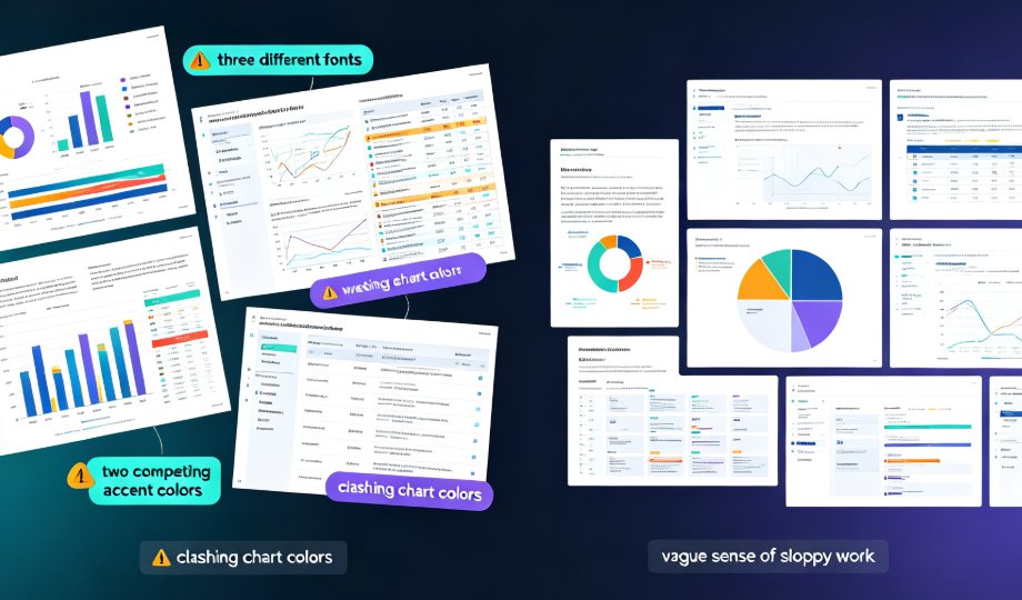
Every bad data slide I've audited shares the same DNA. It's not bad data; it's bad translation. Three failure patterns show up over and over:
- The wall of rows — a raw table pasted intact, every decimal point preserved, zero hierarchy.
- The chart that means nothing — a pie chart with 11 slices, or a 3D bar chart with a legend nobody reads.
- The orphan numbers — figures floating in space, no annotation, no timeframe, no “so what.”
The root cause is simple: we treat slides as containers for information instead of as arguments to be felt. A slide should make a claim; the chart is the evidence; the headline is the conclusion.
The fix isn't more design talent — it's a pipeline that respects how a human actually processes a slide: scan the headline, glance at the visual, connect the dots in five seconds flat.
02 | The Data-to-Deck Pipeline: Five Stages That Kill the Copy-Paste Habit
Copy-pasting a table is the fastest route to a slide nobody remembers. A better instinct: run every data slide through a mini editorial process. Five stages, every single time:
- Clean — cut the noise; keep only the rows that serve your argument.
- Shape — pick the chart that matches the relationship you want to show.
- Structure — organize the slide around one message with a clear visual hierarchy.
- Layer — add annotations, icons, and callouts that add meaning, not decoration.
- Deliver — decide the format: static slide, interactive deck, or narrated micro-course.
The platform gives you a hand at every stage, and — this is the part people miss — it's the pipeline, not any single feature, that makes the difference. Most folks try to fix only stage 2 (the chart), half-clean stage 1, and then wonder why the slide still waffles.
Here's where the hours go when the process stays manual versus when it's assisted, based on the work patterns of consultants and educators I've talked with:
Estimates based on common manual workflows for a 20-slide quarterly review deck. Your mileage will vary.
No matter where you start, the pipeline stays the same — the tool just compresses the painful parts.
03 | Clean the Data Before the Story Can Breathe
Most people skip stage 1 and regret it at stage 4. Cleaning isn't glamorous; it's what separates a “data-heavy” deck from a “believe-the-data” deck.
Three quick wins:
- Delete before you defend. Remove every row that doesn't serve the argument, no matter how proud you are of that 40-question survey.
- Standardize the formats. Dates, currencies, and units must look identical in every slide. A sheet mixing “mm/dd/yyyy” with “Jan 5” reads as sloppy before a single chart is drawn.
- Watch the decimals. Three significant digits are plenty for most business slides. Ten decimals signal anxiety, not precision.
A quick sanity pass: if a number column has values that make a finance auditor twitch — missing cells, obvious outliers, negatives where they make no sense — fix it in Excel, not on the slide.
A clean spreadsheet is the most underrated design tool you own.
Once the data is tidy, the handoff into Zendeck is effortless: paste a range or upload the sheet, and the platform keeps the numbers live while the chart preview refreshes as you refine the range you've chosen.
04 | Chart Selection: Match the Relationship, Not the Fashion
Excel offers 17 chart types. Your slide needs exactly one. A rule that ends most arguments: pick the chart that mirrors the relationship you're communicating — comparison, trend, part-to-whole, or correlation — not the one that looks most impressive in the preview pane.
| What you want to show | Best chart | When to avoid it |
|---|---|---|
| Compare categories | Column or horizontal bar | More than 8 categories? Flip to a horizontal bar so labels fit |
| Change over time | Line chart | Fewer than 4 data points — a small table is clearer |
| Part to whole | Pie or donut | More than 5 slices; viewers will tune out the smaller ones |
| Relationship between variables | Scatter plot | If your audience won't instantly read the axes, skip it |
◉ What's the deal with pie charts?
Pies get a bad rap because people use them for everything, including comparison. Used properly — three to five parts of a single whole, one slice emphasized — a pie is fast and intuitive. The moment you consider adding a second pie, switch to a stacked bar or a column chart. That's not a design opinion; it's how quickly a human brain compares areas versus lengths.
Zendeck's chart library groups visuals by purpose, so when you pick a bar, line, or donut, you're selecting a visual argument, not a decoration. You can adjust colors, strip gridlines, and add data labels without wrestling with cascading style menus — the stuff that normally eats an afternoon.
For a sense of where charting is heading, here's how AI data visualization keeps evolving in 2026.
05 | Let Smart Layout Handle the Visual Hierarchy
Data slides fail on hierarchy more than on chart choice. That's why consultants obsess over the “one message per slide” rule: it forces you to make a claim, then defend it.
A strong data slide has three levels:
- The headline — a takeaway, not a label. “Revenue grew 23% in Q3” beats “Quarterly Revenue.”
- The visual — the chart or table, sized to dominate the slide.
- The footnote — source, methodology, time frame, and caveats in small type.
If your headline reads like a file name, you're not telling a story; you're describing a document.
Your headline should be the conclusion of the slide, not the title of the document.
This is where Zendeck's smart layout earns its keep. Paste data, pick the chart, and the layout engine handles alignment, spacing, and color consistency automatically — no nudging, no “why is this box two pixels off.” Apply a custom brand kit in one click and every slide in the deck carries the same visual voice. That's the hour-eating polish work most non-designers dread, automated.
For the mechanics behind the magic, this piece on smart layout walks through the details.
06 | Add Context, Not Clutter
The fastest way amateur decks bury good charts: they stop at the chart. A bar chart of monthly sign-ups is fine. Add one callout — “Product launch in June” — and it becomes a story.
Three context layers worth adding:
- Annotations — boxed notes that point at the inflection point, the anomaly, or the benchmark.
- Icons — a small icon next to each metric shortens reading time with process or category data.
- Reference lines — a dashed line or shaded band showing an industry average turns relative performance into an argument.
Run the 3-second test: if you can state the slide's core takeaway within three seconds of looking at it, the context layers are working. If not, cut layers — not data.
The asset library of AI-generated icons and charts is where you pull pre-built visuals that slot into slides without breaking alignment — no more hunting for a consistent icon style across five free-icon websites.
07 | Don't Stop at Static Slides: Interactivity and Narration
Once the data slide is built, you don't have to freeze it into a static PDF. Data storytelling gets its legs when the deck can respond to the audience.
Two natural next steps:
- Interactive charts. If the deck lives as a shared link, let stakeholders hover, expand, or filter. The platform pairs with interactive charts from Zendeck's asset library instead of forcing you to embed a second web tool.
- Narrated video. For training or async meetings, convert the deck by adding narration to slides with PPT-to-video. When the slide says “here's the quarter we pivoted,” hearing a voice explain it changes the weight of the number.
This doesn't replace the slide; it multiplies it. A data deck that also works as a three-minute narrated video will actually get consumed.
08 | A Field Guide: 5 Reusable Habits for Data Storytelling
Carry these into your next deck:
- One message per slide. If a second message sneaks in, the slide needs to split.
- Start with the conclusion. Write the headline before you build the chart; the chart serves the headline, not the reverse.
- Simplify decimals. Round to what an audience can compute in their head.
- Label the axis fully. Units, time frame, and source notes on every chart — these are trust signals.
- Present, then defend. The slide is the claim; the appendix holds the backup data. Stop parking 40 columns of detail in the main deck.
◉ Who is this process for?
Anyone who presents numbers: analysts, founders, teachers, HR teams, and content operators. If your audience has ever asked “wait, why did that jump?” you've found your workflow. If you're building shared courseware or training materials, the courseware design category has more where this came from.
FAQ
What's the fastest way to turn an Excel file into presentation slides?
Clean the dataset first — remove duplicates and standardize formats — then paste the relevant range into Zendeck. Choose the right chart from the chart library and let smart layout handle fonts, spacing, and alignment. Most decks take minutes instead of the hours spent manually formatting each slide.
Do I still need design skills to make data slides look professional?
No. Zendeck's smart layout and template library remove the need for manual design skill. Your job narrows to two things: choosing the right chart for the relationship you're showing, and keeping the slide to one core message. The tool enforces the visual consistency that usually separates amateurs from professionals.
How do I choose the right chart when Excel suggests several?
Match the chart to the relationship: column or bar charts for comparing categories, line charts for change over time, pie or donut charts only for part-to-whole with five or fewer slices, and scatter plots for correlations. If you're torn, ask yourself: What question does the audience need answered in five seconds? That question settles it.
Can I import raw Excel files directly into Zendeck?
Yes. You can paste a data range or upload the spreadsheet, and Zendeck turns it into visual elements you can refine. The key is to clean the data before importing — delete irrelevant rows, standardize dates, and keep only the numbers you plan to use.
Should every data slide contain only one chart, or can I combine several?
One chart — or one combined visual — per slide is the safe default. A slide with multiple charts splits attention five ways. If you need to show several relationships, split them across slides so each slide makes its own single claim.