Zendeck Asset Library: Create Stunning Slides Without Design Skills
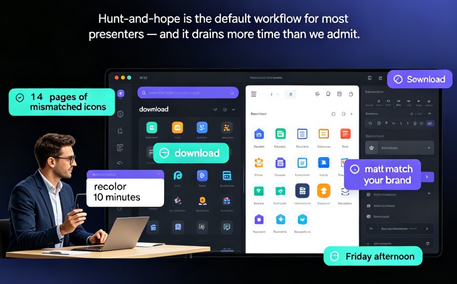
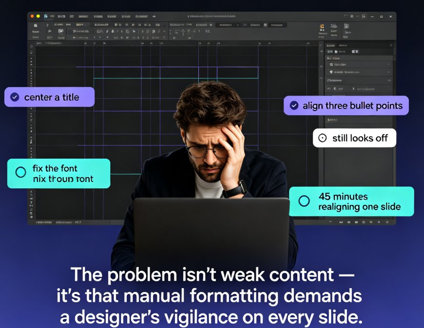
Let's be real: you've probably spent an hour on a slide deck, nudged a text box three pixels to the left, and still felt it looked "off." The content was solid. The logic was tight. But the slides looked like they were designed by someone who gave up halfway through.
Here's the thing nobody tells you: great-looking slides aren't about artistic talent — they're about having the right building blocks and a system to arrange them. That's exactly what Zendeck's asset library is built for.
In this guide, I'll walk you through how to use Zendeck's built-in icons, charts, and illustrations — and, more importantly, how to pair them with smart layout so your slides look professionally designed in minutes, not hours.
01. The Real Reason Your Slides Look "Off" (Even When the Content Is Fine)
You know the feeling. You've written a killer outline. The argument flows. The data is solid. Then you open the deck and... it looks like a Word document that got lost on its way to becoming a presentation.
The problem isn't your content. It's the visual vocabulary — or lack of it.
Most non-designers default to the same three moves: - Plain text bullets (readable, but forgettable) - A generic stock photo (irrelevant, but at least it's colorful) - Default PowerPoint shapes (functional, but dated)
None of these moves are wrong. They're just... safe. And safe slides don't get remembered.
The fix isn't learning Photoshop. It's giving yourself a library of high-quality visual assets and letting a smart layout system arrange them for you.
That's the core idea behind Zendeck's asset library: you don't need to know how to draw an icon, build a chart, or compose an illustration. You just need to know which one fits your message — and let the tool handle the placement.
02. What's Actually Inside the Zendeck Asset Library
Before we get into workflow, let's talk about what you're working with. Zendeck's asset library isn't a random pile of clip art. It's a curated collection of three main asset types, each serving a different purpose:
| Asset Type | What It Is | Best Used For | Example Scenario |
|---|---|---|---|
| Icons | Simple, consistent line and filled icons | Emphasizing key points, replacing bullet lists | A 5-step process shown as 5 icons instead of 5 bullets |
| Charts | Pre-styled data visualizations (bar, line, pie, etc.) | Presenting numbers without spreadsheet clutter | Quarterly revenue shown as a clean bar chart |
| Illustrations | Larger visual scenes and metaphors | Setting tone, explaining abstract concepts | A "growth journey" illustrated as a winding path |
The key word here is consistent. Every icon in the library shares the same stroke weight and style. Every chart uses the same color palette. Every illustration matches the aesthetic of Zendeck's templates. That consistency is what makes a deck look "designed" rather than "assembled."
When every visual element shares the same style, your deck automatically looks cohesive — even if you picked the assets in under five minutes.
This matters more than you'd think. Inconsistent visuals are the #1 giveaway of an amateur deck. One slide uses thin-line icons, the next uses chunky 3D clip art, and suddenly your presentation feels like a garage sale. The asset library removes that risk entirely because everything is designed to work together.
03. The Smart Layout Combo: Why Assets Alone Aren't Enough
Here's where most people get stuck. They find the perfect icon, drop it on the slide, and... it floats awkwardly in the corner. The slide still looks unfinished.
That's because assets are only half the equation. The other half is layout.
Zendeck's smart layout system is the secret sauce. When you add an asset to a slide, the layout engine automatically: - Aligns the asset with your text and other elements - Adjusts spacing to maintain visual balance - Resizes elements proportionally so nothing looks squished - Applies consistent margins across all slides
In other words, you don't position the icon. You place it, and Zendeck positions it for you.
This is a huge deal for non-designers. Alignment, spacing, and proportion are the three things that separate "designed" from "decorated" — and they're also the three things most people get wrong when they try to do it manually.
You don't need an eye for design when the tool has one built in. Your job is to choose the right asset; Zendeck's job is to make it look intentional.
If you want to dig deeper into how layout and templates work together, check out our guide on how Zendeck picks the right template for you — it explains the logic behind the scenes.
04. A 10-Minute Workflow: From Plain Outline to Polished Deck
Let's put this into practice. Here's a realistic workflow that takes about 10 minutes, assuming you already have your content ready.
Step 1: Import your outline (2 minutes) Paste your Markdown or Word outline into Zendeck. The AI generates a structured first draft — titles, bullets, and section breaks all in place. Don't worry about visuals yet; the goal here is to get your content into the tool quickly.
Step 2: Pick a template (1 minute) Choose a template that matches your audience. A corporate training deck needs a different look than a classroom lecture. Zendeck's template selection will suggest options based on your content, so you're not staring at a blank grid of choices.
Step 3: Swap bullets for icons (3 minutes) This is where the magic happens. Find a slide with a bulleted list and replace the bullets with icons. For example: - Instead of "Step 1: Research" → an icon of a magnifying glass - Instead of "Step 2: Draft" → an icon of a pencil - Instead of "Step 3: Review" → an icon of a checklist
Each icon takes about 10 seconds to find and place. Three bullets, three icons, done. The smart layout engine will align them neatly, so you don't have to fiddle with positioning.
Step 4: Turn data into charts (3 minutes) Find any slide with numbers — stats, percentages, timelines — and swap them for a chart. Zendeck's chart assets are pre-styled to match your template, so you don't need to fiddle with colors or fonts. Just pick the chart type that fits your message and drop it in.
Step 5: Add one illustration for the opener (1 minute) The title slide or section divider benefits from a single, strong illustration. It sets the tone for everything that follows. One good illustration beats five mediocre ones, so resist the urge to decorate every slide.
That's it. Ten minutes, and your deck went from "text on slides" to "a presentation that looks like someone cared."
05. Charts That Don't Look Like Spreadsheet Dumps
Data slides are where most decks fall apart. You've got a table with 14 rows, a pie chart with 9 slices, and a bar chart where every bar is a different color. It's information overload.
Here's the rule I've learned from years of reviewing decks: one slide, one message, one chart.
If your slide is about "revenue growth," show one line chart that makes the growth obvious. Don't cram in three charts about different metrics. The asset library helps here because each chart is designed to be clean and minimal — no 3D effects, no rainbow colors, no unnecessary gridlines.
For a deeper dive into turning raw data into compelling visuals, our guide on AI data visualization trends covers the 2026 best practices.
A clean chart beats a fancy chart every time. If your audience can't read the takeaway in three seconds, the chart is wrong.
One more tip: label your charts clearly. A chart without a title or axis labels is just a pretty shape. Zendeck's charts come with sensible defaults, but you should always double-check that the labels match your actual data.
06. Three Mistakes That Make Decks Look Amateur (and How to Fix Them)
Even with great assets, people still make the same three mistakes. Let's fix them.
Mistake 1: Using too many asset types on one slide One icon, one chart, and one illustration on the same slide is visual chaos. Pick one focal point per slide. If everything is emphasized, nothing is. A good rule of thumb: if a slide has more than three visual elements, cut it down.
Mistake 2: Ignoring the brand kit Your deck should look like it belongs to your organization. If you haven't set up a brand kit, Zendeck's brand kit guide shows you how to lock in your colors and fonts so every slide stays on-brand. This is especially important for client-facing decks and training materials.
Mistake 3: Forgetting that assets support the message, not replace it An icon of a lightbulb doesn't make a weak idea clever. Assets are seasoning, not the meal. Make sure your content is solid first, then use assets to elevate it. If you're struggling with messy AI-generated slides, our guide on why AI slides look messy and how Zendeck fixes it is worth a read.
07. FAQ
Q: Do I need design skills to use Zendeck's asset library? A: No. The asset library is designed for non-designers. Every icon, chart, and illustration is pre-styled and consistent, and Zendeck's smart layout handles alignment and spacing automatically. Your only job is to pick the right asset for your message.
Q: Can I use Zendeck's charts for data-heavy slides? A: Yes. Zendeck's charts are pre-styled to match your template and are designed to be clean and minimal. The key is to show one message per chart — if you have multiple data points, split them across multiple slides.
Q: How do assets combine with smart layout? A: When you add an asset to a slide, Zendeck's layout engine automatically aligns it with your text, adjusts spacing, and resizes elements proportionally. This ensures every slide looks balanced and intentional without manual positioning.
Q: Can I add my own brand assets to the library? A: Yes. You can set up a brand kit with your organization's colors, fonts, and logos, and Zendeck will apply them consistently across your deck. This keeps your assets and templates aligned with your brand identity.
Q: What's the fastest way to improve an existing deck? A: Start by replacing bullet lists with icons and turning data tables into charts. These two changes alone will dramatically improve the visual quality of most decks in under 10 minutes.
That's the whole system. Assets give you the building blocks; smart layout gives you the arrangement; and together they turn anyone — regardless of design experience — into someone who can produce decks that look professionally made.
If you want to explore more about making your slides look polished, browse the courseware design category for more tips and tutorials.