Visualize Spreadsheet Data in Presentations Without Design Skills
Let's be real: you've sat in that meeting. Someone pulls up a spreadsheet, zooms into column G, and starts narrating numbers like a radio announcer reading stock tickers. Ten minutes later, nobody remembers a single figure. The data was solid — the delivery was the problem.
Here's the thing: you don't need to be a designer to turn spreadsheet data into visuals people actually remember. With the right workflow, you can go from raw Excel rows to a polished, chart-rich deck in under fifteen minutes. This guide walks you through that exact workflow using Zendeck's AI layout suggestions and asset library — no design background required.
01 — Why Raw Spreadsheets Fail in the Boardroom
Pain point: raw data dumps create cognitive overload. When you drop a 40-row table onto a slide, your audience's brain has to do three jobs at once: read the numbers, figure out which ones matter, and keep up with your narration. Most people give up after the first two rows.
Solution: convert numbers into visual patterns. Charts and infographics let the brain process relationships instantly. A bar chart showing Q3 revenue spiking tells the story in two seconds; a spreadsheet column takes twenty.
Outcome: your audience remembers the insight, not the noise.
People remember roughly 65% of visual content three days later, compared to about 10% of text-only information. If your goal is to make numbers stick, visuals aren't optional — they're the whole point.
02 — What AI Data Visualization Actually Does (and Doesn't Do)
Let's clear up a common misconception. AI data visualization tools don't magically "understand" your business. What they do is handle the formatting, layout, and chart selection logic so you can focus on the story.
The core value: AI removes the mechanical work. When you feed raw data into a tool like Zendeck, it can:
- Detect which columns are numeric vs. categorical
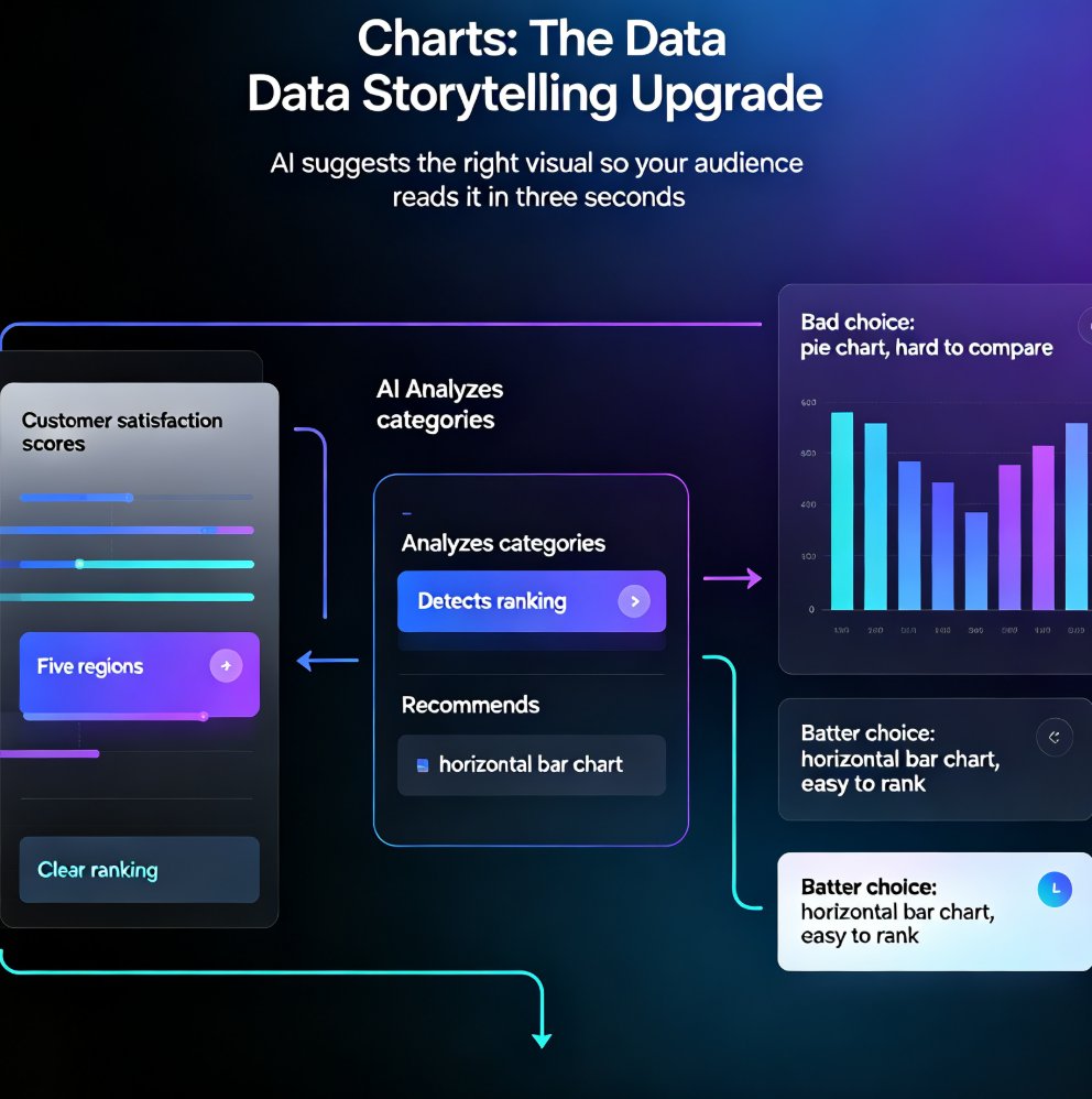
- Suggest appropriate chart types based on the data shape
- Apply consistent colors, fonts, and spacing automatically
- Resize and reposition elements so nothing overlaps
What it doesn't do: decide what your data means. You still need to interpret the numbers and choose the narrative. The AI handles the aesthetics; you handle the insight.
This division of labor is exactly why non-designers can now produce decks that look professionally designed. As we covered in our breakdown of AI-driven data visualization trends in 2026, the tools have matured from "chart generators" to "presentation partners" that understand context.
03 — Step-by-Step: Turn Spreadsheet Data into Slides with Zendeck
Here's the workflow I use, and it works whether you're preparing a quarterly business review, a training module, or a client pitch.
Step 1: Clean your data (5 minutes, max)
Before you import anything, strip out the noise. Remove empty rows, merge duplicate headers, and make sure each column has a clear name. Zendeck works best with tidy data — one row per record, one column per variable.
Quick tip: if your spreadsheet has a summary tab with totals, delete it before importing. Let the AI build the totals from the raw data, or you'll end up with double-counted numbers.
Step 2: Import your data into Zendeck
Zendeck accepts Word outlines, Markdown, TXT, and PDF imports. For spreadsheet data, the cleanest path is to paste your key numbers into a Markdown table or a simple text outline, then let Zendeck generate the deck structure. If you're working from a report, you can also import PDFs and raw text directly and let the AI extract the structure.
Step 3: Let AI suggest the layout
Once your content is in, Zendeck's AI layout engine proposes slide structures. For data-heavy content, it will typically suggest a mix of:
- A title slide with the key takeaway
- One chart per data point
- A summary slide with the "so what"
The magic happens here: you don't choose from 50 blank templates. The AI picks a starting point based on your content, and you refine from there.
Step 4: Build charts from the asset library
This is where Zendeck's asset library shines. Instead of hunting through Excel's chart wizard, you browse a curated set of chart styles — bar, line, pie, donut, scatter, and more — each pre-styled to match your deck's theme. Click a chart, drop in your numbers, and it renders instantly.
Step 5: Polish with a brand kit
If your organization has brand colors and fonts, set up a brand kit in Zendeck once, and every chart you create will automatically match. No more manually recoloring bars to hit the right hex codes.
04 — Choosing the Right Chart Type (Without a Statistics Degree)
The most common mistake I see isn't bad design — it's the wrong chart for the data. Here's a cheat sheet that covers 90% of business scenarios:
| Data relationship | Best chart type | When to use it |
|---|---|---|
| Change over time | Line chart | Revenue by quarter, user growth, temperature trends |
| Part of a whole | Donut or pie chart | Market share, budget allocation, survey breakdowns |
| Comparing categories | Bar chart | Sales by region, performance by team, cost by department |
| Distribution | Histogram | Age ranges, response times, score distributions |
| Correlation | Scatter plot | Ad spend vs. conversions, hours vs. output |
The rule of thumb: if you have more than six categories, skip the pie chart and use a bar chart. Pie slices below 5% become unreadable, and your audience will squint instead of listen.
05 — The Time Math: Why AI-Assisted Visualization Wins
Let's put some numbers on this. In my experience working with teams that switched from manual chart building to AI-assisted workflows, the time savings are dramatic:
These are typical figures from teams I've worked with — your mileage may vary, but the pattern holds. The biggest time sink in manual chart creation isn't the chart itself; it's the formatting, alignment, and re-coloring that eats 80% of your effort. AI tools eliminate that entire category of work.
If you want to see this in action, check out how a consultant built a data-rich case study deck in 10 minutes with Zendeck — the exact same workflow applies to your spreadsheet data.
06 — Common Mistakes and How to Dodge Them
Even with AI handling the heavy lifting, a few habits separate good data decks from forgettable ones.
Mistake #1: Chart spam. Just because you have 12 data points doesn't mean you need 12 charts. One powerful chart beats five mediocre ones. Pick the two or three numbers that matter most and build your story around them.
Mistake #2: Ignoring the "so what." Every chart needs a takeaway line. If your slide has a chart but no headline that says "Q3 growth accelerated 18%," you're making your audience do the analysis. Add a bold takeaway above each visual.
Mistake #3: Letting AI run wild. AI suggestions are starting points, not final answers. If the generated layout feels off, trust your instincts and adjust. Our guide on fixing messy AI-generated slides covers the common layout issues and how to correct them fast.
Mistake #4: Forgetting the narrative arc. Data decks fail when they're just a sequence of charts. Open with the problem, build through the evidence, and close with the decision you want your audience to make. Structure your slides like a story, not a dashboard.
FAQ
Q: Do I need design skills to create charts with Zendeck?
A: No. Zendeck's AI layout engine handles formatting, alignment, and color consistency automatically. You focus on the data and the story; the tool manages the aesthetics. The asset library provides pre-styled chart options that match your deck theme out of the box.
Q: Can Zendeck import data directly from Excel or Google Sheets?
A: Zendeck accepts Word outlines, Markdown, TXT, and PDF imports. For spreadsheet data, the cleanest workflow is to paste key numbers into a Markdown table or text outline, then let Zendeck generate the deck. You can also import PDF reports and let the AI extract the structure.
Q: What chart types does Zendeck's asset library include?
A: The library covers the essentials: bar, line, pie, donut, scatter, and histogram styles, all pre-styled to match your deck's theme. You can also mix in icons and illustrations to build infographic-style visuals.
Q: How long does it take to turn a spreadsheet into a presentation?
A: With clean data, most users go from spreadsheet to a polished 10-slide deck in 10-15 minutes. The AI handles layout and chart generation, so the bulk of your time goes into refining the narrative rather than formatting.
Q: Can I update charts after creating the deck?
A: Yes. You can edit the underlying data and regenerate the chart, or swap chart types entirely. Zendeck's layout engine reflows the slide automatically, so you don't have to manually reposition elements.
That's the full workflow. Next time you're staring at a spreadsheet and dreading the deck, remember: the numbers aren't the problem — the presentation is. And that's a problem you can solve in minutes, not hours.