Icons That Teach: Zendeck's Visual Library for Clearer Courseware
You spent an hour picking icons for your new courseware. They look sharp, modern, on-brand. Then you run the lesson, and someone asks why the lightbulb means "brainstorm" and not "electricity." Another learner misreads the process-flow slide entirely. Sound familiar? The problem isn't your taste. It's that most of us choose visuals for how they look, not for what they teach.
Let's be real: in a learning context, every visual either carries meaning or steals attention. There's no neutral option. A decorative icon that doesn't match the concept forces learners to decode it, burning mental energy you'd rather spend on the lesson itself. That's the hidden cost of "pretty" courseware.
The fix isn't more design talent. It's a set of simple selection principles — plus a library that makes following them effortless. That's exactly where Zendeck's asset library comes in.
01 Why Your Courseware Visuals Aren't Teaching (Yet)
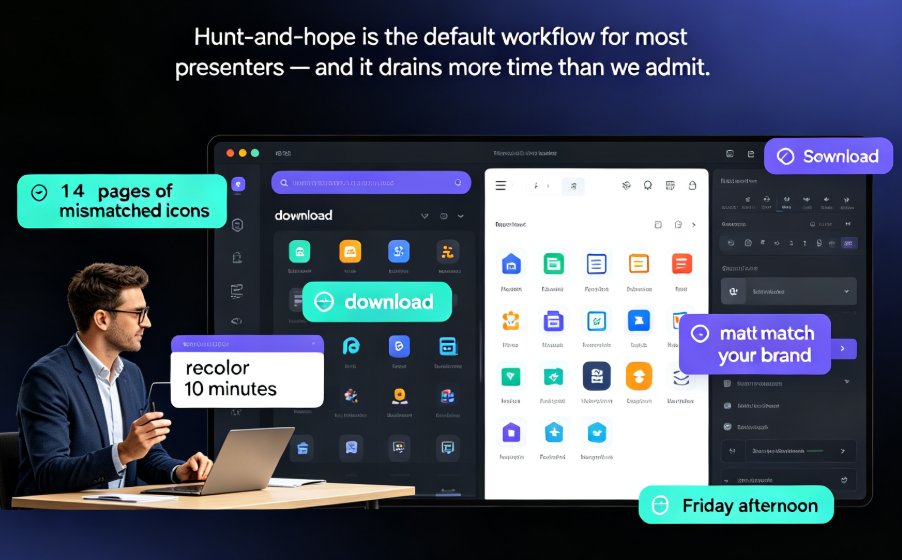
Here's the uncomfortable truth about most courseware: the visuals were added last, as decoration. The icon was chosen because the slide looked empty. The chart was dropped in because the template demanded a chart. Nobody asked the only question that matters — does this visual make the concept clearer or harder?
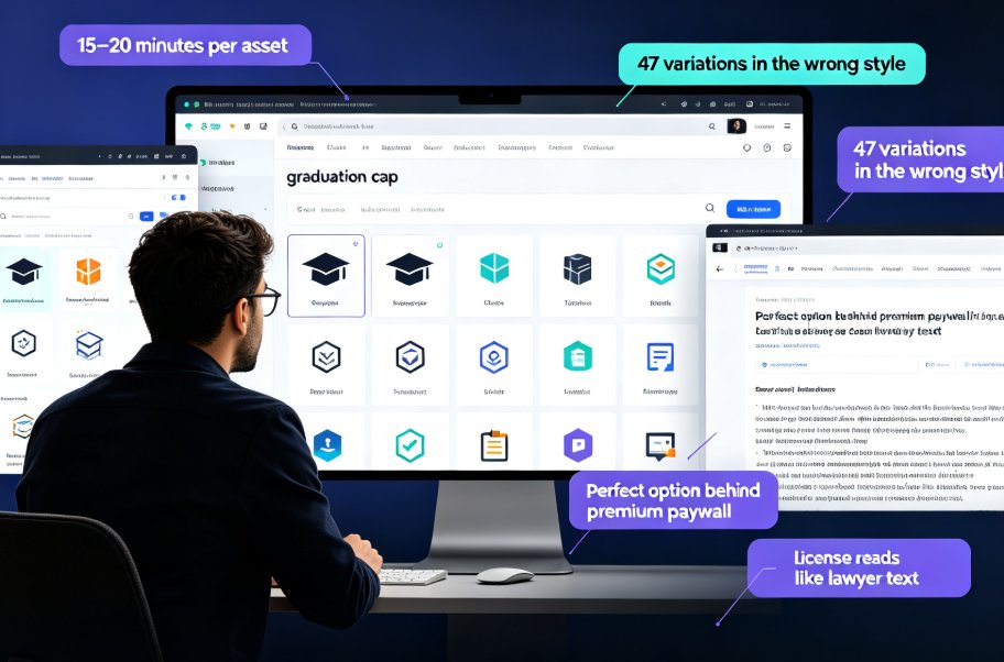
When an icon doesn't match the concept, learners don't just ignore it. They actively misread it. A "growth" arrow pointing the wrong way, a "settings" gear that looks like a steering wheel, a "collaboration" icon that reads as "meeting room" — each mismatch costs a few seconds of decoding. Multiply that across a 40-slide deck and you've quietly lost minutes of attention.
The solution is to give every visual one job. The outcome: learners spend that energy on the content instead of the decoration.
A visual that doesn't clarify is a visual that distracts. That's the first principle of teaching with visuals, and it applies to every icon, chart, and illustration you drop into a slide.
The good news: you don't need to become a graphic designer. You need a decision framework and a library that respects it.
02 The Three Visual Languages: Icons, Charts, Illustrations
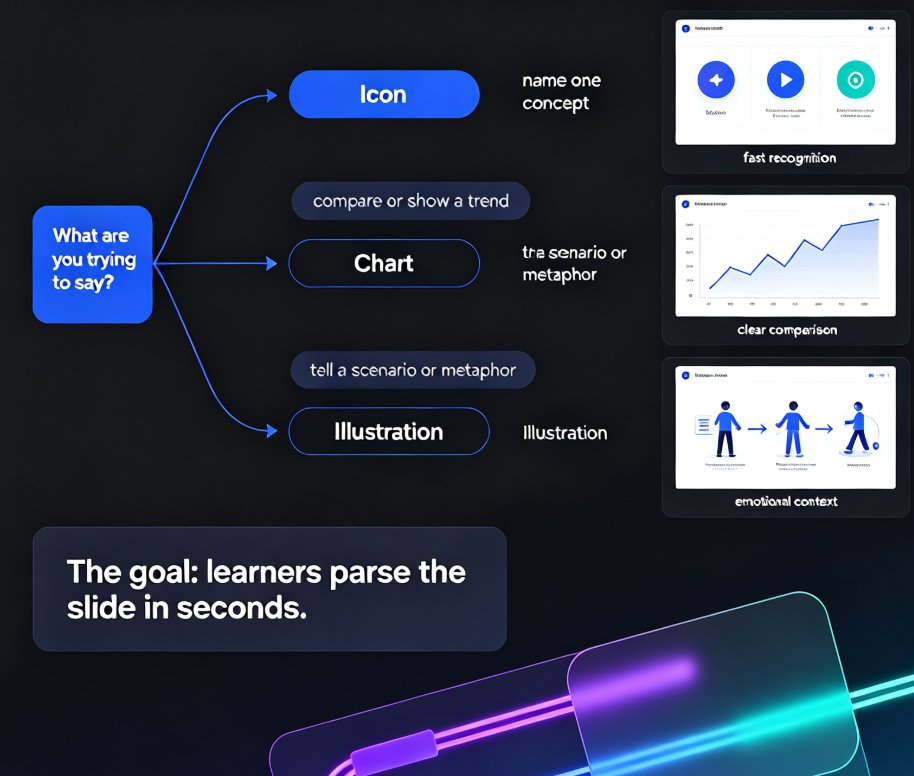
Most courseware problems start with choosing the wrong visual language. Icons, charts, and illustrations aren't interchangeable. Each one speaks a different kind of sentence.
- Icons say single words: "save," "warning," "email." They're fast and universal, but they can only carry one concept at a time.
- Charts say sentences about relationships: "sales grew," "A beats B," "most users chose C." They compare, trend, and proportion.
- Illustrations say stories: "here's a customer struggling with this problem." They add context, emotion, and metaphor.
Pick the wrong language and even a beautiful visual fails. A chart can't name a single concept quickly; an icon can't show a trend; an illustration can't fit in a button.
| Visual type | Best for | When to avoid | Courseware example |
|---|---|---|---|
| Icon | Single, concrete concepts | Abstract ideas that need explanation | A "save" disk icon on a button |
| Chart | Trends, comparisons, proportions | When the raw data isn't the point | A line chart showing quarterly growth |
| Illustration | Scenarios, metaphors, emotion | When a simple icon or chart suffices | A character walking through a workflow |
The solution is to match the visual language to the message. The outcome: learners parse the slide in seconds.
The rule of thumb: if you can't name the concept in two seconds, the visual is wrong for the job.
03 Icon Selection: One Concept, One Icon, No Guesswork
Icons are the workhorses of courseware, and also the most abused. Three principles keep them teaching instead of confusing.
First, one concept per icon. If an icon needs an explanation, it's not an icon anymore — it's a puzzle. A lightbulb means "idea," not "electricity" and not "brainstorm." Pick the most common, literal representation. Envelope for email. Magnifying glass for search. Checkmark for done. Boring wins.
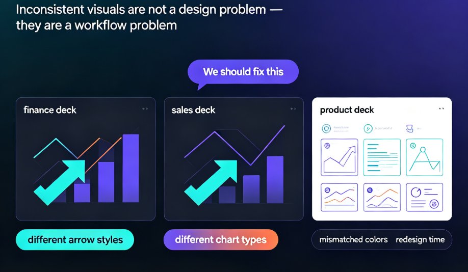
Second, keep the style consistent. Mixed icon styles — some filled, some outlined, some with drop shadows — signal "random decoration" to the brain. Learners subconsciously stop trusting the visuals. A consistent line weight and color logic tells them the deck was designed on purpose.
Third, test with a colleague. Show someone the icon for two seconds and ask what it means. If they hesitate, swap it. This two-second test catches more courseware problems than any design review.
The solution is to apply the one-concept rule and the two-second test. The outcome: instant recognition, fewer "wait, what does this mean?" moments.
Zendeck's asset library makes the consistency part nearly automatic — icons come from a curated set with matching styles, so you're not mixing five different visual languages in one deck. That's one less thing to police yourself.
04 Charts That Teach: Simplify, Annotate, Repeat
Charts are where courseware visuals either shine or sink. The most common failure: dumping a full dataset onto a slide and calling it a chart. Learners see a wall of numbers and stop reading.
Three fixes turn any chart into a teaching tool:
One message per chart. If a chart answers two questions, split it into two charts. A chart that shows both revenue and headcount is really two lessons fighting for attention.
Annotate the takeaway directly on the chart. Don't make learners find the insight. Put a bold label right on the data point: "Q3 spike after launch." If the annotation is the sentence, the chart is the evidence.
Strip the noise. Gridlines, legends, and axis labels that don't matter are cognitive tax. Remove anything that doesn't support the one message.
The solution is to simplify and annotate. The outcome: learners read the insight, not the data.
A chart's job is to make the insight obvious, not to display all the data. If learners have to work to find the point, the chart failed.
If you want to go further, Zendeck's asset library includes interactive chart options that let learners hover and explore — great for self-paced courseware where curiosity should drive the learning. You can see the full approach in our guide to adding interactive charts to your AI slides.
05 Illustrations and Metaphors: When Pictures Beat Words
Some concepts resist icons and charts. "How a firewall works." "Why compounding interest grows." "What a sales funnel actually feels like." These need a story, and that's what illustrations do best.
A well-chosen illustration grounds an abstract idea in a concrete scene. A character walking through a funnel makes the sales pipeline tangible. A shield with a gate makes a firewall feel physical. The metaphor does the teaching; the illustration just makes it visible.
But metaphors have a failure mode: mixed or stretched metaphors. If your illustration shows a shield but your text talks about a "net," learners get two competing pictures. Pick one metaphor and stay with it across the deck.
The solution is to use illustrations for scenarios and keep metaphors consistent. The outcome: abstract ideas become memorable.
The best illustration in courseware is the one that makes an abstract idea feel like a thing you can touch.
06 How Zendeck's Asset Library Does the Heavy Lifting
Here's where the practical payoff lands. Zendeck's asset library isn't just a pile of images — it's a curated, searchable set of icons, charts, and illustrations designed to work together. That matters more than it sounds.
First, consistency is built in. Because the assets share a visual style, your deck looks intentional even if you picked each visual in thirty seconds. No more mixing five icon styles across ten slides.
Second, search is concept-first. You search by what the visual should communicate, not by aesthetic keywords. That nudges you toward the one-concept-per-icon rule without you thinking about it.
Third, accessibility is handled. Zendeck can auto-add alt text to your visuals, which is a growing requirement for courseware — and a genuine teaching aid for learners using screen readers. We covered the details in our guide on accessibility gaps in courseware.
Fourth, the layout engine respects the visual. When you drop an asset into a slide, the smart layout adjusts spacing and sizing so the visual gets the breathing room it needs. No more cramped icons squeezed into a corner.
The solution is to let the library enforce good habits. The outcome: consistent, accessible, well-placed visuals with far less effort.
07 A Five-Minute Workflow for Visual Courseware
Principles are useless without a workflow. Here's the one I use, and it takes about five minutes per deck once your content is drafted:
- Generate the base deck from your outline — let the tool handle the initial layout.
- Audit every visual against the two-second test. If a colleague can't name the concept fast, flag it.
- Swap flagged visuals from the asset library, searching by concept, not by style.
- Check chart messages — one message per chart, takeaway annotated.
- Confirm alt text is in place, then share.
That's it. Five steps, and each one is a small decision that compounds into a deck that teaches.
The solution is a repeatable process. The outcome: every deck gets the same visual discipline, whether it's your first or fiftieth.
If you're building courseware regularly, the broader shift toward context-aware design is worth understanding — it's why modern tools pick visuals based on your content, not just your template. And if you're starting from a Word outline, Zendeck's import flow gets you to the audit step faster.
FAQ
How do I choose the right icon for a courseware slide? Start with the concept, not the aesthetic. Pick the most literal, common representation of the idea — envelope for email, checkmark for done — and apply the two-second test: show it to a colleague and see if they name the concept instantly. Keep the style consistent across the deck so the visuals read as intentional.
When should I use a chart instead of an icon? Use an icon when you're naming a single concrete concept, and a chart when you're showing a relationship — a trend, a comparison, or a proportion. If the message is "sales grew," that's a chart. If the message is "save," that's an icon. Mixing them up is the most common courseware mistake.
How does Zendeck's asset library keep visuals consistent? The library is a curated set of icons, charts, and illustrations that share a visual style, so any combination you pick looks cohesive. You search by concept rather than aesthetic, which nudges you toward clearer choices, and the smart layout engine handles spacing and sizing automatically.
Do I need design skills to use Zendeck's asset library? No. The library is built for people without design training. The assets are pre-styled, searchable by concept, and the layout engine adjusts them to fit your slides. Your job is to pick the right concept — the library handles the polish.
Can I use Zendeck's visuals in commercial courseware? Yes. Zendeck's asset library is designed for professional use, including commercial courseware and training materials. As with any asset library, it's worth checking the specific license terms for your use case, but the library is built for exactly this scenario.