Why Your AI Slides Fail Accessibility (and How Zendeck Fixes It)
Why Your AI Slides Fail Accessibility (and How Zendeck Fixes It)
You spent an afternoon feeding your outline to an AI deck generator, and four minutes later it handed you forty clean, modern slides. Then the training session starts, and a participant leans in. “Sorry,” they say, “that light gray text on white really strains my eyes.” Another attendee needs a screen reader, and every chart comes through as a silent, unlabeled image.
Here’s the uncomfortable truth: most AI-generated slides are optimized for speed and visual flair—not for the people who actually need to read them. You’re not alone if you’ve never audited a generated deck for accessibility. Few people do. But once you see the failures, you can’t unsee them.
01. AI Decks Were Trained on Pretty, Not Accessible
Most AI presentation tools learn from “award-winning” aesthetics: bold gradients, ultra-thin fonts, dramatic photography. That’s why they generate polished results so fast. But polish and readability are two different things.
Let’s be real about what’s happening. If you’re reading this, you’re probably an educator or a corporate communicator who needs to produce courseware—and you may be facing accessibility requirements you didn’t choose, like WCAG compliance in procurement policies or institutional standards. The AI tool you used wasn’t thinking about any of that. It was thinking about looking good.
An accessible slide isn’t a design constraint. It’s a design quality your AI forgot to apply.
02. Contrast: The Silent Killer of Readable Slides
Color contrast is the single most common way AI slides fail—and the easiest one to fix.
WCAG sets a clear bar. Normal body text needs a contrast ratio of at least 4.5:1 (AA) to pass basic compliance, and 7:1 (AAA) for the strongest standard. Yet countless AI templates default to light gray on white, yellow accents on pale backgrounds, or neon highlights that shimmer straight into a viewer’s eyes. They look “modern”—and they fail anyone with low vision or color-vision deficiency.
Typical failures fresh out of the generator:
- Light gray body text on white (often around 2:1—fails)
- Yellow or orange text on white (fails)
- White text over washed-out photos (fails)
- Thin font weights under 14 px in pale shades (marginal at best)
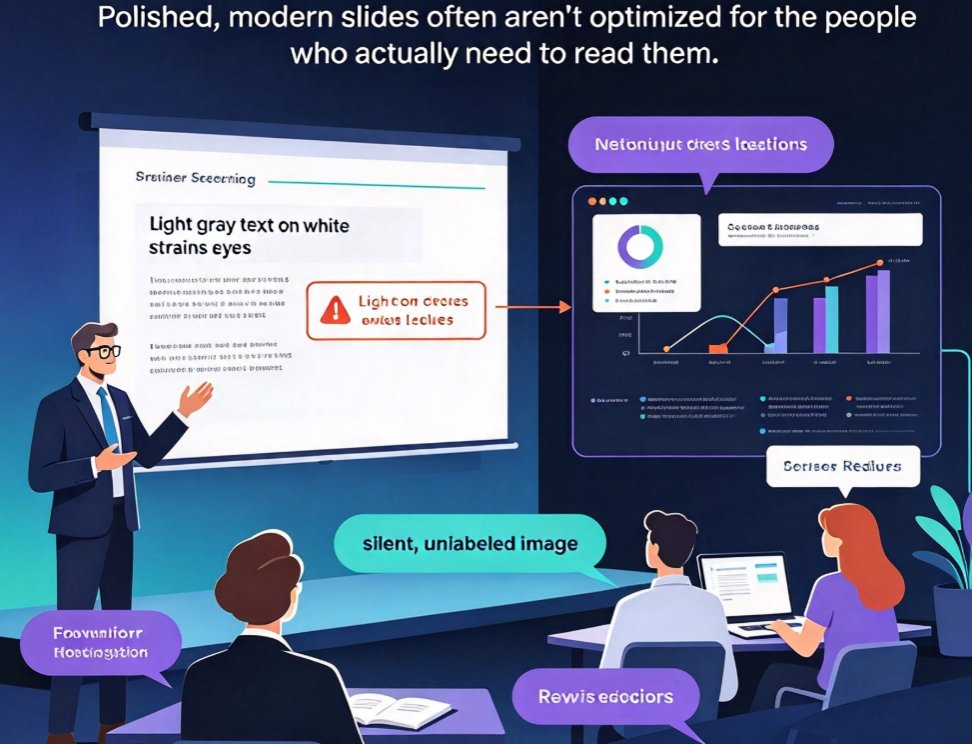
Here’s a visual guide to the contrast ratios of common AI color pairings, mapped against the WCAG thresholds:
Any pairing below the red line fails WCAG AA. Your safest habit: dark text on light backgrounds (or the reverse), with no decorative overlay fighting the content.
03. Alt Text: The Words Screen Readers Never Hear (WCAG 1.1.1)
Run a screen reader over most AI-generated decks and the experience goes something like this: “Image. Graphic. Chart. Image.” A beautiful bar chart becomes a blank hole. A diagram explaining your process becomes noise. This is exactly why accessible AI presentations are becoming the new baseline in courseware design.
Every meaningful image—charts, diagrams, photos—needs descriptive alt text. Decorative graphics should be explicitly marked so screen readers skip them. There’s a subtle layer here too: for a data chart, the alt text should carry the takeaway, not just the shape. “Bar chart showing quarterly sales” is weak. “Revenue grew 34% in Q3 after we retrained the onboarding team” is what a learner actually needs.
Tools that don’t generate useful alt text leave you hand-writing descriptions for twenty images per deck. That’s not how you want to spend a Friday afternoon. (We walk through the fix in our guide to auto-adding alt text in Zendeck.)
04. Cluttered Layouts and Missing Heading Structure
Look down at a generated deck and you’ll often find every slide looks like the same wall of words. The AI dumped your outline verbatim onto one page, with bullets nested four levels deep. For a viewer juggling cognitive load—or a screen reader navigating by heading—it’s a maze.
WCAG asks for logical structure: a clear page title, a coherent heading order, and content that isn’t crammed. Structure isn’t a nice-to-have; it’s how screen readers navigate a deck, and how tired brains scan it.
Dense slides also break the golden rule of slide design: one idea per slide. When text density is high, retention drops—and so does your credibility as a communicator.
05. Why AI Tools Keep Making These Mistakes
Let’s be fair to the AI: it was trained on a diet of visually striking decks, not on WCAG checklists. It optimizes for speed, aesthetic appeal, and the occasional gasp of admiration. Contrast ratios, alt text, and heading order simply aren’t part of its cost function. It’s like driving fast without checking your mirrors.
The result is a systematic failure. Because every slide follows the same template, the accessibility problem repeats across the entire deck—twenty slides of light gray text, or ten unlabeled charts. And when you’re producing several decks a week, you don’t have time to audit each one slide by slide.
06. How Zendeck Fixes Accessibility Automatically
This is where Zendeck earns its keep. Zendeck is built around smart layout and a governed asset system—which happens to be exactly what accessibility demands.
Contrast you can trust. Zendeck’s smart layout applies readable color palettes and balanced contrast automatically across the deck, so light-gray-on-white never ships. Instead of hand-fixing each slide, you correct the logic once and it scales across every page. See exactly how this compresses your design time in 5 Ways Zendeck Smart Layout Cuts Presentation Design Time.
Structure that makes sense. The layout engine keeps hierarchy consistent: clear titles, logical content order, generous spacing. Less clutter, better scanability, and the heading order screen readers expect.
Assets that support reading, not decoration. The asset library serves up chart styles and icons that match your theme, so visuals reinforce your message instead of obscuring it. And through auto-generated alt text, your graphics stop being blank holes to assistive tech.
Accessible by default, on-brand by design. Because Zendeck lets you define a custom brand kit, the accessible defaults don’t fight your identity—they become your identity, at scale.
07. A Pre-Launch Checklist for Your Next AI Deck
Use this table as your quality gate before you hit share:
| Check | WCAG reference | The AI failure | Your fix with Zendeck |
|---|---|---|---|
| Text contrast | 1.4.3 | Light gray on white (about 2:1) | Smart layout enforces 4.5:1+ palettes |
| Alternative text | 1.1.1 | Charts/images labeled “Image” | Auto alt-text for key visuals |
| Heading hierarchy | 1.3.1 / 2.4.6 | Four-level nested bullets | Consistent titles and content order |
| Content density | 1.4.8 | “Wall of words” on one slide | Smart layouts spread content logically |
| Consistent style | 1.4.1 | Clashing accent colors | Brand kit governs color usage |
Bookmark this one—it’s a handy reference for courseware design best practices.
FAQ
Q: Do WCAG requirements apply to internal training decks, or just public content? A: They’re increasingly enforced in both. Procurement policies, institutional standards, and corporate L&D guidelines regularly require WCAG 2.1/2.2 compliance for internal courseware, not just public-facing material.
Q: What is the minimum contrast ratio for body text under WCAG? A: 4.5:1 for normal text at AA level, and 7:1 for AAA. Large text (18 pt, or 14 pt bold) can pass at 3:1 under AA.
Q: Will making my AI slides accessible slow down my workflow? A: Not if it’s built into generation. Zendeck applies accessible defaults—contrast, structure, alt text—as it builds your deck, so you’re not retrofitting slide by slide afterward.
Q: Can Zendeck automatically add alt text to images and charts? A: Yes. Zendeck can auto-generate alt text for visuals in your deck, including the descriptive summaries screen reader users actually need.