Present on Any Screen: Zendeck Fixes 4:3 vs 16:9 Slide Issues
4:3 vs 16:9 Slides: Present on Any Screen Without the Last-Minute Disaster
01 The Venue Moment We All Dread
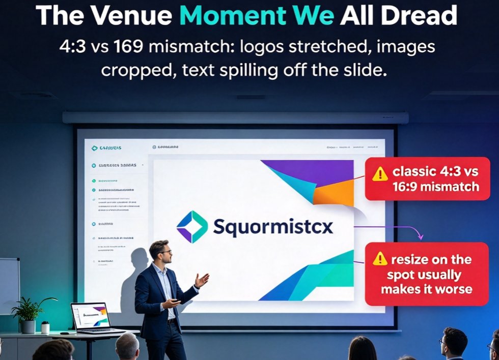
You've rehearsed three times. Coffee's in hand. You plug in your laptop, the projector flicks on... and your carefully built deck suddenly looks like someone ran it through a tumble dryer. Logos stretched sideways, images cropped at the edges, text spilling off the slide. You are staring at the classic 4:3 vs 16:9 mismatch — the single most common reason a polished presentation falls apart at the venue.
I've watched it happen to colleagues in hotels, boardrooms, and lecture halls. The fix they always reach for — resizing the deck on the spot — usually makes it worse. This article explains why that happens, what the actual difference between 4:3 and 16:9 is, and how Zendeck's adaptive aspect-ratio control keeps your slides pixel-perfect on any screen, from a 2010 overhead projector to a 4K conference wall.
02 What 4:3 and 16:9 Actually Mean (and Which One You Need)
Let's be clear about the terms. The aspect ratio describes the relationship between a slide's width and height. 4:3 (standard) is squarer — the format of old CRT monitors and overhead projectors. 16:9 (widescreen) is wider — the default in current PowerPoint and the format that matches HD displays. Here are the real-world dimensions you're dealing with:
| Aspect ratio | Pixel size | Best for | Skip it if |
|---|---|---|---|
| 4:3 (Standard) | 1024×768 | Older ceiling/overhead projectors, A4 printing, legacy templates | Modern boardroom TVs, webinars, laptop screens |
| 16:9 (Widescreen) | 1920×1080 | Laptop screens, HD projectors, Zoom calls, conference displays | Old projectors, A4 handouts you want to print big |
The guidance from presentation display experts is unambiguous: 16:9 is the right choice for almost all modern presentations. It's the default in current PowerPoint, matches HD displays and projectors, and gives you more horizontal space for content — which matters when you present on webinars, online conferences, Zoom calls, or meeting rooms with a big TV instead of an overhead projector.
4:3 earns its keep in only two situations. First, you'll present on an older projector — many conference rooms in hotels and smaller venues still run 4:3 units. Second, you'll print slides on A4 or Letter paper; the squarer format fits the page better, so printed slides come out bigger and more readable. If neither applies, go widescreen and don't overthink it.
A friendly warning before you do anything else: if your deck is already built, change the slide size before adding content — not after. PowerPoint's own guidance warns that switching an existing deck distorts logos, stretches images, and breaks slide master layouts. If you must convert a finished deck, work on a copy and budget real time to fix the master slide manually, especially branded backgrounds and logo placements.
03 Why Manual Resizing Is a Trap
Here's what usually happens in the moment. The projector shows a 4:3 screen, your slides are 16:9, and you open the Design tab, choose 'Slide Size', and switch to 4:3. PowerPoint will ask you: maximize content (which crops slides) or scale to fit (which stretches them). Neither is good. Then you spend the next twenty minutes sliding images back into place while the audience watches you fiddle.
The deeper problem: manual aspect-ratio changes don't understand your layout — they just squeeze or crop whatever's there. Text boxes overlap, charts get distorted, and any element that wasn't anchored correctly drifts off-slide. By the time you've fixed slide one, slide two breaks. It's a whack-a-mole game you cannot win at the venue, and it's exactly why more teams are moving to AI-generated decks that keep the layout logic intact from the start.
04 The Real Fix: Adaptive Layout That Reflows Instead of Squeezing
Here's where the approach changes. Instead of resizing the slide and hoping nothing breaks, you want a tool that reflows the layout for the new ratio — repositioning, rescaling, and re-wrapping content so the design stays intact. That's precisely what Zendeck's adaptive aspect-ratio and resolution control does.
When you set your target format in Zendeck, the smart layout engine reassigns text boxes, images, and chart positions for the new dimensions rather than stretching them. Your branded elements don't distort, because the layout is recomputed — not squeezed. Font sizes adjust to the available space, and the visual hierarchy survives the switch. You get the same structural thinking that makes Zendeck's smart layout system cut design time, applied to the format problem.
This matters more than ever, because the way we present has changed. Decks now get pulled onto laptop screens, cast to wide conference TVs, shared in Zoom, and occasionally printed for handouts — sometimes all in the same week. A single deck needs to survive every one of those. With adaptive layout control, one source deck stays presentable everywhere.
05 Step-by-Step: Set Up Adaptive Ratio in Zendeck
Setting this up takes about two minutes, and it pays off the first time you walk into an unfamiliar venue. Here's the workflow I recommend:
- Open your deck in Zendeck and go to the slide format / resolution settings — this is where you choose the aspect ratio for the current deck.
- Pick your primary ratio: 16:9 if you mostly present on laptops, TVs, or webinars; 4:3 if you know you're heading to an older projector or printing A4 handouts. When in doubt, 16:9 — it's the modern default.
- Let smart layout reflow the content. After changing the ratio, Zendeck's layout engine repositions elements for the new canvas instead of stretching them. Check for anything that needs a nudge, though in smart layout decks there usually aren't any.
- Lock your brand kit so logos, colors, and backgrounds stay consistent across formats — this is where a custom brand kit pays off, because the branded assets re-anchor correctly instead of distorting.
- Export or present from the cloud, and if you're headed to an unfamiliar projector, do a quick format check from the venue's settings before the audience arrives.
One honest tip from someone who's been burned: always keep a 16:9 master copy. If you convert a deck for a specific 4:3 venue, you don't want to lose the widescreen version for next week's webinar. Duplicate the project, convert the copy, and leave the master untouched.
06 Practical Tips for Multi-Screen Presenting
The aspect ratio is only half the story. Here are the habits that keep a deck intact across every screen:
- Set the ratio before adding content. This is the single most important habit. Decks that start at the right ratio never need risky conversions.
- Design with margins. The safe zone at the edges of a 16:9 slide is the first thing to get cropped on odd displays. Keep key content away from the edges and you survive most projector quirks.
- Test on the actual device. If you can't test the venue projector, test on a laptop set to different resolutions. Resolution control in Zendeck lets you preview how the deck behaves across common display sizes without leaving the editor.
- For printing, favor 4:3. Printouts on A4 fit better and read larger with the standard ratio. If your deck needs to work on screen and paper, it's worth keeping a dedicated print version.
A quick note on resolution: aspect ratio and resolution get confused, but they're different. Aspect ratio shapes the slide; resolution sets how crisp it appears. On a 4K conference display, a low-resolution export looks soft no matter how clean your layout is. With proper resolution control, you target the output quality to match the display, so your 16:9 deck looks sharp on a 1080p projector and a 4K TV alike.
If you're building decks from scratch and want to avoid these problems entirely, starting with an AI deck generator that produces ratio-correct layouts from the first slide is a solid move. And if you're still choosing templates, let the tool pick one that matches your content context — a good template is already built at the right ratio, which saves you the headache later. For more on building slides that hold up in any room, browse the PPT tutorial hub.
FAQ
Q: What's the difference between 4:3 and 16:9 slide formats? A: 4:3 (standard) is squarer, at 1024×768 pixels, and matches older overhead projectors and A4 printing. 16:9 (widescreen) is wider, at 1920×1080, matches HD displays and modern projectors, and is the default in current PowerPoint.
Q: Why do my slides stretch or crop on the venue projector? A: The projector's native aspect ratio doesn't match your slides. When software adapts the content, it either stretches to fill the screen or crops to fit. Manual fixes distort logos, images, and layouts because they don't understand the design — they just squeeze it.
Q: Should I switch an existing deck from 4:3 to 16:9? A: Only if you must, and always on a copy. Changing an existing deck distorts logos, stretches images, and breaks slide master layouts. If you're starting fresh, set the ratio before adding content. With Zendeck's adaptive layout, the reflow keeps smart layouts intact instead of squeezing them.
Q: How does Zendeck adapt slides to different aspect ratios? A: Zendeck's adaptive ratio control reflows the entire layout for the new dimensions — repositioning text boxes, images, and charts rather than stretching them. Font sizes and visual hierarchy adjust automatically, so branded elements stay crisp and nothing gets cropped at the edges.
Q: Which ratio should I choose for a deck that will be printed as A4 handouts? A: Choose 4:3. The squarer format fits A4 or Letter paper better, so printed slides come out larger and easier to read. For on-screen presentations, stick with 16:9 — and keep a separate print version if both are needed.