Too Many Bullets? How Zendeck Condenses Dense Text into Clean Slides
Let's be honest: you've sat through a presentation where the slide had more words than the speaker. The audience is reading. Nobody is listening. The speaker thinks they're being thorough; the audience is just drowning.
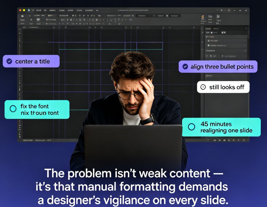
The problem isn't your content. It's the container. Most AI presentation tools do the same thing you do when you're in a hurry: they take the text you paste and spread it across slides. The result is a cleaner-looking text dump — but still a text dump.
This article is about a different approach: condense first, design second. It's a workflow that turns bullet-cluttered slides into scannable visuals, and it's exactly where Zendeck's AI generation and smart layout shine.
01 · The Real Problem: Your Slide Is a Text Dump, Not a Visual
Here's what happens when you put too many bullets on a slide: your audience's brain tries to read and listen at the same time. It can't. Reading wins, listening loses, and by the time they finish the third bullet, you're already on slide five.
That's cognitive overload, and it's not a minor annoyance. It's the reason people walk out of presentations remembering nothing.
A slide should be a headline you can say out loud, not a paragraph you hope they read.
The fix starts before design. You have to decide what the slide is for. If it's for reading, send a document. If it's for presenting, make it scannable. That means fewer words, clearer hierarchy, and a layout that guides the eye.
02 · What the Best Slide Redesigns Actually Do
The good news: you don't need to invent this from scratch. There are proven techniques from real presentation tutorials that work every time.
A widely shared PowerPoint tutorial walks through transforming a busy bulleted slide by moving half the bullets into a second text box, arranging them side by side, and bumping up the font size. The result: more white space, more margins, and a slide that's far easier to scan. The same tutorial then adjusts line spacing, chunks information into panels, and uses animation to reveal each panel one by one.
Another LinkedIn walkthrough of the 'Iconic PowerPoint' technique shows something even simpler: replace bullet symbols with icons. The author says you can apply it in five minutes or less.
These techniques work because they respect how brains process visual information. Short headings, grouped ideas, white space, and a few bold keywords do more than any template ever could.
Here's what the shift looks like in practice:
| Element | Text-dump slide | Condense-then-design slide |
|---|---|---|
| Headline | 'Q3 Sales Update and Regional Performance Review' | 'Q3: Growth in APAC, Flat in EMEA' |
| Bullets | 8 full sentences, 60+ words | 3 short headings, 15 words |
| Layout | Single column, full width | Two or three columns with panels |
| Emphasis | Nothing stands out | Bold keywords, sparing color |
| Delivery | Audience reads silently | Speaker talks, animation reveals |
Notice the pattern: the condensed version doesn't remove information. It reorganizes it. The audience can scan the structure in seconds, then listen while you fill in the details.
03 · The Condense-Then-Design Workflow
Let's turn that into a repeatable process. You can use this for any deck, whether you're building courseware, a sales pitch, or an internal update.
Step 1: Write the one message. If you can't say the slide's point in ten words, the slide isn't ready. Do this before you open any design tool.
Step 2: Turn supporting points into headings. Instead of eight full sentences, write three to five short phrases. Each phrase should name a category, not explain it.
Step 3: Move the detail into speaker notes. This is the step most people skip. The detail isn't lost; it just moves out of the audience's way. If you're using Zendeck, you can auto-generate speaker notes for the whole deck.
Step 4: Choose a layout that groups related ideas. Two columns, three columns, panels — anything that gives related content a visual container.
Step 5: Add white space and visual anchors. Icons, charts, and images give the eye a place to rest. They also make the slide feel designed instead of typed.
Step 6: Use animation to pace the reveal. Reveal each panel or column one at a time. This keeps attention focused on what you're saying, not on what's coming next.
Let's be real: doing this manually for forty slides is exhausting. That's where Zendeck comes in. Paste your Word outline or Markdown into Zendeck's AI generator, and it structures the content into slides instead of reproducing your text dump. Then smart layout unifies fonts, colors, and spacing across the deck.
If your AI-generated slides still look messy, there's a fix for that too — here's how Zendeck handles it.
04 · How Zendeck Turns a Bullet-Cluttered Deck into a Scannable One
Zendeck is built for exactly this problem. You don't need design skills, and you don't need to fight the tool.
- Upload a Word outline or paste Markdown/TXT. Zendeck's AI generation reads the structure and produces slides that respect the hierarchy of your content.
- Use smart layout to unify everything. One click reskins fonts, colors, and spacing, so the deck looks consistent even if your source material was a mess.
- Pull from the template library. Premium templates give you a starting point that doesn't look like a default theme.
- Add icons and charts from the asset library. Visual anchors replace the bullets that used to carry the load.
- Collaborate in real time. Your team can edit the same deck online, which means the condensing conversation happens where the work happens.
Zendeck doesn't just make slides prettier; it changes the information architecture. That's the difference between a tool that reformats text and a tool that helps you communicate.
You can also manually edit AI-generated slides in Zendeck, so you're never locked into the first draft. And if you want every deck to stay on-brand, set up a brand kit once and let it enforce consistency across hundreds of slides.
For data-heavy slides, skip the bullet list entirely and add interactive charts from Zendeck's asset library. The chart does the explaining; you do the narrating.
05 · A Before-and-After Example You Can Steal
Let's make this concrete. Here's a typical text-dump slide:
Before: 'Customer Onboarding: Steps and Requirements' - 'First, create an account using your work email address and verify it within 24 hours.' - 'Second, complete the company profile section, including billing details and tax information.' - 'Third, invite your team members and assign roles based on their responsibilities.' - 'Fourth, connect your data sources and run a test import to confirm everything works.' - 'Finally, review the summary page and launch your first campaign.'
That's five bullets, roughly 70 words, and zero visual hierarchy. The audience will read all of it and hear none of it.
Now here's the same content after a condense-then-design pass:
After: Three columns with short headings - Create — Work email, verify in 24h - Configure — Company profile, billing, roles - Launch — Connect data, test import, go live
Same information. Same steps. But now the audience can grasp the structure in five seconds, and you can elaborate while you speak. The slide works as a visual aid, not a reading test.
06 · When to Break the Rules (and When Not To)
Before you go deleting every bullet you own, let's be honest about the exceptions.
Some slides need more text. Technical specifications, compliance requirements, legal disclaimers — these don't always compress into three-word headings. And that's okay.
But even dense content benefits from the same principles. Chunk related requirements into groups. Use short headings above each group. Bold the keywords that matter. The text is still there, but the structure makes it navigable.
The goal isn't less information; it's better pacing.
If you're worried about losing nuance, move the detail into speaker notes or narration. Zendeck can auto-generate speaker notes for AI decks, so nothing gets lost. And if you're building training content, you can turn the clean deck into a narrated video with Zendeck's PPT-to-video feature — the detail lives in the voiceover, not on the slide.
07 · Why This Matters for Courseware and Training
For educators and trainers, this isn't a style preference. It's instructional design.
When learners are staring at a wall of bullets, they're not processing your message. They're decoding text. Clean slides with clear hierarchy reduce cognitive load, which means learners can actually focus on the concepts you're teaching.
This is also why accessible presentation design matters. A well-structured slide with proper headings and contrast isn't just easier to scan; it's easier for screen readers to interpret. If you're building courseware, that's a compliance issue as much as a design issue.
Zendeck's AI generation and smart layout make this workflow practical at scale. You can turn a messy Word outline into a clean course deck, then turn that deck into a micro-course with narration. The condense-then-design workflow stops being a one-off fix and becomes your standard process.
08 · FAQ
◉ Why do bullet-heavy slides cause cognitive overload?
When a slide is full of text, the audience has to choose between reading and listening. Most people choose reading, which means they stop paying attention to the speaker. The result is a presentation where the content is seen but never heard. Condensing text into short headings and visual groups lets the audience scan quickly and return their attention to you.
◉ How does Zendeck condense dense text into clean slides?
Zendeck's AI generation takes a Word outline or Markdown/TXT and structures it into slides with clear hierarchy. Smart layout then unifies fonts, colors, and spacing across the deck. You can also manually edit the result, apply a brand kit, and add icons or charts from the asset library. The goal is to move from text dump to scannable visual in one pass.
◉ What is the condense-then-design workflow?
It's a two-stage process. First, you reduce the content: write one core message per slide, turn supporting points into short headings, and move detail into speaker notes. Second, you design for scanning: choose a multi-column layout, add white space, use bold keywords sparingly, and animate reveals. The workflow works for any deck, and Zendeck automates most of the design stage.
◉ Can I still edit AI-generated slides in Zendeck?
Yes. Zendeck doesn't lock you into the first draft. You can manually edit text, layout, colors, and images after generation. This is important because the condense-then-design workflow is iterative — you'll often refine the message after you see the first visual version.
◉ How fast can I transform a text-heavy deck?
Once you have the technique, a single slide can be reworked in five minutes or less. With Zendeck, the design part is even faster: paste your outline, let AI generate the structure, then apply smart layout and a brand kit. The bottleneck becomes your thinking, not your software.