Match the Deck to the Moment: Zendeck's Scenario-Based Template Library
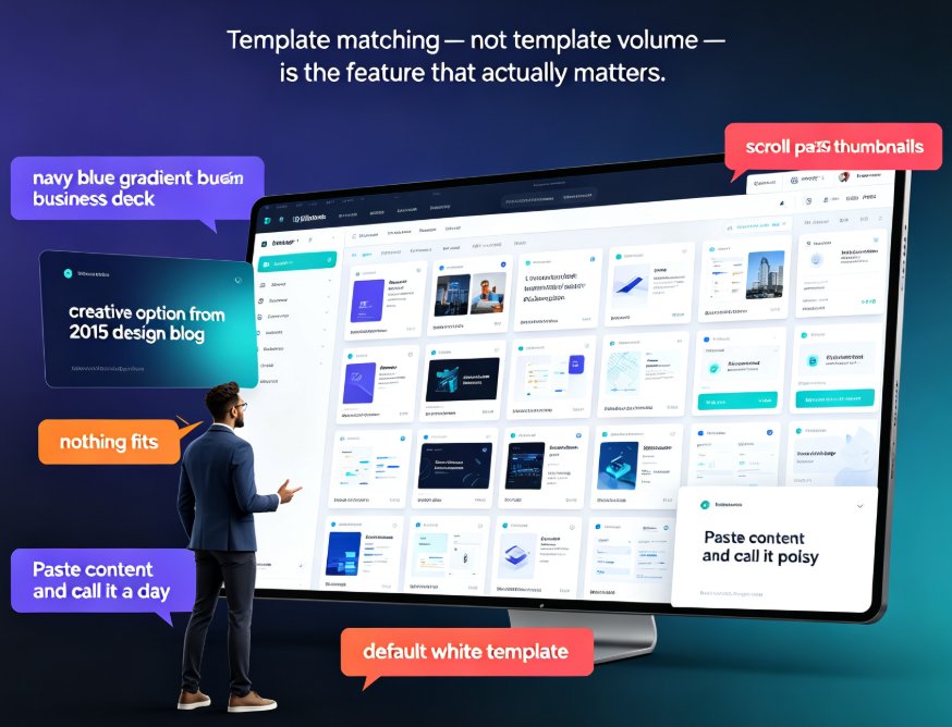
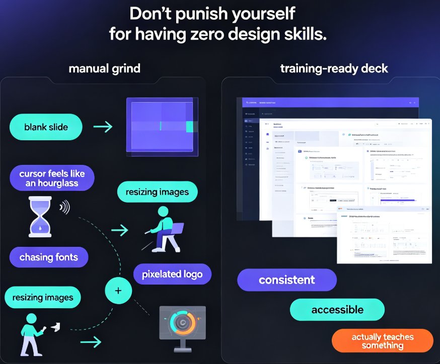
Let's be real: you've sat through a training session where the slides looked like they'd been borrowed from a quarterly earnings call. Or worse — you've delivered one. The template mismatch isn't a cosmetic issue; it's a communication failure. Your audience reads the visual language before they read a single word. If the deck says "corporate compliance" while you're trying to run an interactive workshop, you've already lost half the room.
The template you choose is the first sentence of your presentation — and most people start with the wrong one.
That's why Zendeck's template library is organized by scenario, not just by aesthetic. The goal isn't to hand you a prettier deck; it's to hand you the right deck for the moment you're walking into. Here's how to think about it.
I. Why Template Choice Is a Strategy, Not a Style Decision
Most people pick templates the way they pick wallpaper: whatever looks nice at first glance. That's backwards. A template is a cognitive tool. It shapes how your audience processes your content — how much they read, how quickly they grasp structure, and how they feel about your message.
Think about the last time you sat through a 60-slide deck with dense paragraphs and tiny charts. You didn't absorb the content; you survived it. The template failed you before you even opened your mouth.
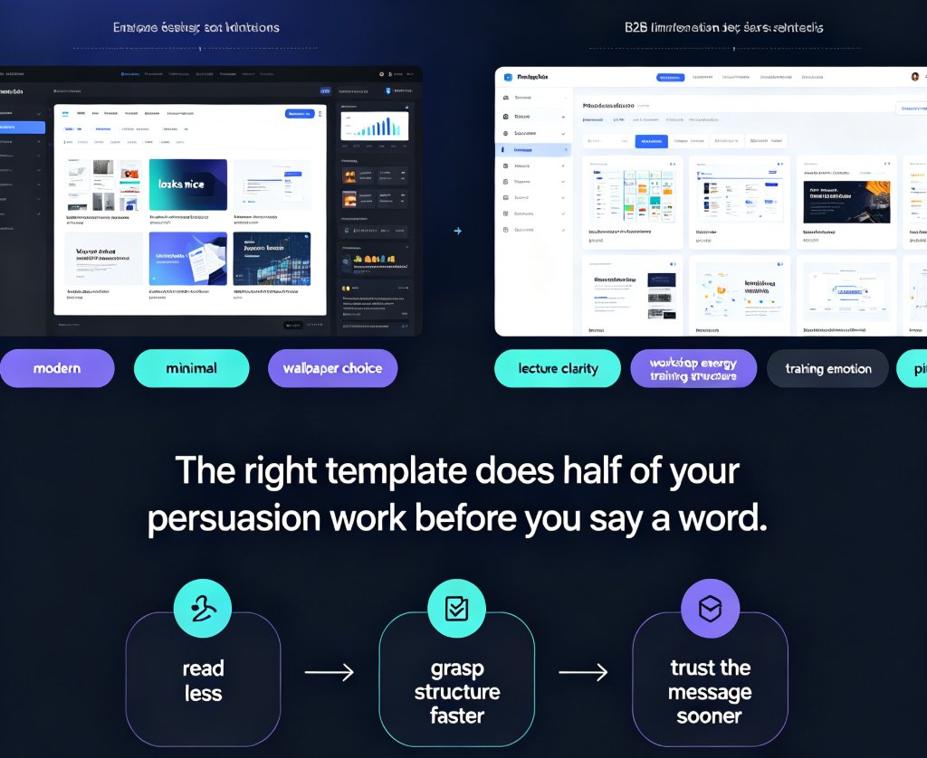
The right template does half of your persuasion work before you say a word.
The fix is simple in principle: match the template to the job your audience needs you to do. A lecture needs clarity. A workshop needs energy. A training session needs structure. A pitch needs emotion. These are different cognitive jobs, and they demand different visual languages.
Zendeck's library is tagged by scenario precisely because of this. When you start a new deck, you're not scrolling through a random gallery of "modern" and "minimal" options. You're choosing from templates built for the moment you're in.
II. The Decision Tree: Four Questions Before You Pick
Before you open any template library, ask yourself four questions. The answers will point you to the right scenario — and the right deck.
1. What does the audience need to do with this information?
This is the most important question. Are they taking notes for an exam? Applying a process on the job? Making a purchase decision? The action determines the structure.
2. How much time do they have?
A 15-minute lightning talk and a 3-hour training session need completely different visual rhythms. Short formats need fewer slides with bigger ideas. Long formats need structure and repetition.
3. What's the emotional register?
Are you inspiring, informing, warning, or selling? The emotional tone of your content should match the visual tone of your template. A playful workshop template will undercut a serious compliance message.
4. What happens after the presentation?
If the deck gets shared internally, it needs to stand alone. If it's a live pitch, it needs to support your voice. If it's a training module, it might need to convert to video later.
Your answers to these four questions are the filter. The template library is just the result.
III. Scenario 1: Classroom Lectures — Clarity Over Flash
The pain point: You're teaching a dense topic — say, financial accounting or molecular biology. The content is heavy, and your students are already fighting for attention. A flashy template with bold graphics and decorative elements makes it worse, not better.
The solution: Choose a template that prioritizes readability. High contrast between text and background, generous whitespace, a clear hierarchy of headings, and minimal decorative elements. Your slides should disappear into the content, not compete with it.
The outcome: Students can follow the logic of your lecture without decoding your design. They take better notes because the structure is visible. And when you share the deck after class, it stands alone as a study resource.
For lectures, look for templates with: - High-contrast text blocks (dark text on light backgrounds) - Consistent heading hierarchy - Room for equations, diagrams, or code snippets - Muted color palettes that don't distract
Zendeck's education-focused templates are built for exactly this. They're designed to carry dense content without visual noise — which is why trainers and educators keep coming back to them. If you want a deeper walkthrough of the trainer-specific library, this guide to AI presentation templates for trainers covers it in detail.
IV. Scenario 2: Workshops — Interaction Over Information
The pain point: You're running a workshop, and you need participation. But your slides are a wall of bullet points. Nobody's engaging. The room is silent, and you can feel the energy draining.
The solution: Workshop templates should build in interaction by design. That means activity blocks, discussion prompts, break-out sections, and visible timers. The deck should feel like a facilitator's toolkit, not a lecture handout.
The outcome: Participants know when to talk, when to write, and when to share. The workshop runs itself because the structure is baked into the slides. You spend your energy facilitating, not managing the flow.
Workshop-friendly templates include: - "Activity" slides with clear instructions - Break-out group sections with space for notes - Poll or discussion prompts - Visual variety to reset attention between segments
The key insight: in a workshop, the template is the agenda. If your slides don't show participants what's happening next, they'll disengage. Choose a template that makes the structure visible.
V. Scenario 3: Corporate Training — Consistency Over Creativity
The pain point: You're rolling out a compliance training program across five departments. Each team builds their own version of the deck. The result is a mess of inconsistent branding, conflicting messaging, and — worst case — missed compliance requirements.
The solution: Corporate training templates need brand governance built in. That means enforced color palettes, standardized layouts, and a consistent visual system across every module. The template should make it hard to go off-brand.
The outcome: Every training module looks like it came from the same team, even when five different people built it. Your brand stays consistent, your messaging stays aligned, and your compliance audits get easier.
This is where Zendeck's brand kit integration shines. You can lock your brand colors, fonts, and logo into the template so every training deck follows the same rules. If you want the full playbook on this, this piece on creating a custom brand kit in Zendeck walks through it step by step.
In corporate training, consistency isn't a design preference — it's a compliance requirement.
VI. Scenario 4: Sales Pitches — Persuasion Over Explanation
The pain point: You have 20 minutes to convince a room of stakeholders. Your current deck is a data dump — 40 slides of features, specs, and screenshots. You're explaining, not persuading. And the room is checking their phones.
The solution: Pitch templates should be built for narrative, not information. Strong visual hierarchy, bold imagery, and data visualization that tells a story. Every slide should advance the argument, not just present facts.
The outcome: Your pitch has momentum. The audience follows the story arc from problem to solution. Your data lands because it's framed in context. And when the meeting ends, the deck works as a leave-behind that reinforces your case.
Pitch-ready templates feature: - Large, bold headlines that carry the argument - Data visualization that supports the narrative - Minimal text — the story lives in your voice - Strong visual contrast to hold attention
If you're building a pitch deck from scratch, this AI pitch deck generator guide is a solid companion piece — it covers the problem-to-solution arc in detail.
VII. How Zendeck Tags Templates by Scenario
Here's where Zendeck gets interesting. The template library isn't just a static gallery — it's tagged by scenario, and the AI uses those tags to make smarter choices for you.
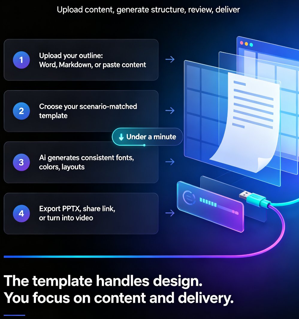
When you paste an outline or type a prompt, Zendeck doesn't just grab a random template. It reads your content, identifies the scenario (lecture, workshop, training, pitch, and more), and suggests templates that fit both your content and your context. This is the shift from template-picking to context-aware design — and it's the direction the whole industry is moving.
The practical benefit: you spend less time browsing and more time building. You don't need to know the difference between "minimal" and "corporate" templates. You just tell Zendeck what you're making, and the library narrows itself down.
And if you want to understand why this matters for 2026, this breakdown of contextual templates versus generic ones explains the trend in more depth.
VIII. Quick Reference: Which Template for Which Moment
Here's the cheat sheet. Save it, screenshot it, or just remember the pattern.
| Scenario | Primary goal | Visual density | Text load | Color strategy | Interaction needs | Best template style |
|---|---|---|---|---|---|---|
| Classroom lecture | Transfer knowledge | Low–medium | High | High contrast, muted | Minimal | Clean, text-friendly |
| Workshop | Facilitate participation | Medium | Low–medium | Energetic, varied | High (activity blocks) | Interactive, modular |
| Corporate training | Standardize & certify | Medium | Medium | Brand-governed | Medium (quizzes) | Structured, compliant |
| Sales pitch | Persuade & close | High | Low | Bold, emotional | Low | Narrative, visual |
The pattern is simple: the more your audience needs to do, the more your template needs to guide them.
FAQ
Q: How do I know which Zendeck template fits my scenario?
Start with the four questions: what does the audience need to do, how much time do they have, what's the emotional register, and what happens after the presentation? Your answers point you to the right scenario category. Zendeck's AI also reads your content and suggests scenario-matched templates automatically.
Q: Can I use the same template for different scenarios?
You can, but you'll likely compromise on effectiveness. A lecture template used for a workshop will feel too passive. A pitch template used for training will feel too flashy. Zendeck's one-click reskin makes it easy to switch templates without rebuilding your content, so there's little reason to force a mismatch.
Q: Does Zendeck's template library support brand consistency for corporate training?
Yes. Zendeck's brand kit integration locks your colors, fonts, and logo into templates, so every training module follows the same visual rules. This is critical for compliance-heavy training programs where consistency is a requirement, not a preference.
Q: What if my presentation doesn't fit any of the four scenarios?
The four scenarios cover the most common cases, but Zendeck's library includes more categories — product demos, internal updates, research presentations, and more. The decision-tree logic still applies: identify the audience's job, then match the template to it.