How to Choose a Winning Template for Investor Pitches with Zendeck
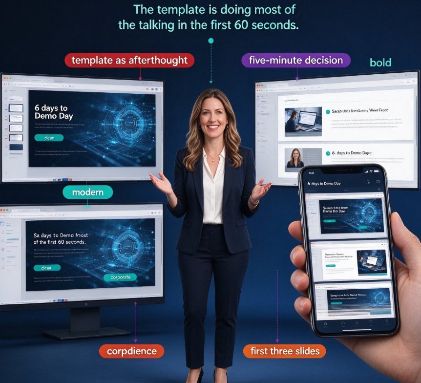
Six days before Demo Day, Sarah opens her company's deck, looks at four template candidates, and picks the one that "feels modern." She has no idea if it communicates her story to investors — she just knows it looks clean.
If you've been there, you know the problem: founders pour weeks into the content, then pick a template in five minutes. But when an investor opens your deck, they scan the first three slides in under 60 seconds. The template is doing most of the talking in those 60 seconds.
This guide walks you through a practical, repeatable process for choosing a winning template for investor pitches using Zendeck's template library. No design degree required.
01 — Why Template Choice Separates Funded and Ghosted Decks
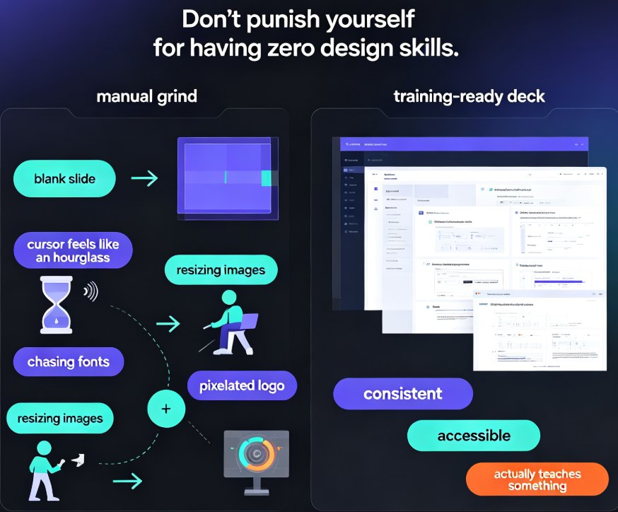
Your content is finished, but your design is an afterthought — and investors can tell. You've lived with your product for two years, so you read your own deck the way it's meant to be read. An investor hasn't. They're seeing it cold, usually on a phone, often at 11 p.m. between two other decks. In that context, the template decides what they notice first, what they skip, and whether they send it to a partner.
A template is a communication layer, not a decorative skin. It encodes visual hierarchy — which elements get bold, which get small, where the eye lands. Choose a crowded template and investors get lost. Choose a sparse, confused one and they skim past the ask.
A template is not a design afterthought — it's the first slide of your pitch, before you say a word.
The Zendesk research on winning sales pitches makes the same point in a different context. Adam Goldstein, CEO of travel startup Hipmunk, couldn't get investor meetings. He sent a two-sentence pitch to United Airlines' CEO, got a response within 15 minutes, and the company ultimately raised over $55 million. The lesson: matching your format to your audience is the single most consequential decision you'll make in fundraising. For your deck, that means choosing a template that speaks the investor's language — not the language of a marketing brochure.
02 — The Anatomy of an Investor-Ready Template
To pick a template well, you first need a mental model of what a fundraising deck must contain. Without that skeleton, you'll fall in love with a pretty template that has the wrong bones.
The slide structure that wins funding rounds consistently looks like this (it mirrors the investor pitch template Zendesk's own research suggests — "developing [offering] to help [target audience] with [pain point]"):
- Problem slide — the pain point your audience experiences daily
- Solution slide — how your product removes that pain
- Market opportunity — size, growth potential, trends
- Product or demo — what you've actually built
- Traction — revenue, users, momentum
- Team — why you're the ones to execute
- Financials and the ask — what you need and what investors get back
The market opportunity slide deserves special attention. A well-known pitch deck guide notes it "highlights the size, growth potential, and trends in your target market" — and you should use charts and graphs because they "prove that your business has room to grow and can scale to generate significant returns." If your template doesn't reserve visual space for a strong data chart, you'll be fighting the design to tell that story.
A winning template isn't the prettiest one — it's the one that makes the investor's scan path obvious.
03 — How to Evaluate a Template: A Practical Checklist
Here's a scoring framework I've used with founders, refined over years of fundraising decks. Run every template candidate against six criteria. If it fails two or more, move on.
| Criterion | What to look for | Why it matters |
|---|---|---|
| Visual hierarchy | Clear headline hierarchy, one message per slide | Investors scan decks, they don't read them |
| Chart-ready layouts | Reserved space for graphs, data blocks | Market opportunity slide needs charts to prove scale |
| Problem-slide prominence | First three slides tell a complete story | You get under 60 seconds of attention |
| Brand flexibility | Customizable color palette, fonts, logo | Consistency between deck and product builds trust |
| Slide economy | 10–15 slides max, no filler | Each extra slide dilutes the ask |
| Mobile readability | Text legible at small sizes | Investors often open shared links on phones |
Score every template candidate against these six criteria. If it fails two, move on. That filter takes you from 200 thumbnails to five real candidates in under 15 minutes.
Visual impact matters more than most founders think. Scrub Daddy's Shark Tank pitch — a smiling sponge with a live demonstration — secured $200,000 from Lori Greiner and was projected to pass $100 million in sales by 2022. The template you choose should make that kind of "show, don't tell" moment possible. If it crushes all your images into tiny boxes, you'll never get that energy onto the slide.
04 — Zendeck's Template Library: Matching Templates to Your Stage
Here's where Zendeck makes template selection faster than it has any right to be. Instead of scrolling endless generic templates, Zendeck's library narrows by intent — fundraising decks, courseware, corporate training, product launches — so you're already in the right neighborhood before you start comparing.
For investor pitches specifically, look for templates that:
- Force a story arc — problem → solution → market → ask, not a bullet-point feature list
- Reserve slide space for data — chart-friendly layouts are built into the template
- Handle brand constraints — one-click reskin so you're not hand-picking colors on every slide
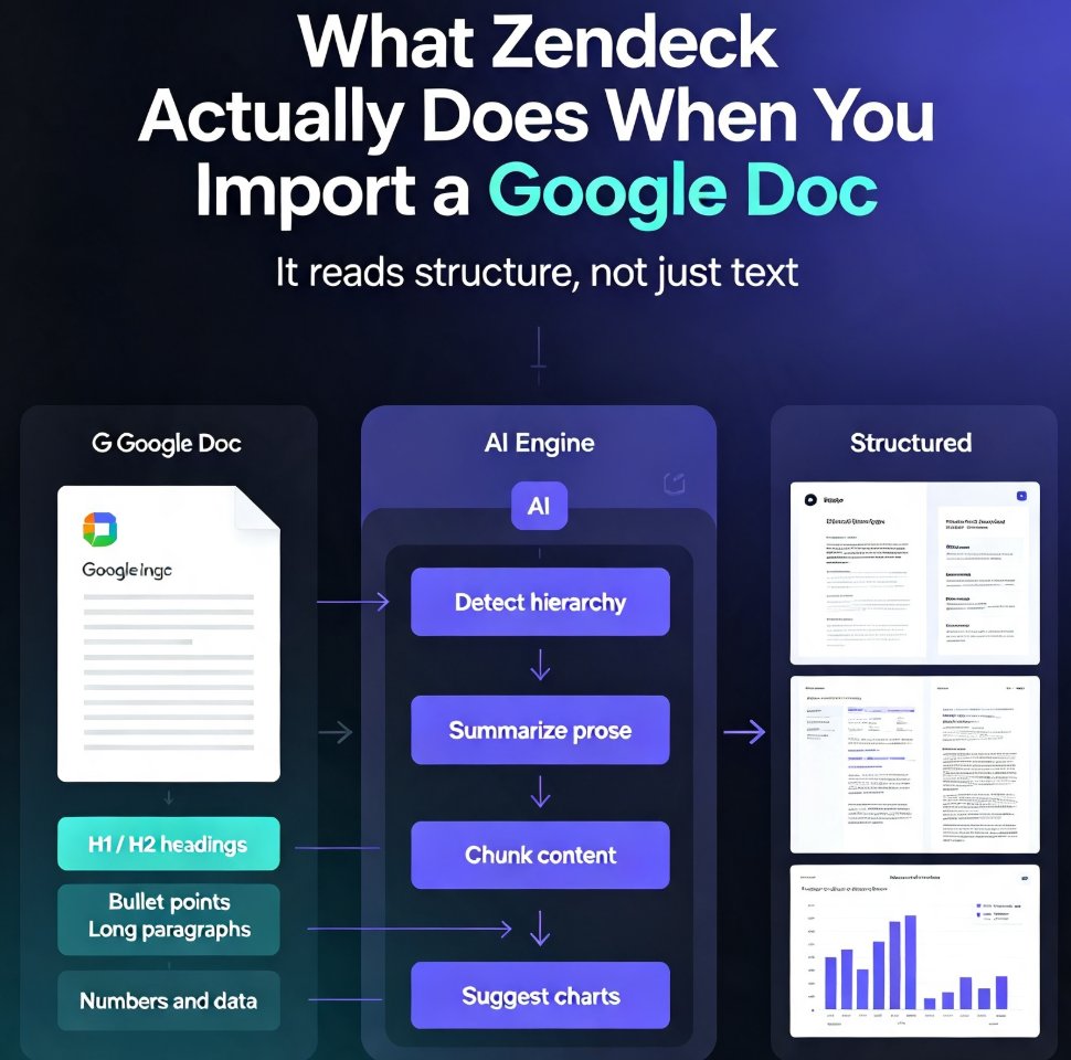
The smart layout can also auto-align content as you paste it in. That's a subtle but huge deal: you're selecting a template for its structure, not just its surface look. The template should do the layout thinking for you — that's the whole point of choosing one. If you're wondering how the selection works under the hood, read our breakdown of how Zendeck picks the right template for you. And for the full flow from problem statement to the ask — including how to build the content itself — check our guide on creating a winning pitch deck with AI.
05 — A Step-by-Step Process for Picking Your Template
Stop browsing thumbnails at random. Use this five-step process instead.
Step 1: Write your pitch arc first. Before opening any template library, put your narrative spine on paper — problem, solution, market, traction, ask. The template follows the story, not the other way around. If you skip this step, you'll cram your story into the template's slots and lose its shape.
Step 2: Filter by format. In Zendeck, filter by pitch deck or investor deck. If that category doesn't exist, narrow to business or startup templates. Avoid academic, training, or courseware templates for investor pitches — the visual language reads "classroom," not "funding."
Step 3: Test the ten-feet rule. Load your top three candidates and paste in your real headline text. Then stand ten feet back from the screen. If you can't read the main message on each slide, the typography is fighting you. That deck will feel even worse on a phone.
Step 4: Stress-test with actual data. Drop your market-size chart or traction numbers into the template. Does the layout hold without collapsing? Does the chart still look sharp? If the grid breaks, move on. This step alone will eliminate 40% of candidates.
Step 5: Commit and reskin once. Pick the winner, paste in all of your content, then do a single pass of brand colors and fonts. Don't revisit the template decision after content is in — you'll burn hours second-guessing what an A/B test would never resolve.
06 — Common Template Mistakes That Kill Pitch Decks
Even with a good process, three mistakes keep showing up in founder decks.
Mistake 1: Template before story. You fell in love with the template and adapted your story to fit its sections. Now slide three makes an argument you never intended to make first. Always lock the narrative before the template.
Mistake 2: Feature-list slides. Any template that lets you dump ten features on a single slide is a trap. Investors want one message per slide, max. Pick a template that fights for simplicity, not one that accommodates clutter.
Mistake 3: Visual inconsistency. Your pitch deck says "modern SaaS" and your financial appendix looks like a 2008 Excel export. Investors feel that mismatch subconsciously, and it erodes trust in the whole operation. Consistent visual language is a trust signal — and trust is the currency of fundraising. If you're building decks as a team, a shared brand kit in Zendeck keeps every founder and operator on the same visual system — exactly the kind of discipline covered in our piece on brand consistency in AI asset libraries.
Also, for startups weighing template options beyond Zendeck, our guide on how Zendeck helps startups win investors covers the practical differences between generic and context-aware templates.
07 — Beyond the Template: Extending Your Deck's Life
If you want your pitch to travel further than a shared PDF, consider turning your deck into a narrated video. Zendeck's PPT-to-video feature converts slides into a short narrated pitch — usually under two minutes — which is what many investors want before committing to a full call.
A narrated recap doesn't replace your template; it extends it. The template still does the structural work; the narration adds a layer that a static deck can't carry. For remote fundraising, that's a quiet edge most competitors aren't using.
If you're new to this workflow, start with the template selection process you just read, build the deck, then decide whether narration makes sense for your next investor touchpoint.
FAQ
How many slides should an investor pitch deck have? Keep it between 10 and 15 slides. Winning decks are tight — each slide carries one message. Templates that let you add slides on demand are better than ones that assume a fixed count, but aim for the shorter end.
What's the most important slide in an investor pitch deck? The market opportunity slide. Investors want size, growth potential, and trends backed by charts and graphs — that's what proves your business can scale and generate meaningful returns. Choose a template that gives this slide room to breathe.
How do I pick a template when I'm not a designer? Score candidates against six criteria (hierarchy, chart-readiness, problem-slide prominence, brand flexibility, slide economy, mobile readability) and test the ten-feet rule. Filter by pitch deck category in Zendeck, stress-test with real data, and commit once.
Can Zendeck help me pick a template automatically? Yes — Zendeck's AI suggests templates based on your content type and structure, and its smart layout auto-aligns as you build. But you should still apply the six-point checklist to filter its suggestions.
Should I use the same template for different investor meetings? Yes. Consistency builds recognition. If you're meeting a seed fund versus an angel, adjust the financial assumptions, not the visual language. Your deck should feel like the same company every time.