How to Choose the Right Template from Zendeck's Library for Your Deck
How to Choose the Right Template from Zendeck's Library for Your Deck
You've been staring at the template gallery for twenty minutes. Everything looks good in the thumbnail. Nothing feels right for your actual deck. Sound familiar?
Here's the uncomfortable truth: most template problems aren't design problems — they're matching problems. You didn't pick a bad template; you picked a template built for a different audience, a different content type, or a different room.
This guide gives you a scenario-based framework for choosing templates from Zendeck's library — one that works whether you're building a lecture deck, a corporate training session, or a boardroom pitch. By the end, you'll have a repeatable process that takes about five minutes, not twenty.
01. Why template choice is a strategy decision, not a style decision
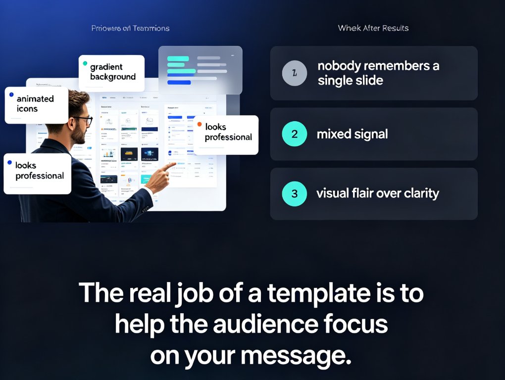
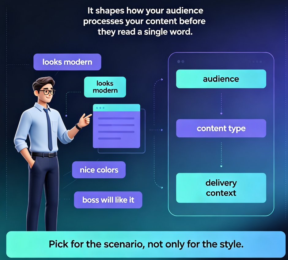
Let's be real: when most of us pick a template, we're judging it like a poster. Does it look modern? Are the colors nice? Will my boss think it's pretty?
That's backwards. A template is a communication container — it shapes how your audience processes your content before they read a single word. Pick a data-dense template for a storytelling pitch and you'll bury your narrative under charts. Pick a playful, illustration-heavy template for a compliance training and you'll undermine the seriousness of the material.
The cost of a mismatched template is measurable:
- Audience disengagement — people stop following your argument because the visual rhythm fights the content.
- Credibility loss — a template that looks "off" makes your expertise look "off" too, especially in front of executives.
- Wasted revision time — you'll spend hours reworking layouts that should have worked from slide one.
The fix isn't finding a "better" template. It's finding the template that matches your scenario — audience, content type, and delivery context.
That's the core idea behind scenario-based selection, and it's exactly how Zendeck's library is organized. Instead of a flat grid of "pretty designs," templates are grouped by use case, so you're choosing from designs built for how you'll actually present. If you're new to the library, the courseware design category is a good starting point for education-focused decks.
02. Three questions to ask before you open the library
Before you even look at templates, answer these three questions. Write the answers down — they'll be your filter.
Question 1: Who is in the room?
Not "who is my audience" in the abstract. Think about the actual people: Are they students who need step-by-step guidance? Employees who've seen forty training decks this quarter? Executives who skim and decide fast?
Each audience reads decks differently: - Students and trainees need clear structure, visible progress, and repetition of key points. - Professionals in training need practical takeaways and room for notes. - Executives and investors need conclusions first, data to back them, and zero fluff.
Question 2: What does the content demand?
Count your content types. Is this deck mostly: - Concepts and explanations → needs generous white space and strong typography - Data and comparisons → needs chart-friendly layouts and clear data hierarchy - Processes and steps → needs numbered flows and progress indicators - Narrative and persuasion → needs visual storytelling and emotional pacing
Question 3: How will it be delivered?
A deck that's presented live by you has different needs than one that's shared as a PDF or converted to video. Live decks need speaker-friendly layouts. Self-serve decks need self-explanatory slides. Video decks need bold visuals that work at small sizes.
Once you've answered these three questions, you've built your selection filter. Every template you consider now gets judged against it — not against how pretty it looks.
03. Matching templates to your scenario: the practical framework
Here's where it comes together. Based on the three questions, here's how to match templates to the four most common scenarios.
| Scenario | Best template style | Design priorities | Common mistake |
|---|---|---|---|
| Lecture / teaching | Clarity-first, education-tagged | Strong typography, white space, step-by-step layouts | Picking a flashy template that distracts from content |
| Corporate training | Structured, progress-oriented | Visual engagement, clear sections, note-friendly | Using a template with no visual variety across modules |
| Business pitch / boardroom | Data-forward, premium | Data hierarchy, brand consistency, high-impact visuals | Choosing a template that hides the numbers |
| Internal status update | Clean, minimal, brand-aligned | Speed of scanning, consistency, low decoration | Over-designing a deck that's read in five minutes |
The chart below shows how the three core design factors shift in priority depending on your scenario. It's a useful sanity check when you're torn between two templates.
Let's unpack the two trickiest scenarios.
Lectures and courseware. Your job is to make complex ideas feel simple. That means templates with clear hierarchy — a strong title, a visible structure, and layouts that guide the eye from "what" to "why" to "how." Zendeck's courseware-tagged templates are built for exactly this: they give you room for explanations, callouts for key definitions, and progress markers so students always know where they are. If you build courseware regularly, the AI Presentation Templates for Trainers: Zendeck's Library Guide walks through the best picks in detail.
Business pitches. Executives don't read decks — they scan them. Your template needs to put the conclusion on the slide, the data behind it, and the ask at the end. Look for templates with strong data hierarchy: big numbers, clean charts, and minimal decoration. A premium, restrained template will serve you better than a colorful one. And if brand consistency matters — it always does in a boardroom — check out 5 Ways to Create a Custom Brand Kit in Zendeck for Consistent Decks.
04. How Zendeck's library does the matching for you
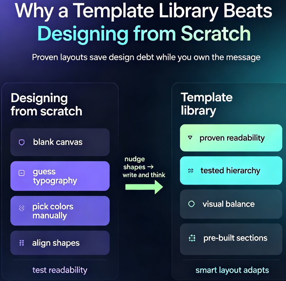
Here's where Zendeck earns its keep. The library isn't just a collection of templates — it's organized around the scenarios above, and the AI does a lot of the matching work.
When you paste a Word outline or Markdown into Zendeck, the system analyzes your content structure. Text-heavy sections? It suggests layouts with strong typography. Data-heavy sections? It steers you toward chart-ready templates. This is the same logic behind AI Deck Template Selection: How Zendeck Picks the Right Look for You — the AI reads your content's rhythm and matches it to a template's layout strengths.
The result is that you're not choosing from hundreds of "maybe" templates. You're choosing from a shortlist of templates that already fit your content type. That's a massive time saver, and it's the difference between template roulette and template selection.
The smartest move is to let the AI shortlist, then apply your scenario filter on top. AI handles the content match; you handle the audience match.
This is also where the 2026 trend toward contextual templates comes in. Generic templates are losing ground to designs that adapt to content and context — 2026 Template Library Trends: Why Contextual Templates Beat Generic explains why this shift matters for anyone who builds decks regularly.
05. A five-point checklist before you commit
Once you've shortlisted a template, run it through this checklist. If it fails more than one item, move on.
1. Does the title slide set the right tone? The first slide is your handshake. It should match the formality of the room — casual for workshops, polished for boardrooms.
2. Can your content breathe? Drop in your actual text (not lorem ipsum). If the layout feels cramped or the text overflows, the template is fighting you.
3. Do the chart and data slots exist? If your deck has data, the template needs dedicated chart layouts. Don't force data into a text template.
4. Does it match your brand? Colors, fonts, logo placement. If the template's default palette clashes with your brand, check whether it can be reskinned. Zendeck's one-click reskin handles this, but it's worth confirming before you invest time.
5. Will it survive delivery? If you're converting to video, test a slide at small size. If you're presenting live, check that speaker notes have room.
A template that passes all five checks is a keeper. One that fails two or more will cost you more time in revisions than it saves in setup.
06. Common template mistakes (and how to avoid them)
Even with a framework, we all slip. Here are the three mistakes I see most often — and the fix for each.
Mistake 1: Picking the "wow" template. The most visually striking template in the gallery is rarely the right one. It's designed to impress in a thumbnail, not to serve your content. Fix: apply your scenario filter first, then look at visuals.
Mistake 2: Ignoring the content-to-layout ratio. If your deck is 80% text and the template is 80% visuals, you'll spend hours deleting decorative elements. Fix: count your content types before you browse, and match the template's layout strengths to your dominant content type.
Mistake 3: Never changing templates for recurring decks. Some teams use the same template for everything — training, pitches, updates — because it's "safe." But a template that works for a boardroom pitch will feel stiff in a workshop. Fix: keep a small set of go-to templates per scenario, not one universal template. This is where Zendeck's library shines — you can save favorites per use case.
If you've already hit these problems with AI-generated slides, you're not alone. Why Your AI-Generated Slides Still Look Messy and How Zendeck Fixes It covers the root causes and the fixes.
07. When to break the rules
Every framework has exceptions. Here's when you can ignore the scenario-matching advice:
- You're building a personal brand deck. If the deck is about you, your personality can override scenario conventions. A creative professional can use a playful template in a client pitch — if it's intentional.
- You're designing for a hybrid audience. When your deck serves both a live room and remote viewers, optimize for the smaller screen and the shorter attention span. That usually means bolder visuals and less text.
- You have a strong brand system. If your brand kit is locked down, the template's job is just to provide structure — the brand does the talking. In that case, prioritize layout over style.
The rule of thumb: scenario matching is the default, and breaking it is a deliberate choice — not an accident.
FAQ
How do I know which Zendeck template fits my lecture deck? Focus on clarity-first templates with strong typography hierarchy and generous white space. In Zendeck's library, look for templates tagged for education or courseware, and check that the layout supports step-by-step explanations rather than dense data.
Can Zendeck recommend a template automatically? Yes. When you paste a Word outline or Markdown into Zendeck, the AI analyzes your content structure and suggests templates that match the document's rhythm — text-heavy sections get layout-friendly designs, data-heavy sections get chart-ready templates.
What's the difference between a generic template and a scenario-matched one? A generic template looks fine in the gallery but forces your content to fit its structure. A scenario-matched template is built around how that audience reads — trainers get progress-friendly layouts, boardrooms get data-forward designs, lectures get clarity-first typography.
Should I customize templates after selecting one? Light customization is fine — swap colors to match your brand, adjust font sizes. But if you're reworking more than 20% of the layout, you picked the wrong template. Zendeck's one-click reskin handles brand consistency so you don't have to rebuild.
How often should I change templates for recurring decks? Keep a stable template for recurring internal decks — familiarity builds trust. Change templates when the audience or purpose shifts, like moving from a training session to an executive review.