How to Choose a PPT Template Your Audience Will Actually Remember
Let's be honest: you've sat through a hundred decks that looked perfectly fine and vanished from your memory the second the lights came up. The template wasn't ugly. The colors matched. The fonts were clean. It just wasn't chosen for the people sitting in the room.
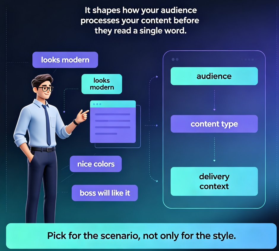
Most template guides tell you to pick what looks good. That's backwards. A template is a communication decision, not a decoration decision. Choose it the way you'd choose a tone of voice — based on who you're talking to and what you need them to feel.
This guide walks through a decision framework that educators, trainers, and team leads can actually use. By the end, you'll know how to pick a template that supports your message instead of fighting it — and why Zendeck's template library makes that choice easier than it's ever been.
I. Why Most Template Choices Fail (It's Not About Aesthetics)
Here's a scene you'll recognize. A training manager spends forty minutes scrolling through template galleries. She picks the one with the gradient background and the animated icons because it "looks professional." The deck goes out. Three weeks later, nobody remembers a single slide.
The problem isn't the template. It's the selection criteria.
When you choose a template based purely on aesthetics, you're optimizing for the first five seconds of a slide — not for the twenty minutes of attention that follow. The real job of a template is to reduce cognitive load so your audience can focus on your message, not to impress them with visual flair.
Think about what happens when a template fights your content. You're teaching a serious compliance module, and the template is full of playful cartoon illustrations. Every slide sends a mixed signal. Your audience spends mental energy reconciling the visual tone with the serious content — energy they should be spending on the material itself.
The fix is simple: choose the template that matches the job the deck needs to do. That's the framework below.
II. The Three-Question Framework for Template Selection
Before you open any template gallery, answer three questions. Write the answers down. They'll do more for your deck than any design skill.
◉ Question 1: Who Is Actually in the Room?
Audience psychology matters more than any color palette. A template that works for a room of executives will feel wrong for a classroom of new hires — even if the content is similar.
- Executives respond to density and data. They want to scan, extract, and move on. Templates with strong chart layouts and minimal decoration win here.
- Trainers and educators need breathing room. Learners need space to take notes, process examples, and follow along. Templates with generous whitespace and clear section breaks support that.
- External audiences (clients, partners, investors) need polish and brand alignment. They're judging you as much as your content.
The same content can be remembered or forgotten depending on whether the template matches the audience's expectations. That's not a soft claim — it's how attention works. Familiar visual patterns let people process faster; unfamiliar ones force them to slow down and re-orient.
◉ Question 2: What Kind of Content Are You Carrying?
Content type should drive template structure. Here's the distinction that matters most:
- Narrative content (a story, a case study, a journey) needs templates with strong visual flow — clear beginnings, middles, and ends. Timeline layouts, big imagery, and sequential section dividers help.
- Data-heavy content (reports, metrics, research findings) needs templates built around charts, tables, and callout boxes. The template's job is to make numbers scannable.
- Instructional content (training, how-tos, onboarding) needs templates with clear hierarchy — objectives, steps, and summaries that learners can anchor to.
If you're not sure which category your deck falls into, ask yourself: "What do I want people to do with this information?" The answer tells you the structure you need.
◉ Question 3: What Brand Signals Do You Need to Send?
Every template sends a signal about who you are. A bold, colorful template says one thing; a restrained, minimal one says another. Neither is wrong — but they need to match the impression you're trying to create.
For internal training, brand consistency builds trust. When every deck from your team uses the same template family, learners start to recognize the format. They know what to expect, which means they can focus on content instead of orientation. If you want to lock this down properly, a custom brand kit is the way to go — you can see exactly how to set one up in our guide on creating a custom brand kit in Zendeck.
For external presentations, brand alignment is non-negotiable. A pitch deck that doesn't match your company's visual identity undermines your credibility before you say a word.
III. Matching Content Type to Template Style
Here's a practical mapping you can steal. It's not exhaustive, but it covers the scenarios most trainers and team leads face:
| Content type | Best template style | Why it works |
|---|---|---|
| Executive update | Data-forward, minimal decoration | Executives scan for numbers; clean charts speed extraction |
| New-hire training | Generous whitespace, clear section breaks | Learners need room for notes and mental processing |
| Product pitch | Bold imagery, strong contrast | Visual impact supports persuasion and recall |
| Compliance module | Serious, restrained, high contrast | Tone alignment prevents mixed signals |
| Workshop facilitation | Interactive layouts, space for activities | Supports participation, not just passive viewing |
| Research findings | Chart-heavy, callout boxes | Makes complex data scannable and quotable |
The pattern here: every template choice is a trade-off between visual impact and cognitive efficiency. Impact gets attention; efficiency gets retention. You need both — but the balance shifts depending on your content.
This is also where template trends are heading. The old approach of picking from a static gallery is giving way to templates that adapt to context. If you want to see where that's going, our piece on 2026 template library trends breaks down why contextual templates are beating generic ones.
IV. How Zendeck's Template Library Puts This Framework to Work
This is where the framework stops being theory. Zendeck's template library is built around the idea that templates should serve content, not the other way around.
When you build a deck in Zendeck, the platform doesn't just hand you a random gallery. It uses context-aware design to suggest templates that match the structure and purpose of your content. Drop in a Word outline or paste Markdown, and Zendeck generates a deck with a template that fits — then lets you swap the entire look with one click if you want a different direction.
That one-click reskin is a quiet superpower. You can test the same content against three different template styles in about two minutes, which means you can actually apply the framework above without spending an afternoon rebuilding slides. 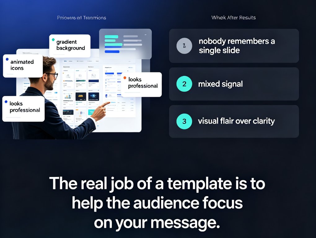
For teams that need consistency, Zendeck's brand kit features let you lock in your colors, fonts, and logo treatment across every template. That solves the brand-signal question from Section II without manual effort — every deck from your team automatically matches.
And if you're building courseware specifically, Zendeck's library includes templates designed for educators and trainers, with layouts that support learning objectives, section reviews, and activity breaks. You can see more in the AI Presentation Templates for Trainers guide. If you're curious about how the platform decides which template to suggest in the first place, our deep dive on AI deck template selection walks through the logic.
V. Three Habits That Make Any Template Work Harder
Even the right template won't save a deck if the content is weak. But these three habits will make any good template perform better:
1. Test before you commit. Open your content in two or three template styles and flip through them. The right one will feel obvious — the content will look like it belongs. If you're using Zendeck, the one-click reskin makes this test take minutes, not hours.
2. Cut more than you think you need. Templates have room for a reason. When every slide is full, the template's structure disappears under the clutter. Trust the whitespace. Your audience will thank you.
3. Stay consistent across the deck. The most common template mistake isn't choosing badly — it's mixing. Once you pick a template, commit to it. Consistency is what builds the familiarity that lets your audience focus on your message.
If you're building training or course materials specifically, the same principles apply — and you can dig deeper into how to structure those decks in our courseware design category.
FAQ
Q: How do I know if a template matches my audience?
A: Think about what your audience needs to do with the information. Executives need to scan and extract; learners need to process and remember. Match the template's density and structure to that need, not to your personal taste.
Q: Should I always use the same template for consistency?
A: Consistency within a deck and across a team's materials builds recognition and trust. But different content types may warrant different template families. The key is that each choice is intentional, not random.
Q: Can Zendeck help me choose a template?
A: Yes. Zendeck's context-aware design suggests templates based on your content structure and purpose, and its one-click reskin lets you test multiple styles quickly. Its brand kit features also keep your colors and fonts consistent across every deck.
Q: What's the biggest template mistake people make?
A: Choosing based on aesthetics alone. A template that looks great but fights your content creates cognitive friction. The audience spends energy reconciling the mismatch instead of absorbing your message.
Q: Do templates really affect how much people remember?
A: Yes. Familiar visual patterns reduce cognitive load, letting audiences process and retain more. Templates that match audience expectations and content type support memory; mismatched ones undermine it.