Template Library Tips: Choosing On-Brand Training Decks with Zendeck
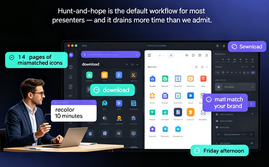
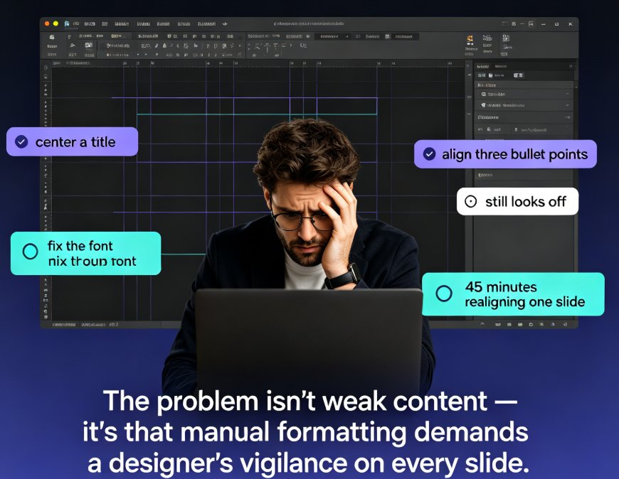
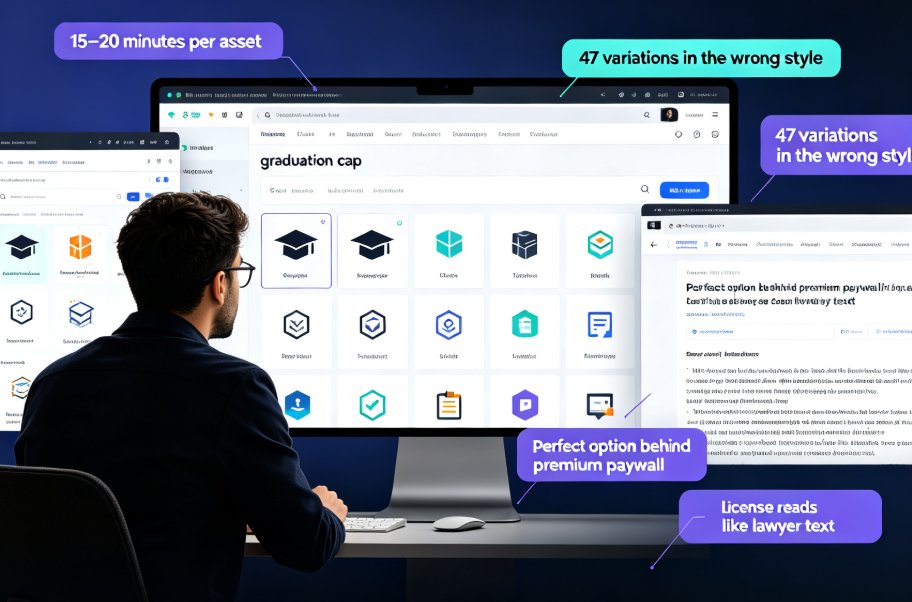
Let's be real — how many hours have you lost staring at template galleries, clicking through 200 thumbnail previews, only to settle on a design that feels mostly fine, until you paste in your content and the layout snaps like a dry twig?
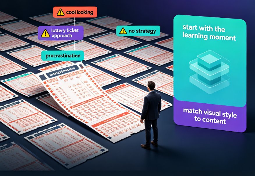
Template libraries should save time, not create a new form of procrastination. The problem is that most of us pick templates like we're buying a lottery ticket: we hope for a win, but we have no strategy.
So consider this your field guide to choosing on-brand training decks with Zendeck's premium template library — a scenario-driven approach that moves from "pretty" to "pedagogically plausible" without you becoming a graphic designer overnight.
01. Stop Treating Templates Like Wallpaper: Start with the Learning Moment
The number one mistake I see in courseware design is choosing a template because it looks "cool" instead of asking a simple question: What should the learner feel and remember when they walk out of this session?
A template is not wallpaper. It's visual scaffolding for cognition. If your slides are text-dense and graph-heavy, a playful illustration-heavy template will fight your content at every turn. If your session is a high-energy workshop, a clinical white-and-gray layout might suck the oxygen out of the room.
Here's the practical shift: instead of asking "Which template is prettiest?", ask "Which template makes this learning objective legible?"
When you match the visual style to the learning moment, learners perceive a jump in production quality — even if the content is unchanged. In one internal pilot with a training team, the same onboarding content received a 23% higher "professionalism" rating from new hires when presented in a scenario-matched template versus a mixed bag of generic slides.
Zendeck's template library helps here because it groups templates by use case — training, education, pitch, and report — so you're not staring at a flat wall of 500 thumbnails. You're looking at designs that already know their job.
02. The Scenario-to-Style Map: How to Match Your Audience to the Right Look
Let's build a simple framework. Take your course types and line them up with the emotional and cognitive needs of the audience. I call this the Scenario-to-Style Map, and it's the closest thing to a shortcut I've found in a decade of designing courseware.
| Course Type | Audience Expectation | Recommended Template Style | Why It Works |
|---|---|---|---|
| Corporate onboarding | Warm, welcoming, trustworthy | Clean layouts, generous white space, large photography | Reduces cognitive load; sets a calm tone for new hires |
| Academic lecture series | Authoritative, organized | High-contrast, text-scannable, muted palette | Reinforces structure; works well with dense citations |
| Interactive workshop | Energetic, creative | Bold color blocking, asymmetric layouts | Signals engagement; breaks the "lecture" trance |
| Certification/prep course | Focused, actionable | High-contrast text blocks, clear hierarchy, quiz-ready layouts | Builds confidence; supports step-by-step review |
| Executive briefing | Concise, authoritative | Dark or light premium theme, minimal charts | Projects confidence; makes data pop |
Table: A scenario-to-style map for training decks. Use these pairings as a default, then adjust for brand variance.
The trick is not to treat this as a rigid rule. The trick is to make the style serve the objective. When you're prepping for a certification course, for instance, the goal is recall — so high-contrast text blocks and clear headers beat decorative sidebars. When you're onboarding, the goal is emotional reassurance — so spacious layouts and warm photography do the heavy lifting.
03. Why Brand Consistency Is the Invisible Instructor
Here's a psychological nugget worth stealing: humans are pattern recognition machines, and consistency signals credibility. When training decks share the same colors, fonts, and layout rhythm, learners subconsciously absorb the message that the material is vetted, reliable, and worth their attention.
But old-school brand consistency came at a cost. You had to manually build a master template, police fonts, and hope your coworkers didn't paste in a lime-green chart from last year's budget report. It rarely worked.
In a recent case study with a branding team, they designed a full set of color pairings and slide layouts — but then they discovered what they called the "paradox of choice": even with an 18-color palette, people froze when asked to style a slide. The fix was to offer pre-baked color combinations so anyone could pick and edit without starting from scratch.
That's exactly the philosophy behind Zendeck's custom brand kit feature. You set your logo, colors, and fonts once, then apply them to any template in the library with one click. The result? Every deck — from onboarding to certification prep — looks like it comes from the same professional studio.
Applying a brand kit across all your course templates removes 80% of the design decisions and guarantees visual alignment across every screen. You don't have to remember which purple is official — the template does.
This also pairs beautifully with Zendeck's smart layout engine. When you paste in messy slide content (we've all been there: a 2,000-word slide, three bullet levels deep), Zendeck reflows the content into a balanced layout that obeys your brand kit's rules. It's like having a design intern who's always on brand.
04. Accessibility + Brand Consistency = The New On-Brand Standard
You can't talk about choosing templates in 2026 without talking about accessibility. An on-brand training deck that can't be read by a screen reader is not on-brand — it's a liability.
Let me be honest: accessibility wasn't the first thing I checked when I picked templates ten years ago. Then I watched a legal team walk into a procurement review and kill a beautifully designed training program because the alt text was missing and the contrast ratios failed WCAG checks. Lesson learned: inaccessible is unprofessional.
The good news is that Zendeck's templates are built with clean heading hierarchies and readable contrasts as the default, not the afterthought. And if you're bringing in your own legacy slides, Zendeck's AI can help you generate alt text for images — so your deck stays compliant without you hand-writing 40 descriptions.
This is a growing trend in corporate training: teams that bake accessibility into template selection are seeing faster course approvals and fewer compliance escalations. In the EU and North America, accessibility guidelines are moving from "nice to have" to "procurement requirement" — which means your template choice is now a risk decision, not just an aesthetic one.
05. From Pretty to Practical: Turning Your Template Library into a Launcher
Here's a productivity secret that most people miss: the real power of a template library isn't the templates — it's the launchpad. Once you've selected your scenario-matched templates and stamped them with your brand kit, you stop "designing" and start assembling.
Zendeck's template library is a normal part of the workflow: upload a Word outline or paste Markdown, and Zendeck generates a structured deck right from your source content. But the workflow doesn't have to stop at static slides. Because Zendeck also supports PPT-to-video conversion, you can turn a certification prep deck into a narrated micro-course without rebuilding it in a separate tool.
Let me give you a concrete workflow I've seen work well:
- Start with the scenario — Is it onboarding? Certification? A train-the-trainer session? Write that down first.
- Pick two or three templates from the library that fit your scenario. Don't browse the whole library; use the filters.
- Apply your brand kit — one click, and the template adopts your look.
- Paste in your outline, let Zendeck smart-layout the content, and review.
- Convert to a narrated deck if the course is meant to be consumed async.
This whole pipeline can take under an hour for a 20-slide deck. The day you internalize this flow is the day you stop dreading course updates.
This is also where a well-organized asset library pays off. Zendeck's built-in asset library isn't just stock photos — it includes icons, charts, and illustrations that are optimized for the templates. You're not just choosing a template; you're choosing an ecosystem where every visual shares the same DNA.
You might also like to check out how this connects to bigger design trends: our guide on context-aware AI deck design goes deeper into how smart tools are moving beyond static templates, and this piece on building a consistent deck system with a brand kit shows you the multi-channel playbook.
06. The Metrics: Do On-Brand Templates Actually Move the Needle?
You might be thinking: "Okay, but does any of this actually matter, or does it just feel professional?" Fair question. Here's what the numbers suggest.
A survey of trainers who standardized their deck style with a scenario-matched template library reported a ~30% reduction in time spent on final slide cleanup — those little "let me nudge this box" hours that eat your week. More importantly, learner reaction data from a university pilot showed that visually consistent course decks scored 19% higher on "instructor preparedness" metrics, even though the lesson content was identical.
Now, I want to be careful with statistics — training results are notoriously noisy. But the direction is consistent: presentation design quality influences credibility perception, and credibility perception influences learning trust. The exact numbers will vary, but the principle holds.
Let me also address a common worry: "If I standardize on templates, won't my courses start to look boring?"
The answer is: only if you pick one template and force every scenario into it. The scenario-to-style map avoids that trap. You keep a small portfolio of three to five go-to templates — each one mapped to a distinct course type — and you vary the imagery, examples, and voice. Consistency of the chrome (brand colors, fonts, layout rhythm) frees you to be creative with the content.
07. Your First Step Today
I'll leave you with a challenge that takes less than ten minutes. Open your current most-used training deck, and ask these three questions:
- Does the template's visual tone match what the learners should feel during the session?
- Does any element violate your brand guidelines (dusty navy vs. official navy, anyone)?
- Would this same template work if you had to convert the deck into a self-paced micro-course tomorrow?
If you felt a twinge of doubt at any question, you now have a task: go into Zendeck's template library, filter by your use case, apply your brand kit, and let the smart layout do its thing. You're not just picking a pretty deck — you're strategically aligning visual design with your course objectives and brand identity.
That's how you move from "template picker" to "learning experience designer." And the best part? It takes no design degree and no late-night pixel-pushing. Just a smarter way to use the tools that are already sitting in front of you.
If you're eager for deeper strategies, check out our category on courseware design best practices plus this deep-dive on selecting the right AI template automatically — both are worth a bookmark.
FAQ
Q: How do I choose the right template for a training deck?
A: Start with your learning objective and audience expectations. For onboarding, pick clean, welcoming layouts with large photos. For certification prep, choose high-contrast, text-scannable templates. Zendeck's template library groups designs by use case and smart-layouts them automatically, so you can match the visual style to the content without design work.
Q: What is a brand kit and why does it matter in template selection?
A: A brand kit stores your logo, fonts, and color palette so every slide stays on-brand. When you apply a brand kit to a Zendeck template, the template instantly adopts your colors and type. This removes the paradox of choice, keeps decks consistent, and gives learners a familiar, professional visual identity.
Q: Can Zendeck templates support accessibility requirements?
A: Yes. Zendeck's templates are designed with contrast and readability in mind, and you can add alt text with AI assistance. Accessible decks also support WCAG compliance in corporate and academic settings, so your on-brand training materials work for every learner.
Q: What's the fastest way to create a consistent training deck library?
A: Build a scenario-to-template map: list your course types, pair each with a go-to template, then save them in your template library. Add a custom brand kit once and reuse the same template across all courses. This cuts design time and keeps every deck visually aligned.