Promptable Analytics for Course Design: Turning Feedback into Better Decks
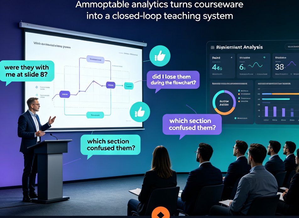
You know that feeling, right? You spend a week building what you're pretty sure is a solid lecture deck. Engaging intro, clean visuals, a few interactive checkpoints. Then you present it, you get the polite nods, and you walk away wondering… did that actually land? Were they with me at slide 8, or did I lose them during the flowchart? you're a very good and professional SEO content editor.
Let's be real: most educators fly blind. We craft courseware based on guts and good intentions, then wait for the final exam to tell us how we did. By then, it's too late to fix anything in the moment.
But that's changing. A new approach—promptable analytics—is making its way from customer experience software into education. And it's about to make our decks a whole lot smarter.
What Promptable Analytics Actually Means (and Why It Matters for Teachers)
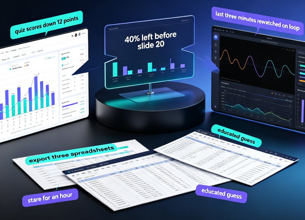
You've used a dashboard before. They're fine. You stare at a dashboard full of charts and try to find the one metric that matters. Then you export it, forget about it, and pray it's read.
Promptable analytics flips that entirely. Instead of searching for insight, you just ask a question in plain English.
Think: "Which slide in Module 2 caused the biggest drop-off?" or "Did students rewatch the video on photosynthesis after the quiz?" The system figures out the query, digs through the data, and hands you back a clear answer—usually with a recommended action attached.
This is conversational AI applied to your actual teaching materials. And here's the thing: it's not science fiction. Research into AI-powered prompt engineering for Education 4.0 already emphasizes how analytics can automatically measure student engagement and identify current trends and challenges in learning experiences.
So what does that mean for a busy instructor? Instead of "let me check the engagement report" (that you'll read in two weeks), you get immediate, actionable insight that fits your existing workflow.
01 | Why Traditional Course Design Feedback Fails (and What's Changed)
For years, improving courseware was a slow, painful loop. You design a deck, deliver it, collect student surveys, and hope the feedback covers the right parts. The problem is, surveys are biased toward the extremes—the students who loved it or hated it. The silent majority never tells you what confused them.
Assessment results tell you that students struggled, but not where or why in your materials.
That's where modern analytics-driven systems shine. As research on course design and development shows, analytics allows course design to be based on what data is important to collect—and more importantly, how to interpret it.
The savvy instructor might decide to collect data on content that students found difficult, or even foster social learning that generates data on how peers interact. Tag distribution and user activity bubbles can indicate when certain topics need more attention than others.
This is the critical shift: analytics lets you design for engagement, not just for content delivery.
And it doesn't require a Ph.D. in data science. The systems do the heavy lifting; you get the insights.
02 | Turning Viewing Data into Design Decisions
Here's a scenario that will resonate.
You've just converted your latest slide deck into a narrated micro-course. (You're doing this already, right? It's where we're headed in corporate training and education alike.)
A week later, you open the analytics. You see that slide 12 has an average viewing time of three seconds, while the rest hovered around forty-five. You also see that three students dropped off right after slide 12 and never came back.
Before promptable analytics, you'd have to cross-reference logs manually (if your platform even had that granularity) and guess why. Now consider asking:
"What's confusing about slide 12?"
A system with access to your slide content, the transcript, and interaction data could respond:
"The chart on slide 12 uses a complex 3D pie format that's hard to parse. Students spent less time reading it, and two dropped off during this section. Consider a simple bar chart, or break the data into two slides for clarity."
That's the difference between data reporting and data action. The output isn't just a metric—it's a design recommendation that matches your educational objectives.
Let's put this in perspective. A quick comparison of old-school feedback vs. promptable analytics:
| Aspect | Traditional Feedback Loop | Promptable Analytics Loop |
|---|---|---|
| When you get feedback | Weeks later (end-of-course surveys) | Immediately (after each viewing) |
| Granularity | Overall course rating, vague comments | Slide-by-slide engagement, quiz item details |
| Who interprets data | You (weeks of work) | AI system (instant, contextual) |
| Type of output | Raw numbers, static charts | Plain-language answers with design recommendations |
| Actionable? | Usually requires extra analysis | Yes—direct guidance on what to change |
The value isn't just saving time. It's that the feedback loop becomes tight enough to actually use. You improve slide 12, re-publish, and see if the drop-off disappears. The iterate-fast cycle makes your courseware better every single run.
03 | Promptable Analytics in Practice: Questions That Guide Smarter Decks
You don't need to wait for a complete platform overhaul to start thinking this way. You can begin with a mindset shift: what should I be asking?
Here are five questions worth asking about your next course deck (and what a promptable system would look up to answer them):
◉ 1. "Which slide lost my audience?"
Essentially engagement dips. The system looks at viewing time, navigation back-and-forth, and drop-off rates per slide.
◉ 2. "Did students struggle with the quiz on Module 3?"
It connects quiz answers to the relevant content section. If most students got a certain question wrong, it traces that question back to the slide where that concept appeared.
◉ 3. "Are students rewatching a specific explanation?"
A sign that the explanation might be unclear. It flags that a few students watched a 20-second segment five times, which might warrant a simplified re-explanation or a supplementary example.
◉ 4. "Which format works best for this concept?"
Your earlier slides used a bulleted list, but the material is inherently visual. The system can compare engagement with similar content that used a diagram format, and suggest a switch.
◉ 5. "What content should I emphasize next semester?"
By aggregating which topics generated the most questions and annotations, you get a curve of where students consistently get stuck.
Notice how the tone isn't "numbers" or "metrics"—it's plain language. That's the promise of promptable analytics: between you and the data, there's a layer of understanding, not a wall of spreadsheets.
And here's a quick tip from someone who's been in your shoes: don't just ask about what students did, ask why they might have done it. You'll often get insight about the content's structure (too much on one slide, unclear heading), not just the result.
04 | Where Zendeck Fits into This Smarter Courseware Future
Alright, let's talk about the platform in the room.
Zendeck is built around a core idea: anyone can make professional, engaging courseware without a design degree. It starts with an outline, generates a coherent deck, enforces consistent brand styling, and even converts slides into narrated micro-courses.
But the roadmap into promptable analytics means extending that value. Instead of just creating a deck, Zendeck aims to help you optimize it based on how your audience engages. You'd be able to ask the same platform that generated your slides:
"Suggest a better layout for slide 7 based on attention data."
It sees the layout, it sees the attention drop, and it recommends a fix—like a different template or moving the key takeaway higher up.
The goal is to close the loop between design, delivery, and feedback. You create with AI, publish with AI, and improve with AI. If your current tools handle the first part but leave you in the dark on the last, that's a significant gap to consider.
For now, if you're teaching or training, you can already build on that foundation. Use Zendeck to ensure the starting material is clean, focused, and visually consistent, then prepare for a future where data recommends your next edit.
05 | Practical Steps to Start Using Feedback Data Today
You might not have a promptable system live right now. But you can still adopt the mindset and get most of the value:
Step 1: Define what engagement means for your course
Is it quiz scores? Viewing completion? Annotations? Pick two or three signals that matter for your learning goals.
Step 2: Set up your content to generate that data
If you want slide-level attention, break points that allow tracking (like one concept per slide). If you want quiz-based insights, place micro-quizzes strategically—after a concept that's often misunderstood.
Step 3: Use what you have, imperfectly
Even basic platform analytics (like video watch time or quiz item difficulty) can be turned into hypotheses. "Students paused the video at the coordinates section—maybe I need a better graphic." Test it, tweak, and see if the metric improves.
Step 4: Think like a prompt designer
Refine the questions you ask about your course data. Instead of a vague "how did it go?" ask "which section caused the most hesitation?" The quality of your insight is directly tied to the quality of your questions.
06 | What Promptable Analytics Means for the Future of Teaching
This isn't just a time-saver. It's a shift in how we approach educational content. We're moving toward systems that can:
- Automatically identify where students form misconceptions.
- Suggest adaptive activities based on what a class struggled with.
- Generate formative feedback that feels personal and timely.
There's already promising research showing that conversational AI can provide systematic, constructive feedback when guided by precise prompts aligned with educational objectives. That's the exact logic we're applying to course design itself.
And it extends beyond the classroom. Corporate trainers, HR teams running onboarding, and content operators building certification paths all face the same challenge: is my material working? At scale, getting a promptable answer instead of a data analyst's report could be a game-changer for iteration cycles.
Consider this: an ecosystem where you ask your tooling for advice on how to teach better, and receive specific recommendations grounded in your audience's actual behavior. It's a powerful margin that makes our content increasingly effective over time, not just pretty.
FAQ
What is promptable analytics in course design?
Promptable analytics means you can ask an AI system questions about your course data in plain language—like "which slide had the highest drop-off?"—and receive actionable insights. It's conversational analytics applied to learning materials, helping educators understand engagement without needing a data science background.
How can promptable analytics improve my teaching materials?
It pinpoints exactly where students disengage or struggle. For example, if analysis shows that most students pause at a particular chart, you can get a suggestion to simplify the visual or add an explanatory note. Instead of redesigning your whole deck, you make targeted improvements where they matter most.
What types of data does promptable analytics use?
It combines viewing behavior (how long students linger on slides, where they rewatch), interactive quiz results, and even annotation patterns. Some advanced systems also consider whether students re-engage with specific sections after a question, which signals comprehension issues.
Do I need to be good with data to use promptable analytics?
No. That's the whole point. You simply ask questions in natural language, like "did my students struggle with Module 3?" The system translates that into data queries and returns plain-language answers with recommended actions. It's designed for educators, not analysts.
How does Zendeck fit into promptable analytics for courseware?
Zendeck is already positioned to support this workflow. It can auto-generate slides, convert them to narrated videos, and track how viewers interact with the content. The roadmap points toward using that interaction data to recommend design improvements—selecting alternative layouts or templates that boost clarity and engagement.