How to Create a Webinar Deck That Converts with Zendeck Templates
Let's be real: most webinar decks are built to inform, not to convert. You spend 40 minutes walking through features, and then the last slide says "Questions?" and the audience quietly leaves. If you're a marketer, trainer, or product manager, you know the real goal isn't just to present — it's to get people to register, sign up, buy, or book a call. The good news? A conversion-focused webinar deck follows a repeatable architecture, and Zendeck's templates make that architecture easy to execute without a design team.
A webinar deck that converts is not a slide deck with a CTA at the end. It's a sequence of slides engineered to move one specific audience from attention to action.
This guide walks through the slide structure, visual hierarchy, and CTA placement that turn a passive webinar into a decision-driving experience. No generic design tips. Just the architecture that works.
01 Start with the one action before slide one
Before you open a template, write down the single action you want viewers to take. Registration for the next session? A trial sign-up? A sales call? Course enrollment? Every slide should serve that action.
The pain point is obvious: when the goal is vague, the deck becomes a data dump. You include everything because you're afraid to leave something out. The result is a webinar that feels informative but produces no measurable outcome.
The fix is to define one primary CTA and one secondary CTA before you write a single headline. Your primary CTA is the main event — the action that pays the bills. Your secondary CTA is the fallback for people who aren't ready to commit, like downloading a resource or joining a newsletter.
The outcome is clarity. Once you know the action, you can judge every slide by a simple test: does this move viewers closer to the action, or does it just fill time? If it doesn't earn its place, cut it.
◉ What counts as a conversion for a webinar?
It depends on your funnel. For a product launch, conversion might mean "start a free trial." For a training team, it might mean "enroll in the full course." For a consultant, it might mean "book a discovery call." The important thing is to pick one primary action and make it unmistakable.
02 Use the 4-act structure that keeps attention and drives action
High-converting webinars don't follow a linear "here's everything we know" structure. They follow a narrative arc: Hook, Teach, Prove, Convert.
The 4-act structure — Hook, Teach, Prove, Convert — turns a passive presentation into a guided decision path.
Act 1: Hook. In the first 60 seconds, state the problem your audience feels and the promise of what they'll walk away with. This is not the time for a company history or a team photo. It's the time to earn attention.
Act 2: Teach. Deliver the core insight in small, scannable chunks. One idea per slide. Use examples, short caselets, and visuals that make the idea concrete. This is where most decks fail — they cram three ideas into one slide and lose the thread.
Act 3: Prove. Show that the approach works. Use a customer story, a before-and-after comparison, or a live demo. The proof section is where doubt gets replaced by confidence.
Act 4: Convert. Present the offer, the deadline, and the next step. This is the slide you've been building toward. Make it clean, specific, and impossible to miss.
The outcome is a webinar that feels like a conversation, not a lecture. Viewers know where they are in the story, and they know what to do when the story ends.
03 Slide-by-slide blueprint for a converting webinar deck
Here's a practical blueprint you can adapt to any webinar. Use it as a checklist before you start building.
| Slide | Purpose | Key elements | CTA |
|---|---|---|---|
| 1 | Hook | Problem statement, bold promise, visual contrast | None — earn attention |
| 2 | Agenda | 3-point roadmap, time expectations | None |
| 3–5 | Teach | One idea per slide, examples, short takeaways | None |
| 6 | Proof | Case study, metric, testimonial, demo | Soft CTA: "imagine if..." |
| 7 | Objection handling | FAQ, risk reversal, guarantee | None |
| 8 | Convert | Offer, deadline, guarantee, button | Primary CTA |
| 9 | Next step | Recap, secondary offer, thank-you | Secondary CTA |
Notice where the CTAs live. There's a soft CTA in the proof section, a primary CTA on the convert slide, and a secondary CTA on the final slide. That's intentional. You're not begging for action — you're giving viewers multiple natural moments to raise their hand.
◉ How many slides should a webinar deck have?
Enough to deliver the story, not so many that you lose the room. For a 30-minute webinar, 8 to 12 slides is a comfortable range. For a 45-minute session, 12 to 15 slides works. The exact number matters less than the rhythm: every slide should have one job, and no slide should outstay its welcome.
04 Visual hierarchy: where the eye goes and where the CTA lives
You can have the perfect offer and still lose the conversion because the CTA is buried in a footer or hidden behind a wall of text. Visual hierarchy is the silent salesperson in your deck.
Most people scan slides in an F-pattern or a Z-pattern. The top-left gets the first look, the middle gets the main content, and the bottom-right is where the eye lands last. That bottom-right corner is prime CTA real estate.
Use contrast to make the action obvious. A single bold button in a brand color will outperform a text link that blends into the background. Keep the slide clean: one headline, one supporting visual, one CTA. If every element is competing for attention, nothing gets noticed.
If every slide screams, nothing is heard. The CTA should be the loudest element on the slide — and it should appear more than once in the deck.
This is also where templates earn their keep. A well-designed template already has the visual hierarchy built in. You don't have to think about alignment, contrast, or spacing — you just drop in your content and the structure does the work.
05 Use templates to build the deck in minutes, not days
Now let's talk about the practical side. You don't need a design team to build a conversion-focused webinar deck. You need a template that's already structured for clarity and a tool that lets you move fast.
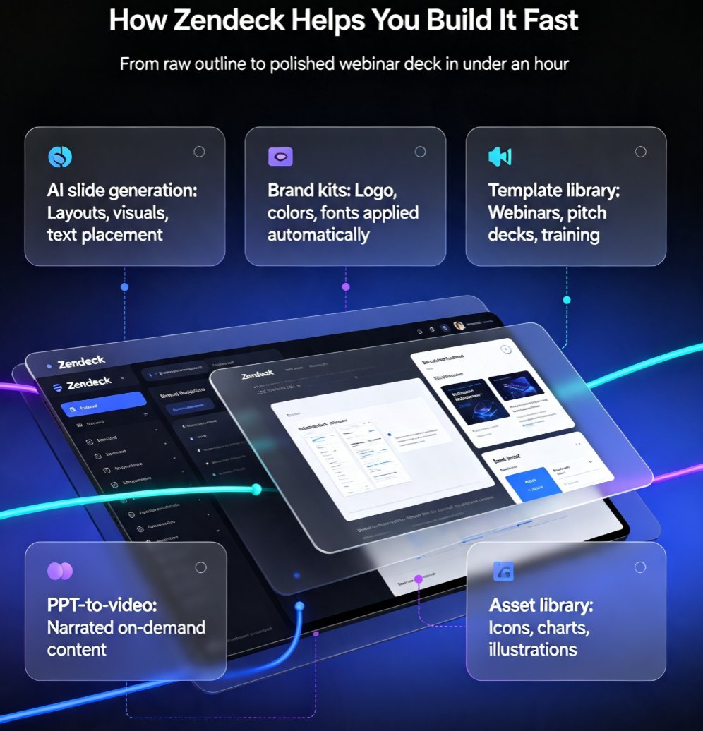
Start by choosing a Zendeck template that matches the energy of your webinar. A product launch needs a bold, high-contrast template. A training session needs something calmer and more readable. Paste in your outline or a rough Markdown draft, and the tool generates structured slides with consistent fonts, colors, and spacing.
Then apply your brand kit so every slide feels like it belongs to your company. This is especially important for webinars because attendees are judging your credibility from the first slide. A consistent brand signal says "this team knows what it's doing." If you want to set this up properly, the guide on setting up brand kits walks through the exact steps.
And if you plan to repurpose the webinar after the live session, the PPT-to-video workflow lets you add narration and turn the deck into a replay or a micro-course. That's a smart way to extend the life of a deck that already converts.
◉ Can templates really save time on webinar decks?
Yes, because the design decisions are already made. You're not starting from a blank canvas and agonizing over font pairings. You're filling a structure that's been tested for readability and visual flow. The time you save on layout goes into the part that actually matters: the message and the offer.
06 Common conversion killers and how to fix them
Even with a solid structure, small mistakes can sink a webinar. Here are the most common conversion killers I've seen in real decks — and the fixes that work.
Killer 1: The bullet-point graveyard. Slides with six bullets and a paragraph of speaker notes. Fix: one idea per slide, three bullets max, and a visual that reinforces the point. Outcome: viewers actually read the slide instead of tuning out.
Killer 2: The CTA that appears only at the end. If the first mention of the offer happens on the last slide, you've lost the people who checked out early. Fix: plant a soft CTA in the proof section and a clear CTA in the final section. Outcome: multiple entry points for action.
Killer 3: No proof. You make big claims but never show a result. Fix: include one concrete example, a customer quote, or a before-and-after comparison. Outcome: the offer feels believable.
Killer 4: No urgency. "Sign up whenever you're ready" doesn't move people. Fix: add a deadline, a bonus, or a limited seat count. Outcome: viewers act now instead of "later."
Killer 5: Inconsistent branding. Every slide looks like it came from a different presentation. Fix: use a brand kit and a single template across the deck. Outcome: the webinar feels polished and professional.
07 Measure what matters after the webinar
The deck doesn't end when the webinar ends. If you want to know whether your slide architecture actually converts, track the metrics that matter.
Start with the basics: registration rate, attendance rate, and CTA click-through rate. Then look at the conversion rate for the primary action — trial sign-ups, course enrollments, or booked calls. If you export the deck to video, you can also see where viewers drop off. That's a goldmine for improving the next deck.
A conversion-focused webinar deck is never finished. It's a hypothesis you test, measure, and refine with every session.
If you're turning the deck into a replay or a training video, the same structure applies. You can learn more about building interactive training modules with PPT-to-video if you want to go deeper.
FAQ
What is a webinar deck that converts? A webinar deck that converts is a slide deck designed around a specific action — registration, sign-up, purchase, or booking. Instead of simply informing the audience, it uses a Hook-Teach-Prove-Convert structure, visual hierarchy, and strategic CTA placement to move viewers toward that action.
How many slides should a webinar deck have? For a 30-minute webinar, 8 to 12 slides is a comfortable range. For a 45-minute session, 12 to 15 slides works. The exact number matters less than the rhythm: every slide should have one job, and no slide should outstay its welcome.
Where should the CTA go in a webinar deck? Place a soft CTA in the proof section, a primary CTA on the convert slide, and a secondary CTA on the final slide. Visually, put the CTA in the bottom-right corner or another high-visibility spot, and make it the loudest element on the slide.
Can Zendeck templates really help build a webinar deck? Yes. Templates come with built-in visual hierarchy, consistent typography, and layout structure, so you can focus on your message instead of design. You can paste in an outline, generate slides, apply a brand kit, and even export the finished deck to video.
How do I turn my webinar deck into a video? Use the PPT-to-video feature to add narration and export the deck as a replay or micro-course. This is a practical way to extend the life of a high-converting webinar deck beyond the live session.