How to Build a Reusable Template Library for Consistent Brand Decks
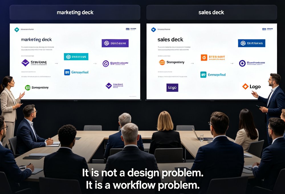
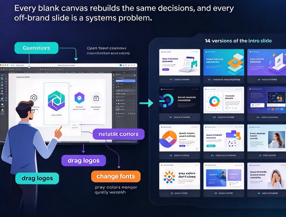
You know the drill. It's Wednesday, 4:47 p.m., and the VP asks for "a quick deck" before tomorrow's 9 a.m. call. You open your presentation tool, stare at the default theme, and spend the next hour dragging logos, changing fonts, and praying the colors don't clash. Meanwhile, somewhere in your company there are 14 versions of the intro slide floating around, none of them matching, and your brand manager quietly weeping.
This isn't a design-skills problem. It's a systems problem. And the fix isn't "be more careful" — it's a properly built reusable template library. Here's how to build one that actually works, the way a team run by a senior editor would build it.
01. Stop Rebuilding Decks From Scratch
Let's be real: every time someone starts a deck from a blank canvas, they re-make the same decisions that were already made last quarter. What font goes with the logo? How much white space should the title slide have? Which chart style does the CEO approve of? Re-answering those questions weekly is why your team wastes hours and why your decks drift off-brand.
A reusable template library turns every new deck into a repeatable starting point — you stop designing and start assembling.
That's the core shift. Instead of a designer handing you a finished deck, they hand you the constraints: a pre-built template with locked layout, approved fonts, and the correct color palette. From there, your job is to fill in content. The heavy lifting of visual decision-making is done once, well, and then reused hundreds of times.
The bigger trend here matters too. As the wider shift toward contextual templates shows, generic one-size-fits-all themes are losing ground because they don't match the job your deck has to do. A template that knows it's a sales proposal behaves differently from one that knows it's an internal training micro-course.
02. Design the Library Structure Before You Fill It
Most teams skip this step and pay for it later. They dump thirty vaguely similar templates into one shared folder and call it a library. Then nobody knows which one to pick, so everyone just uses the first thumbnail that looks nice. That's not a library — that's a junk drawer.
Structure your library by scenario, not by aesthetics. A template should be named for what it does, not for how it looks.
A reliable structure looks like this:
- Folder by scenario: investor pitch, sales proposal, board update, product launch, internal training, quarterly review.
- Name by purpose:
pitch-v1-master,sales-proposal-light,micro-course-2-col— neverblue-template-2. - Master + variants: build one master layout per scenario that holds the creative concept and brand rules, then define size or format variants (16:9 deck, PDF handout, video frame) that inherit from it. This mirrors the master-layout approach used in professional creative teams.
- A clear default: mark one template per scenario as the default so people don't have to choose from three near-identical options.
This structure removes choice anxiety. When someone needs a deck for a client meeting, they open the Sales Proposal folder and grab the default. Done. No browsing, no guessing, no accidentally grabbing the pitch template that says "confidential" in a corner.
03. Map Templates to Scenarios, Not to Aesthetics
Here's where most template guides go wrong: they tell you to pick templates that are "clean" or "modern" or "eye-catching." Those words describe the look, not the job. The right question is: what should this deck accomplish, and what does the audience need to feel?
| Deck Scenario | Primary Audience | What the Template Must Bias Toward | Zendeck Approach |
|---|---|---|---|
| Investor pitch | Investors, partners | Clarity of the ask, traction data, narrative flow | Scenario-matched base with strong data-viz placeholders |
| Sales proposal | Prospects, procurement | Convincing proof points, fast scanning, ROI callouts | Clean grid with bold stat blocks and contract-ready layout |
| Internal status update | Execs, cross-team stakeholders | Speed to insight, next steps, ownership | Compact layout that prioritizes bullets and a clear action column |
| Board / quarterly review | Board members | Trend visibility, variance analysis, honest risks | Chart-heavy template with consistent axis styling |
| Training micro-course | Employees, learners | Engagement, navigation, knowledge checks | Two-column courseware layout with quiz placeholders |
Each of these decks serves a different human moment, and the template should be tuned for that moment. An investor pitch needs room for a problem-to-solution arc; an internal update needs to be skimmable in 90 seconds because everyone's scanning it between meetings.
The good news is you don't need a million options. Five to seven well-chosen templates — one per recurring scenario — cover 90 percent of a typical team's needs. More than that and you're back in the junk-drawer problem.
04. Bake Brand Rules Into Each Template
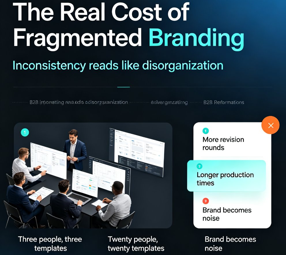
The whole point of a template library is consistency, so the template itself has to be brand-locked. If every template still lets someone swap in Comic Sans, your library is decorative, not functional.
The template holds the layout, but the brand kit holds the truth — fonts, colors, and logo rules should be enforced by the tool, not by a designer chasing down offenders.
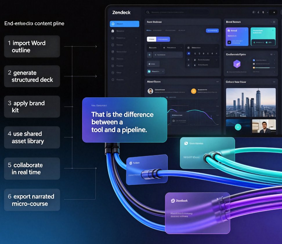
This is where Zendeck does the heavy lifting. When you pair a scenario template with a custom brand kit, the smart layout engine automatically reskins any deck that uses it. Your fonts, palette, and logo usage stay locked, and the one-click reskin unifies anything that's drifted out of line. That's the difference between asking people to follow rules and making it impossible to break them in the first place.
If you're building a kit from scratch, keep your rules short and enforceable: two or three fonts max, a primary-plus-accent palette, and a clear rule for logo placement. Write those rules down once, lock them into the template, and let everyone stop worrying about them.
05. Share, Govern, and Iterate as a Team
A template library saved only on the marketing director's laptop is a museum exhibit, not a workflow. The library earns its keep only when it's shared, governed, and used by the whole team.
Start by putting the library in a central, accessible place — a shared workspace or a synced folder that everyone on the team can reach. Then set up permissions sensibly: a small group of "owners" can edit templates, while everyone else can only use them. This protects the approved versions from well-meaning tweaks that slowly erode the brand.
Version every update and leave a one-line changelog — otherwise the team won't know why the layout changed, and they'll silently keep sending the old, off-brand version.
If you're running a bigger organization with multiple departments, think about governance the way a brand operations team would: the core templates are sacred and centrally owned, while departments get lightweight variants for their own recurring formats. That balances standardization with flexibility.
06. Keep the Library Alive
Here's the truth nobody likes to hear: a template library is a living asset, not a finished project. In three months your company might rebrand, launch a new product line, or realize the sales team never touches the "clean" template because it's too rigid. If you don't refresh, the library rots.
Build a simple maintenance rhythm. Review the library quarterly: archive anything unused in the last two quarters, fix templates people actually complained about, and check that new hires can find the default template without help. Ask one person per team to be the template owner — someone who collects feedback and filters it into updates.
The payoff compounds fast. Each quarter you spend less time fixing inconsistencies and more time shipping decks. And because every new deck starts from an approved, scenario-matched template, even a junior colleague's first presentation will look like your brand — not a reasonable approximation of it.
FAQ
How do I structure a reusable template library?
Structure it by scenario or audience, not by aesthetics. Create folders like 'Investor pitch', 'Sales proposal', 'Internal update', and 'Training micro-course', give each template a descriptive name, and use a master layout with format variants so every deck inherits the same brand rules and content logic.
How many templates does a typical team actually need?
Most teams do fine with five to seven templates: one per recurring scenario. A startup might need an investor pitch, a board update, a sales deck, a product launch, and an internal all-hands. More templates than that usually means clutter that people ignore.
How does Zendeck keep a template on-brand?
Zendeck pairs a scenario-matched template with a custom brand kit that locks in your fonts, colors, and logo usage. When anyone applies the template, the smart layout engine reskins the deck automatically, so visual consistency is enforced by the tool rather than by a designer reviewing every file.
Can I share templates with my whole team and control permissions?
Yes. A shared template library sits in a central location, and permissions determine who can edit a template versus who can only use it. This keeps a few approved owners responsible for changes while everyone else gets a reliable starting point.
How often should we refresh a template library?
Review it quarterly or whenever your brand identity changes. Archive anything unused in the last two quarters, version every update clearly, and leave a short changelog so the team knows why the layout shifted.