Presentation Analytics: Tracking Audience Engagement with AI
You just sent your pitch deck to a prospect. You wait. You refresh your email. Nothing. Did they even open it? Did they read slide 7? Or did they bail after the title slide? If you're like most people, you have no idea. And that's the problem.
Traditional presentation tools give you a view count and maybe a download count. But that's like knowing someone walked into your store without knowing if they bought anything or even looked at the shelves. The next frontier in presentations isn't creating better slides—it's understanding what happens after you hit send.
AI-driven presentation analytics is changing that. Tools like Pitch and Displai are already showing us what's possible, and the implications for sales, education, and internal comms are huge. Let's dig into what this means for you and how you can start measuring what actually matters.
01 The Problem: You Sent the Deck, But Did Anyone Read It?
We've all been there. You spend hours crafting the perfect deck—polished visuals, airtight logic, a killer call to action. You share it with your team, your client, or your class. Then... silence. You're left guessing whether anyone actually engaged with your content or just clicked through out of obligation.
The pain point is clear: without engagement data, you're flying blind. You can't tell which slides resonated, which ones confused people, or where you lost their attention. You're making decisions about your content based on gut feel, not evidence.
The solution is presentation analytics. By tracking how viewers interact with your slides, you can see exactly where they spend time, where they skim, and where they drop off. This isn't just about vanity metrics—it's about closing the feedback loop and making your next deck better.
"Engagement analytics means we're no longer left guessing if a prospect has finished reading one of our decks or gave up on it halfway through." — Jimmy Gordon, Myth
That quote from Pitch's blog captures the shift perfectly. Instead of wondering, you know. And knowing changes everything.
02 What AI-Driven Presentation Analytics Actually Measures
AI-powered analytics tools go far beyond simple view counts. They use machine learning to interpret viewer behavior and provide actionable insights. Here's what they typically track:
- Dwell time: How long a viewer spends on each slide. Longer dwell times usually indicate higher interest and better content quality.
- Attention level: Categorized into glance (≤2 seconds), skim (2-10 seconds), and deep read (>10 seconds). This tells you whether viewers are truly processing your content or just flipping through.
- Conversion rate: The percentage of viewers who take a desired action, like signing up, downloading a resource, or making a purchase. This ties your presentation directly to business outcomes.
- Drop-off points: The exact slides where viewers stop engaging or leave the deck entirely. This is gold for identifying weak spots in your narrative.
AI takes this a step further by automatically detecting patterns and correlations. For example, it might notice that slides with data visualizations get 30% more dwell time than text-heavy slides. Or that viewers who watch your intro video are twice as likely to convert. These insights are impossible to spot manually.
Displai, an audience measurement platform, uses AI-powered face and body detection to gather real-time insights like age, gender, and attention span in offline settings. They also track dwell time and conversion rates, proving that analytics isn't just for digital decks—it works in physical presentations too.
03 The Metrics That Matter: Dwell Time, Attention, and Conversion
Let's break down the key metrics you should be tracking and what they mean for your presentation strategy.
Dwell Time: The Attention Meter
Dwell time is the most direct measure of engagement. If someone spends 30 seconds on a slide, they're clearly interested. If they spend 2 seconds, they're just glancing. Pitch's engagement analytics categorizes attention based on time spent:
- ≤2 seconds: Glance—viewer barely registered the content.
- 2-10 seconds: Skim—viewer scanned the slide but didn't deeply process it.
- >10 seconds: Deep read—viewer is genuinely engaged and absorbing the information.
Conversion Rate: The Bottom Line
Conversion rate is the ultimate metric for business presentations. It tells you whether your deck is actually driving action. Displai defines conversion as the percentage of viewers who complete a desired action, like making a purchase or signing up for a newsletter. If your conversion rate is low, it doesn't matter how many views you get—your deck isn't working.
Putting It All Together
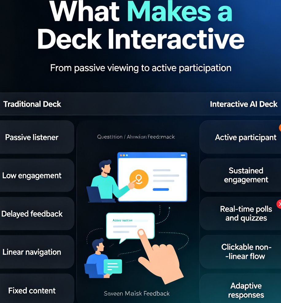
Here's a quick comparison of traditional vs. AI-driven analytics:
| Metric | Traditional Analytics | AI-Driven Analytics |
|---|---|---|
| Views | Total count only | Per-slide breakdown |
| Dwell time | Not available | Tracked automatically |
| Attention level | Not available | Categorized (glance/skim/deep) |
| Conversion | Not tracked | Tied to specific slides |
| Drop-off points | Not available | Identified precisely |
| Pattern detection | Manual, error-prone | Automated, AI-powered |
As you can see, AI analytics gives you a much richer picture. It's the difference between knowing someone visited your website and knowing exactly which pages they read, how long they stayed, and whether they clicked 'buy'.
04 How to Turn Engagement Data into Better Decks
Now that you understand the metrics, let's talk about how to use them. This is where the real value lies—not in collecting data, but in acting on it.
The first step is to identify your weakest slides. Look for slides with high drop-off rates or dwell times under 2 seconds. These are the slides that are losing your audience. Ask yourself: Is the content too dense? Is the visual confusing? Is the message unclear? Then, simplify, restructure, or cut them entirely.
The second step is to double down on what works. If certain slides consistently get deep-read attention, make them the backbone of your narrative. Front-load your deck with your most engaging content to hook viewers early. Pitch's blog suggests using these insights to shape follow-up conversations—if a prospect spent extra time on a pricing slide, that's your cue to discuss pricing in detail.
The third step is to iterate continuously. Presentation analytics isn't a one-time thing. It's an ongoing loop: create, share, analyze, improve. Each cycle makes your next deck better. This is especially powerful for sales teams who send the same deck to multiple prospects—you can aggregate data across all of them to see what works universally.
"By analyzing the engagement data, we can tailor our presentations more precisely to our customers' needs." — Benita Schmidt, Hive
This quote from Hive's Benita Schmidt highlights the strategic advantage. When you know what your audience cares about, you can customize your message to match their interests. That's the difference between a generic pitch and a winning one.
05 Why Zendeck Is Poised to Bring Analytics to Your Workflow
You might be thinking, "This all sounds great, but how do I get started?" That's where Zendeck comes in. As an AI-powered presentation platform, Zendeck is already helping you create stunning decks in minutes. But the next step is measuring their impact.
Zendeck's architecture is built for integration. With features like real-time collaboration, brand kits, and asset libraries, it's designed to fit seamlessly into your workflow. Adding analytics would be a natural extension—imagine creating a deck in Zendeck, sharing it with your team, and then seeing exactly how each slide performs. That's the future we're heading toward.
In the meantime, you can use Zendeck to create data-rich, visually compelling presentations that are more likely to engage your audience. By combining Zendeck's design intelligence with analytics tools like Pitch or Displai, you can close the loop: create, measure, optimize.
If you're new to Zendeck, check out our guide on how to create a winning pitch deck with AI to get started. And for tips on making your slides more engaging, read about AI-powered design suggestions that can boost viewer attention.
06 FAQ
What is presentation analytics?
Presentation analytics refers to the collection and analysis of data about how audiences interact with your slides. This includes metrics like views, dwell time per slide, attention levels, and conversion actions. AI-driven analytics tools go beyond simple view counts to reveal which parts of your deck capture interest and which get ignored.
How does AI improve presentation analytics?
AI enhances presentation analytics by automatically detecting patterns in viewer behavior, such as how long someone spends on each slide, whether they scroll or skip, and even their emotional response via facial recognition (in offline settings). This data helps you understand what resonates with your audience and allows you to tailor your content accordingly.
What are the key metrics to track in presentation analytics?
The most important metrics include dwell time (how long a viewer stays on a slide), attention level (categorized as glance, skim, or deep read), and conversion rate (the percentage of viewers who take a desired action, like signing up or making a purchase). These metrics give you a clear picture of engagement and effectiveness.
Can Zendeck integrate presentation analytics?
While Zendeck currently focuses on AI-powered deck creation, its architecture is designed to support future integrations. Given the growing demand for performance insights, it's highly likely that Zendeck will add analytics features to help users measure and optimize their presentations. For now, you can use Zendeck to create data-rich decks and export them to platforms that offer analytics.
How can I use presentation analytics to improve my next deck?
Start by identifying slides with low dwell time or high drop-off rates. Use this data to restructure your narrative, front-load key messages, and remove or simplify content that doesn't engage. Also, track conversion actions to see which slides drive the most business outcomes, and replicate those patterns in future decks.
Ready to take your presentations to the next level? Start by creating a data-driven deck with Zendeck's AI-powered tools. Then, pair it with an analytics platform to measure your impact. The combination of great design and actionable insights is unstoppable.